README
chakra-react-select

This component is a wrapper for the popular react component react-select made using the UI library Chakra UI.
Check out the demos here:
- Vanilla JS: https://codesandbox.io/s/chakra-react-select-demo-65ohb?file=/example.js
- TypeScript: https://codesandbox.io/s/chakra-react-select-ts-demo-vz9ut?file=/app.tsx
Contents
Usage
In order to use this package, you'll need to have @chakra-ui/react set up like in the guide in their docs. Then install this package:
npm i chakra-react-select
Then you can import the base select package, the async select, the creatable select or the async creatable select:
import {
  AsyncCreatableSelect,
  AsyncSelect,
  CreatableSelect,
  Select,
} from "chakra-react-select";
In order to use this component, you can implement it and use it like you would normally use react-select. It should accept almost all of the props that the original takes, with a few additions and exceptions.
Extra Props
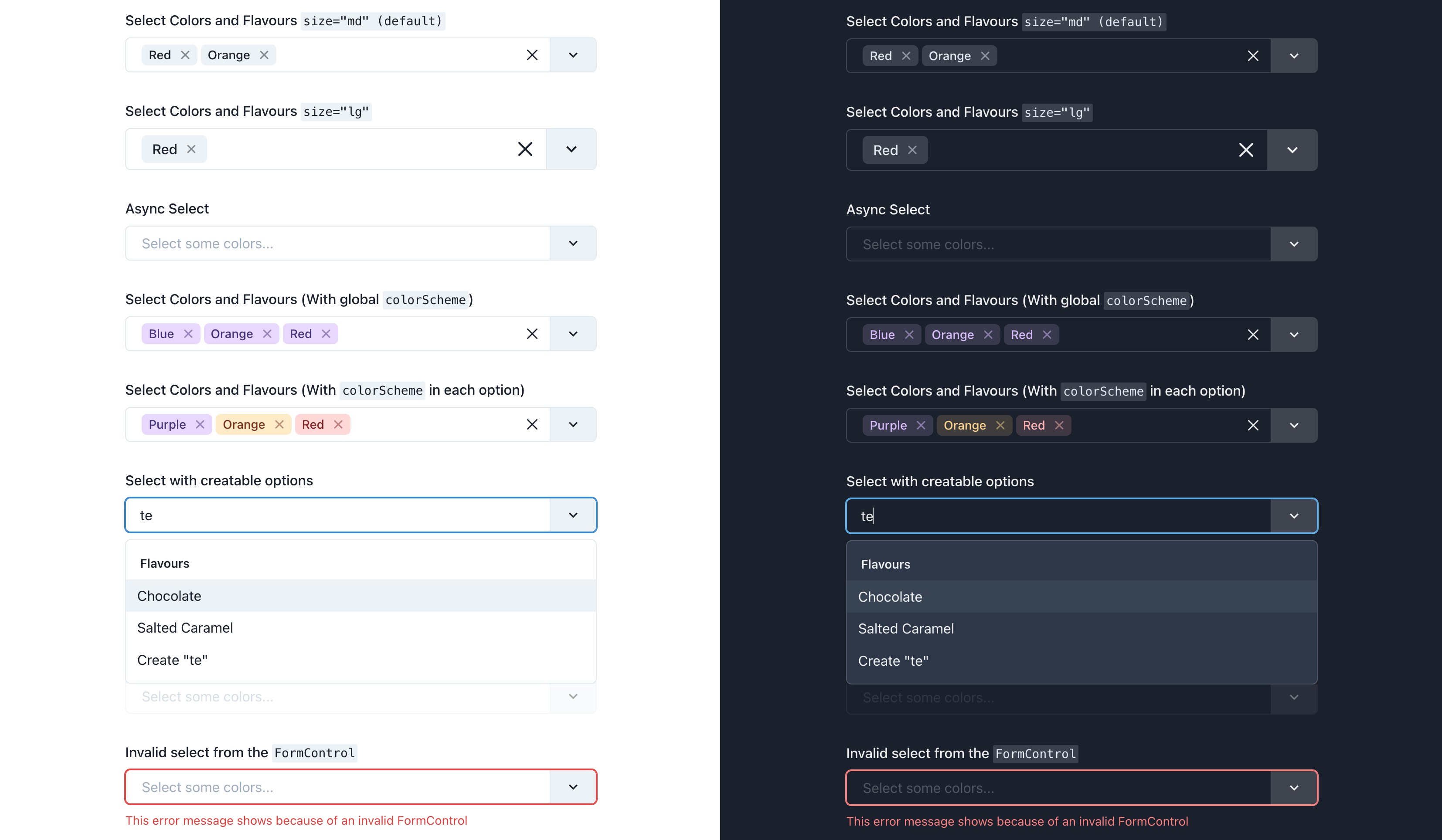
size — Options: sm, md, lg — Default: md
You can pass the size prop with either sm, md, or lg (default is md). These will reflect the sizes available on the Chakra <Input /> component (with the exception of xs because it's too small to work).
return (
  <>
    <Select size="sm" />
    <Select size="md" /> {/* Default */}
    <Select size="lg" />
  </>
);
colorScheme
You can pass the colorScheme prop to the select component to change all of the selected options tags' colors. You can view the whole list of available color schemes in the Chakra docs, or if you have a custom color palette, any of the custom color names in that will be available instead.
Alternatively you can add the colorScheme key to any of your options objects and it will only style that option when selected.
return (
  <Select
    {/* The global color scheme */}
    colorScheme="purple"
    options={[
      {
        label: "I am red",
        value: "i-am-red",
        colorScheme: "red", // The option color scheme overrides the global
      },
      {
        label: "I fallback to purple",
        value: "i-am-purple",
      },
    ]}
  />
);
tagVariant — Options: subtle, solid, outline — Default: subtle
You can pass the tagVariant prop with either subtle, solid, or outline (default is subtle). These will reflect the variant prop available on the Chakra <Tag /> component.
Alternatively you can add the variant key to any of your options objects and it will only style that option when selected. This will override the tagVariant prop on the select if both are set
return (
  <Select
    {/* The global variant */}
    tagVariant="solid"
    options={[
      {
        label: "I have the outline style",
        value: "i-am-outlined",
        variant: "outline", // The option variant overrides the global
      },
      {
        label: "I fallback to the global `solid`",
        value: "i-am-solid",
      },
    ]}
  />
);
isInvalid — Default: false
You can pass isInvalid to the select component to style it like the Chakra <Input /> is styled when it receives the same prop.
You can pass also pass isInvalid or isDisabled to a wrapping <FormControl /> and it will output their corresponding <Input /> on the select.
return (
  <>
    {/* This will show up with a red border */}
    <Select isInvalid />

    {/* This will show up with a red border, and grayed out */}
    <FormControl isInvalid isDisabled>
      <FormLabel>Invalid & Disabled Select</FormLabel>
      <Select />
      <FormErrorMessage>
        This error message shows because of an invalid FormControl
      </FormErrorMessage>
    </FormControl>
  </>
);
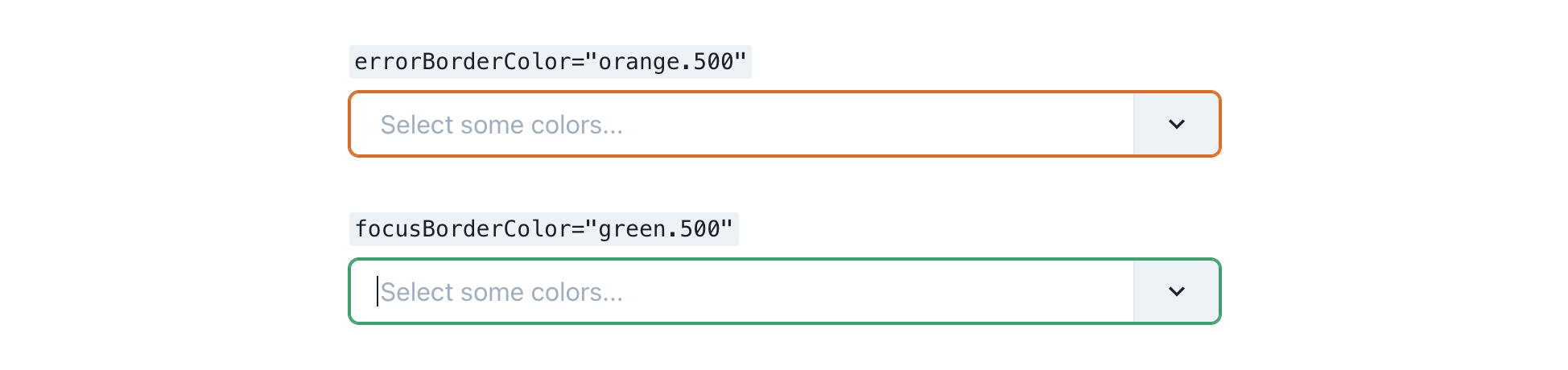
focusBorderColor — Default: blue.500 | errorBorderColor — Default: red.500
The props focusBorderColor and errorBorderColor can be passed with Chakra color strings which will emulate the respective props being passed to Chakra's <Input /> component.
return (
  <>
    <Select focusBorderColor="green.500" />
    <Select errorBorderColor="orange.500" />
  </>
);
hasStickyGroupHeaders — Default: false
One additional feature which isn’t specific to Chakra or react-select is sticky group headers. It adds a border to the bottom of the header and keeps it in view while its corresponding group of options is visible. This can be very nice for when you have long lists of grouped options so you can always tell which group of options you're looking at. To add it, pass the hasStickyGroupHeaders prop to the select component.
return <Select hasStickyGroupHeaders />;
NOTE: It has recently been discovered that when using this prop, navigating up through the available options with the arrow key will keep the focused option underneath the header, as it will not scroll enough to account for it being there. So if this is an issue for you, avoid this prop. A fix for this is being investigated.

selectedOptionStyle — Options: color, check — Default: color
In v1.3.0 you can now pass the prop selectedOptionStyle with either "color" or "check" (defaults to "color"). The default option "color" will style a selected option similar to how react-select does it, by highlighting the selected option in the color blue. Alternatively if you pass "check" for the value, the selected option will be styled like the Chakra UI Menu component and include a check icon next to the selected option(s). If isMulti and selectedOptionStyle="check" are passed, space will only be added for the check marks if hideSelectedOptions={false} is also passed.
return (
  <>
    <Select selectedOptionStyle="color" /> {/* Default */}
    <Select selectedOptionStyle="check" /> {/* Chakra UI Menu Style */}
  </>
);


selectedOptionColor — Default: blue
If you choose to stick with the default selectedOptionStyle="color", you have one additional styling option. If you do not like the default of blue for the highlight color, you can pass the selectedOptionColor prop to change it. This prop will accept any named color from your color theme, and it will use the 500 value in light mode or the 300 value in dark mode.
return (
  <>
    <Select selectedOptionColor="blue" /> {/* Default */}
    <Select selectedOptionColor="purple" />
  </>
);


isFixed
In your options objects, you can add the key isFixed: true to emulate the example in the react-select docs. This will prevent the options which have this flag from having the remove button on its corresponding tag, and it changes the default tagVariant for that tag to be solid. This only applies when using isMulti.
return (
  <Select
    isMulti
    options={[
      {
        label: "I can't be removed",
        value: "fixed",
        isFixed: true,
      },
      {
        label: "I can be removed",
        value: "not-fixed",
      },
    ]}
  />
);
If you have any other requests for Chakra-like features that could be added, or problems with the current features, please submit an issue!
Styling
There are a few ways to style the components that make up chakra-react-select. It's important to note that this package does not use the theme or styles props that are implemented in react-select. The theme prop isn't used as most of the components' base styles are pulling from your Chakra theme, and customizing your base theme (such as colors or component styles) should in turn change the styles in this package.
This package does however offer an alternative to the styles prop, chakraStyles. It mostly emulates the behavior of the original styles prop, however, because it’s not identical it is named differently to prevent confusion.
chakraStyles
In order to use the chakraStyles prop, first check the documentation for the original styles prop from the react-select docs. This package offers an identical API for the chakraStyles prop, however the provided and output style objects use Chakra's sx prop instead of the default emotion styles the original package offers. This allows you to both use the shorthand styling props you'd normally use to style Chakra components, as well as tokens from your theme such as named colors.
The one difference between the keys in this style object and the original, is that in the original the input styles apply to a container surrounding the html <input /> element, and there was no key for styling the input itself. With this styles object, the input key now styles the actual <input /> element and there is a new key, inputContainer, that styles the surrounding Box. Both functions use the state argument for the original input key.
The API for an individual style function looks like this:
/**
 * @param {SystemStyleObject} provided -- The component's default Chakra styles
 * @param {Object} state -- The component's current state e.g. `isFocused` (this gives all of the same props that are passed into the component)
 * @returns {SystemStyleObject} An output style object which is forwarded to the component's `sx` prop
 */
function option(provided, state) {
  return {
    ...provided,
    color: state.isFocused ? "blue.500" : "red.400",
  };
}
All of the style keys offered in the original package can be used here, except for input as that does not allow me to use the chakraStyles from the select props. The input styles are also much more dynamic and should be left alone for the most part.
Most of the components rendered by this package use the basic Chakra <Box /> component with a few exceptions. Here are the style keys offered and the corresponding Chakra component that is rendered:
clearIndicator-Box(uses theme styles for Chakra'sCloseButton)container-Boxcontrol-Box(uses theme styles for Chakra'sInput)dropdownIndicator-Box(uses theme styles for Chrakra'sInputRightAddon)group-BoxgroupHeading-Box(uses theme styles for Chakra'sMenugroup title)indicatorsContainer-BoxindicatorSeparator-Dividerinput-chakra.input(wrapped in aBox)inputContainer-BoxloadingIndicator-SpinnerloadingMessage-Boxmenu-BoxmenuList-Box(uses theme styles for Chakra'sMenu)multiValue-chakra.span(uses theme styles for Chakra'sTag)multiValueLabel-chakra.span(uses theme styles for Chakra'sTagLabel)multiValueRemove-Box(uses theme styles for Chakra'sTagCloseButton)noOptionsMessage-Boxoption-Box(uses theme styles for Chakra'sMenuItem)placeholder-BoxsingleValue-BoxvalueContainer-Box
If you're using TypeScript, the chakraStyles prop is defined by the exported ChakraStylesConfig interface.
import { ChakraStylesConfig, Select } from "chakra-react-select";

const App: React.FC = () => {
  const chakraStyles: ChakraStylesConfig = {
    dropdownIndicator: (provided, state) => ({
      ...provided,
      background: state.isFocused ? "blue.100" : provided.background,
      p: 0,
      w: "40px",
    }),
  };
  return <Select chakraStyles={chakraStyles} />;
};
- Dropdown menu attached to control example:
- Default Chakra
<Select />styles example:
Theme Styles
As mentioned above, a few of the custom components this package implements either use styles from the global Chakra component theme or are themselves those components. As this package pulls directly from your Chakra theme, any changes you make to those components' themes will propagate to the components in this package. Here is a list of all components that will be affected by changes to your global styles:
react-select component |
chakra-ui component styles |
|---|---|
ClearIndicator |
CloseButton |
Control |
Input |
DropdownIndicator |
InputRightAddon |
GroupHeading |
Menu group title |
IndicatorSeparator |
Divider |
LoadingIndicator |
Spinner |
MenuList |
MenuList |
MultiValueContainer |
Tag |
MultiValueLabel |
TagLabel |
MultiValueRemove |
TagCloseButton |
Option |
MenuItem |
In addition to specific component styles, any changes you make to your global color scheme will also be reflected in these custom components.
NOTE: Only make changes to your global component themes if you want them to appear in all instances of that component. Otherwise, just change the individual components' styles using the chakraStyles prop.
className
This package implements the same classNames on the sub components as the original package so you can use these to style sub-components with CSS. Here is an excerpt from the react-select docs describing how it works:
If you provide the
classNameprop to react-select, the SelectContainer will be given a className based on the provided value.If you provide the
classNamePrefixprop to react-select, all inner elements will be given a className with the provided prefix.For example, given
className='react-select-container'andclassNamePrefix="react-select", the DOM structure is similar to this:<div class="react-select-container"> <div class="react-select__control"> <div class="react-select__value-container">...</div> <div class="react-select__indicators">...</div> </div> <div class="react-select__menu"> <div class="react-select__menu-list"> <div class="react-select__option">...</div> </div> </div> </div>While we encourage you to use the new Styles API, you still have the option of styling via CSS classes. This ensures compatibility with styled components, CSS modules and other libraries.
Here is an example of using classNames to style the components: https://codesandbox.io/s/chakra-react-select-classnameprefix-demo-4r2pe?file=/example.js
TypeScript Support
This package has always supported typescript, however until 3.0.0 none of the type inference was working on the props passed into this component. Now that they are, you may need to pass in some generics in order for your component to work properly.
This package exports all of the named module members of the original react-select in case you need their built in types in any of your variable declarations. The root select Props type that is exported by react-select has been extended using module augmentation so if you import that type, it will include all of the extra props offered. This package also exports a few custom types that are specific to the custom props offered by this package:
ChakraStylesConfig— The type for the propchakraStylesthat can be passed to customize the component styles. This is almost identical to the built inStylesConfigtype, however it uses Chakra'sSystemStyleObjecttype instead of react-select's emotion styles.OptionBase— A type for your individual select options that includes the custom props for styling each of your selected options. This type is made to give you a base to extend off of and pass in as a generic to the rootSelectcomponent.
Here is an example of how to pass in the proper generics to chakra-react-select:
import { GroupBase, OptionBase, Select } from "chakra-react-select";

/**
 * `OptionBase` is a custom type exported by this package meant to be extended
 * to make your custom option types. It includes all of the keys that can be
 * used by this package to customize the styles of your selected options
 *
 * ```
 * type OptionBase = {
 *   variant?: string;
 *   colorScheme?: string;
 *   isFixed?: boolean;
 *   isDisabled?: boolean;
 * };
 * ```
 */
interface ColorOption extends OptionBase {
  label: string;
  value: string;
}

const colorOptions = [
  {
    label: "Red",
    value: "red",
    colorScheme: "red", // This is allowed because of the key in the `OptionBase` type
  },
  {
    label: "Blue",
    value: "blue",
  }
]

function CustomMultiSelect() {
  return {
    <Select<ColorOption, true, GroupBase<ColorOption>>
      isMulti
      name="colors"
      options={colorOptions}
      placeholder="Select some colors..."
    />
  }
}
Customizing Components
Like the original react-select, this package exports all of the custom components that make up the overall select. However, instead of being exported as components they are exported as chakraComponents in order to leave the original components export from react-select alone (you can export that as well if you'd like). When implementing this component, you have the option to wrap these components and alter their state and the children they return in the same way the original does.
Here's an example of how you might use this to create a select with a custom Option:
import { Icon } from "@chakra-ui/react";
import { Select, chakraComponents } from "chakra-react-select";
import {
  GiCherry,
  GiChocolateBar,
  GiCoffeeBeans,
  GiStrawberry,
} from "react-icons/gi";

const flavorOptions = [
  {
    value: "coffee",
    label: "Coffee",
    icon: <Icon as={GiCoffeeBeans} color="orange.700" mr={2} h={5} w={5} />,
  },
  {
    value: "chocolate",
    label: "Chocolate",
    icon: <Icon as={GiChocolateBar} color="yellow.800" mr={2} h={5} w={5} />,
  },
  {
    value: "strawberry",
    label: "Strawberry",
    icon: <Icon as={GiStrawberry} color="red.500" mr={2} h={5} w={5} />,
  },
  {
    value: "cherry",
    label: "Cherry",
    icon: <Icon as={GiCherry} color="red.600" mr={2} h={5} w={5} />,
  },
];

const Example = () => (
  <Select
    name="flavors"
    options={flavorOptions}
    placeholder="Select some flavors..."
    components={{
      Option: ({ children, ...props }) => (
        <chakraComponents.Option {...props}>
          {props.data.icon} {children}
        </chakraComponents.Option>
      ),
    }}
  />
);
CodeSandbox Example: https://codesandbox.io/s/chakra-react-select-custom-option-d99s7?file=/example.js
CodeSandbox Templates
When submitting a bug report, please include a minimum reproduction of your issue using one of these templates:
- React Vanilla JS Starter: https://codesandbox.io/s/chakra-react-select-vsvr0?file=/example.js
- React Typescript Starter: https://codesandbox.io/s/chakra-react-select-typescript-4sce1?file=/app.tsx
- Next.js Vanilla JS Starter: https://codesandbox.io/s/chakra-react-select-next-js-dtnsm?file=/pages/index.js
- Next.js Typescript Starter: https://codesandbox.io/s/chakra-react-select-next-js-typescript-kscuf?file=/pages/index.tsx
Roadmap
Since releasing this project, there have been a few things brought up that will be addressed in the near future. In version 2.0.0 the Better Customization feature was implemented, and in version 3.0.0 the version of react-select used by this package was updated to v5.
Better Support for component wrapping
When implementing this component, you have the option to wrap the custom components exported in chakraComponents, however, these wrapped components do not accept any of the Chakra style props. And more importantly, in the cases where Chakra components other than the base Box are used, for example the LoadingIndicator which uses the Chakra Spinner, you can not pass any of the custom props that are specific to that component. The fact that they do not accept the style props is not the most important, as these can all be passed using the chakraStyles prop, however this package will never feel quite as customizable as it could until you have to freedom to pass more of these props directly to the component.
Because of this, at this point in time it is not recommended to wrap the custom components exported by this project (unless you're altering their children), but instead replace them entirely. If you would like them to do more in-depth alteration to the the custom components in this package, it is recommended to copy the source for that component, alter it as needed, and then pass it into the components prop on your root select. Eventually there will be better support for passing custom props while wrapping this package's internal components.