README

customizable-react-badges
Customizable and Reusable React Badge component for your all kinds of Projects and WebSites.
For thorough docs , click here

- Customizable - Easy to customize background color, color and more.
- Notification Badge - Easy to use with any icon as a notification badge.
- Reasonable package size - <2.8 kB gzipped.
- Chip - Pass content as string and use it as Chip.
- It Just Works - Sensible default styling. Uses inline styles, so no need to import a separate css file.
Install
npm i customizable-react-badges
or
yarn add customizable-react-badges
Usage
If you wanted to use them as notification badges like
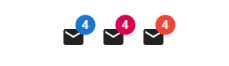
you can use code like below
import React from 'react';
import { Badge } from 'customizable-react-badges';
import MailIcon from './MailIcon';

const App = () => {
    return (
            <Badge
                content={4}
                verticalAlignment="top"
                horizontalAlignment="right"
            >
                <MailIcon />
            </Badge>
    );
};

export default App;
OR
If you wanted to use them as regular simple badges like

you can use code like below
import React from 'react';
import { Badge } from 'customizable-react-badges';

const App = () => {
    return (
        <div
            style={{
                height: '100vh',
                display: 'flex',
                justifyContent: 'space-around',
                width: '60vw',
                alignItems: 'center'
            }}
        >
            <Badge content="Danger" contentColor="#ffffff" />
            <Badge content="Success" bgColor="green" />
            <Badge content="Warning" bgColor="orange" />
            <Badge content="Info" bgColor="skyblue" />
        </div>
    );
};

export default App;
Properties
| Property | Type | Required | Default value | Description |
|---|---|---|---|---|
content |
string/number | yes | Content to be shown in the badge. | |
bgColor |
string | no | red | Background Color of the badge. |
contentColor |
string | no | white | Color of the content of badge. |
verticalAlignment |
'top'/'bottom' | no | 'top' | Vertical Alignment of the badge |
horizontalAlignment |
'left'/'right' | no | 'right' | Horizontal Alignment of the badge. |
max |
number | no | 99 | Max count to show. |
hideZero |
boolean | no | false | Controls whether the badge is hidden when badgeContent is zero. |
| ## License |
MIT © satishnaikawadi2011