README
Tailwind CSS Components
Adds component classes like btn, card and more to Tailwind CSS

daisyUI 2.0
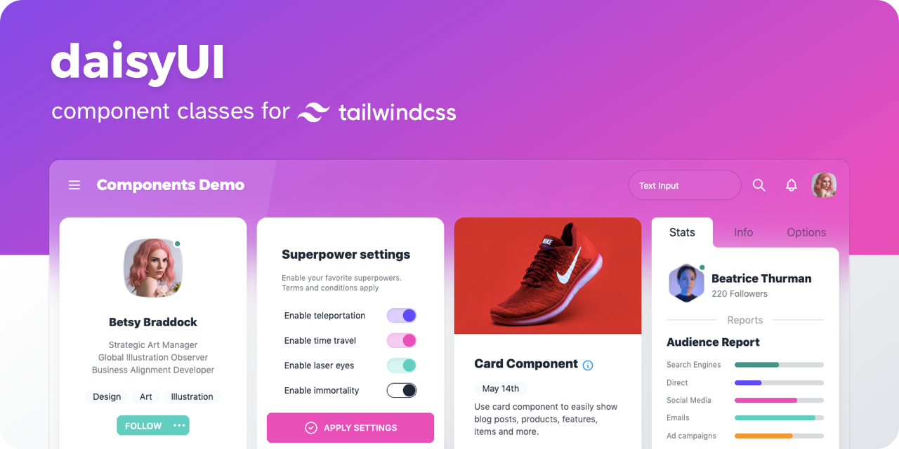
- 👉 [ See all components ]
- 📘 Documents: daisyui.com
- 🎲 Try it online: Tailwind Play | Codepen
- 📦 Source: GitHub | NPM | Unpkg | JSdeliver | cdnjs
🌼 Features
show / hide
- Tailwind CSS plugin
daisyUI is a Tailwind CSS plugin. Install it and add it to yourtailwind.config.jsfile. - Component classes
Adds component classes to Tailwind. Classes likebtn,card,… So you will end up with a cleaner HTML. - Semantic color names
Adds color names likeprimary,secondary,accent,…. - Customizable
You can customize the design of components with Tailwind utility classes and CSS variables. - Themeable
Add multiple themes and customize colors. You can even set a theme for a specific section of your page. - RTL supported
Enablertlconfig for right to left layouts. - Pure CSS
No script file. Pure CSS. Works on all frameworks!
📀 Install now!
npm i daisyui
Then add daisyUI to your tailwind.config.js
[ Read more ]
module.exports = {
  plugins: [require("daisyui")],
};
Or use a CDN
Loading CSS files from CDN is not recommended for production. It's better to install Tailwind and daisyUI as Nodejs dependencies so you can config/customize everything, and purge unused styles.
<link href="https://cdn.jsdelivr.net/npm/daisyui@2.1.0/dist/full.css" rel="stylesheet" type="text/css" />
<script src="https://cdn.tailwindcss.com"></script>
🚀 Use
Use component classes to build your UI.
<a class="btn">Hello!</a>
<input type="checkbox" class="checkbox" />
<input type="checkbox" class="toggle" />
<div class="alert alert-success">Message sent successfully</div>
👉 See all components
🎲 Try it online
📘 Documents + Examples
See the official site:
[ daisyui.com ↗︎ ]
🤝 Contributing
Read the documents for more info:
[ Read contribution guide ]
List of Components
show / hide
Actions
- Button
- Dropdown
- Modal
- Swap
Data display
- Alert
- Avatar
- Badge
- Banner
- Calendar
- Card
- Carousel
- Chat bubble
- Collapse
- Comment
- Countdown
- Empty placeholder
- Kbd
- Loading
- Progress
- Radial progress
- Stat
- Table
- Tag
- Timeline
- Toast
- Tooltip
- Treeview
Data input
- Checkbox
- Text input
- Radio
- Range
- Rating
- Select
- Textarea
- Toggle
- Upload
Layout
- Artboard
- Button group
- Divider
- Drawer
- Footer
- Hero
- Indicator
- Input group
- Mask
- Stack
Navigation
- App bar
- Breadcrumbs
- Link
- Menu
- Navbar
- Pagination
- Steps
- Tab
Mockup
- Browser
- Code
- Phone
- Window
Featured on:
show / hide
- Blogs
- Youtube videos
- Supabase & Sveltekit - Build Twitter in 75 minutes
- Setup the Best Frontend JavaScript Stack - Svelte, Vite, TailwindCSS and DaisyUI
- Jamstack powered Image gallery with Cloudinary, Tailwind and DaisyUI
- SvelteKit Crash Course w/ Tailwind CSS and DaisyUI, GraphQL and dynamic routes
- DaisyUI : Worth a try or skip on by?
- How to use daisyUI in SvelteKit?
- DaisyUI Untuk Yang Mau Pindah ke TailwindCSS dari Bootstrap (Indonesian)
- Next.js - Tailwind - DeisyUI Setup
- Svelte Setup with Vite, Tailwind, DaisyUI. Custom Themes!
- Courses
- Building with SvelteKit and GraphCMS
- Svelte for Beginners by Mike Karan
- React Front To Back 2022 by Brad Traversy
- Build Instagram profile page UI clone w/Next.js TailwindCSS
- Instagram UI Clone Login Page w/ NextJS & TailwindCSS
- Build your Developer Portfolio and Blog from Scratch with Svelte and GraphCMS
༼ つ ◕_◕ ༽つ Please share