README
dfx-bootstrap-table
Angular table CDK implementation for Bootstrap with filtering and sorting.
Working with @ng-bootstrap/ng-bootstrap and @ngx-bootstrap.

Demo
 Click me (or the video) for a faster version
Visit the demo in the browser.
Description
The ngb-table provides a Bootstrap styled data-table that can be used to display rows of data.
This table builds on the foundation of the CDK data-table and uses a similar interface for its data input and template, except that its element and attribute selectors will be prefixed with ngb- instead of cdk-. For more information on the interface and a detailed look at how the table is implemented, see the guide covering the CDK data-table.
Information
- Usage
- Development notes
- Deployment notes
- Project website
- created with Angular, used libraries
Credits
Full credits go to the Angular and Angular Material Team. I literally copied most of their mat-table implementation and narrowed it down for Bootstrap.
Features
- Extendable template
- Builtin sorting and filtering available through
NgbTableDataSource
Usage
Installation
npm install dfx-bootstrap-table@latest
- If you have not already installed Bootstrap
npm install bootstrap@latest - For sorting
npm install @angular/animations@latest - If you are going to use the filtering code
npm install @angular/forms@latest
Getting started (table with filtering and sorting)
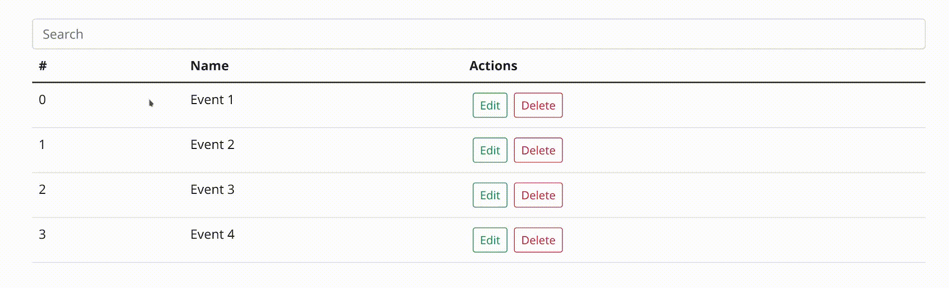
This is the code for a table as you see it above. You can run the demo with npm run demo and visit it under
http://localhost:4200, read more.
Every code piece is located in src/app/.
<!-- Filtering stuff -->
<form>
  <div class='input-group'>
    <input class='form-control' type='text' [formControl]='filter'
           placeholder='Search' />
  </div>
</form>

<table ngb-table [dataSource]='dataSource' ngb-sort>
  <ng-container ngbColumnDef='id'>
    <th *ngbHeaderCellDef ngb-header-cell ngb-sort-header>#</th>
    <td *ngbCellDef='let event' ngb-cell>{{ event.id }}</td>
  </ng-container>

  <ng-container ngbColumnDef='name'>
    <th *ngbHeaderCellDef ngb-header-cell ngb-sort-header>Name</th>
    <td *ngbCellDef='let event' ngb-cell>{{ event.name }}</td>
  </ng-container>

  <ng-container ngbColumnDef='actions'>
    <th *ngbHeaderCellDef ngb-header-cell>Actions</th>
    <td *ngbCellDef='let event' ngb-cell>
      <button
        type='button'
        class='btn btn-sm m-1 btn-outline-success'>
        Edit
      </button>
      <button
        type='button'
        class='btn btn-sm m-1 btn-outline-danger'>
        Delete
      </button>
    </td>
  </ng-container>

  <tr *ngbHeaderRowDef='columnsToDisplay' ngb-header-row></tr>
  <tr *ngbRowDef='let event; columns: columnsToDisplay' ngb-row></tr>
</table>
| ngb-table properties | Description | default |
|---|---|---|
| hover | Determines if the table is hoverable | false |
| striped | Determines if the table is striped | false |
export type eventModel = {
  id: number,
  name: string,
}

@Component({
  selector: '...'
})
export class AppComponent implements OnInit {
  // Filtering
  public filter = new FormControl();

  // Sorting
  @ViewChild(NgbSort, {static: true}) sort: NgbSort | undefined;

  public columnsToDisplay = ['id', 'name', 'actions'];
  public dataSource: NgbTableDataSource<eventModel> = new NgbTableDataSource();

  eventModels = [
    {
      id: 0,
      name: 'Event 1'
    },
    {
      id: 1,
      name: 'Event 2'
    },
    {
      id: 2,
      name: 'Event 3'
    },
    {
      id: 3,
      name: 'Event 4'
    },
  ];

  ngOnInit(): void {
    this.dataSource = new NgbTableDataSource<eventModel>(this.eventModels);
    // Sort has to be set after template initializing
    this.dataSource.sort = this.sort;

    this.filter.valueChanges.subscribe((value) => {
      this.dataSource.filter = value;
    });
  }
}
import {BrowserAnimationsModule} from '@angular/platform-browser/animations';
import {ReactiveFormsModule} from '@angular/forms';

import {DfxTableModule, DfxSortModule} from 'dfx-bootstrap-table';

@NgModule({
  declarations: [...],
  imports: [
    BrowserAnimationsModule, // (probably) only once in your project
    ReactiveFormsModule, // only if you use the filtering code
    DfxTableModule,
    DfxSortModule,
  ],
})
export class EventsModule {
}
1. Write your ngb-table and provide data
Begin by adding the <table ngb-table> component to your template and passing in data.
The simplest way to provide data to the table is by passing a data array to the table's dataSource input. The table will take the array and render a row for each object in the data array.
<table ngb-table [dataSource]='myDataArray'>
  ...
</table>
Since the table optimizes for performance, it will not automatically check for changes to the data array.
Instead, when objects are added, removed, or moved on the data array, you can trigger an update to the table's rendered rows by calling its renderRows() method.
While an array is the simplest way to bind data into the data source, it is also the most limited. For more complex applications,
using a DataSource instance is recommended. See the section Advanced data sources below for more information.
2. Define the column templates
Next, write your table's column templates.
Each column definition should be given a unique name and contain the content for its header and row cells.
Here's a simple column definition with the name 'name'. The header cell contains the text "Name" and each row cell will render the score property of each row's data.
<ng-container ngbColumnDef='name'>
  <th ngb-header-cell *ngbHeaderCellDef> Name</th>
  <td ngb-cell *ngbCellDef='let event'> {{event.name}} </td>
</ng-container>
Note that the cell templates are not restricted to only showing simple string values, but are flexible and allow you to provide any template.
3. Define the row templates
Finally, once you have defined your columns, you need to tell the table which columns will be rendered in the header and data rows.
To start, create a variable in your component that contains the list of the columns you want to render.
columnsToDisplay = ['id', 'name', 'actions'];
Then add ngb-header-row and ngb-row to the content of your ngb-table and provide your column list as inputs.
<tr ngb-header-row *ngbHeaderRowDef='columnsToDisplay'></tr>
<tr ngb-row *ngbRowDef='let event; columns: columnsToDisplay'></tr>
Note that this list of columns provided to the rows can be in any order, not necessarily the order in which you wrote the column definitions. Also, you do not necessarily have to include every column that was defined in your template.
This means that by changing your column list provided to the rows, you can easily re-order and include/exclude columns dynamically.
4. Filtering
dfx-bootstrap-table does not provide a specific component to be used for filtering the NgbTable since there is no single common approach to adding a filter UI to table data.
A general strategy is to add an input where users can type in a filter string and listen to this input to change what data is offered from the data source to the table.
If you are using the NgbTableDataSource, simply provide the filter string to the NgbTableDataSource.
The data source will reduce each row data to a serialized form and will filter out the row if it does not contain the filter string.
By default, the row data reducing function will concatenate all the object values and convert them to lowercase.
For example, the data object {id: 123, name: 'Mr. Smith', favoriteColor: 'blue'} will be reduced to 123mr. smithblue.
If your filter string was blue then it would be considered a match because it is contained in the reduced string, and the row would be displayed in the table.
To override the default filtering behavior, a custom filterPredicate function can be set which takes a data object and filter string and returns true if the data object is considered a match.
If you want to show a message when not data matches the filter, you can use the *ngbNoDataRow directive.
5. Sorting
To add sorting behavior to the table, add the ngb-sort directive to the table and add ngb-sort-header to each column header cell that should trigger sorting.
Note that you have to import DfxSortModule in order to initialize the ngb-sort directive.
<!-- Name Column -->
<ng-container ngbColumnDef="name">
  <th ngb-header-cell *ngbHeaderCellDef ngb-sort-header> Name </th>
  <td ngb-cell *ngbCellDef="let event"> {{event.name}} </td>
</ng-container>
If you are using the NgbTableDataSource for your table's data source, provide the NgbSort directive to the data source, and it will automatically listen for sorting changes and change the order of data rendered by the table.
By default, the NgbTableDataSource sorts with the assumption that the sorted column's name matches the data property name that the column displays. For example, the following column definition is named position, which matches the name of the property displayed in the row cell.
Note that if the data properties do not match the column names, or if a more complex data property accessor is required, then a custom sortingDataAccessor function can be set to override the default data accessor on the NgbTableDataSource.
If you are not using the NgbTableDataSource, but instead implementing custom logic to sort your data, listen to the sort's (ngbSortChange) event and re-order your data according to the sort state. If you are providing a data array directly to the table, don't forget to call renderRows() on the table, since it will not automatically check the array for changes.
Advanced data sources
The simplest way to provide data to your table is by passing a data array. More complex use-cases may benefit from a more flexible approach involving an Observable stream or by encapsulating your data source logic into a DataSource class.
Observable stream of data arrays
An alternative approach to providing data to the table is by passing an Observable stream that emits the data array to be rendered each time it is changed. The table will listen to this stream and automatically trigger an update to the rows each time a new data array is emitted.
DataSource
For most real-world applications, providing the table a DataSource instance will be the best way to manage data. The DataSource is meant to serve as a place to encapsulate any sorting, filtering and data retrieval logic specific to the application.
A DataSource is simply a class that has at a minimum the following methods: connect and disconnect. The connect method will be called by the table to provide an Observable that emits the data array that should be rendered. The table will call disconnect when the table is destroyed, which may be the right time to clean up any subscriptions that may have been registered in the connect
method.
Although dfx-bootstrap-table provides a ready-made table DataSource class, NgbTableDataSource, you may want to create your own custom DataSource class for more complex use cases. This can be done by extending the abstract DataSource class with a custom DataSource class that then implements the connect and disconnect methods. For use cases where the custom DataSource must also inherit
functionality by extending a different base class, the DataSource base class can be implemented instead (MyCustomDataSource extends SomeOtherBaseClass implements DataSource) to respect Typescript's restriction to only implement one base class.
Development
Everything important in this library is located in projects/dfx-bootstrap-table, that's the "real" library. (following commands still have to be executed at the root level)
Dependency installation
npm install
Running the demo
Install all dependencies. Then run:
npm run demo
Visit the demo under http://localhost:4200
Starting in development environment
npm run-script watch
Building a production version
npm run-script build
Deployment notes
dfx-bootstrap-table deployments are managed via .gitlab-ci
All builds are uploaded to releases.datepoll.org/common/dfx-bootstrap-table
Development builds
Commits to the develop branch create a dev build downloadable via this link.
Production builds
Tags create a release build downloadable via this link. Additionally, a versioned zip is uploaded and the package is published to npm.