README

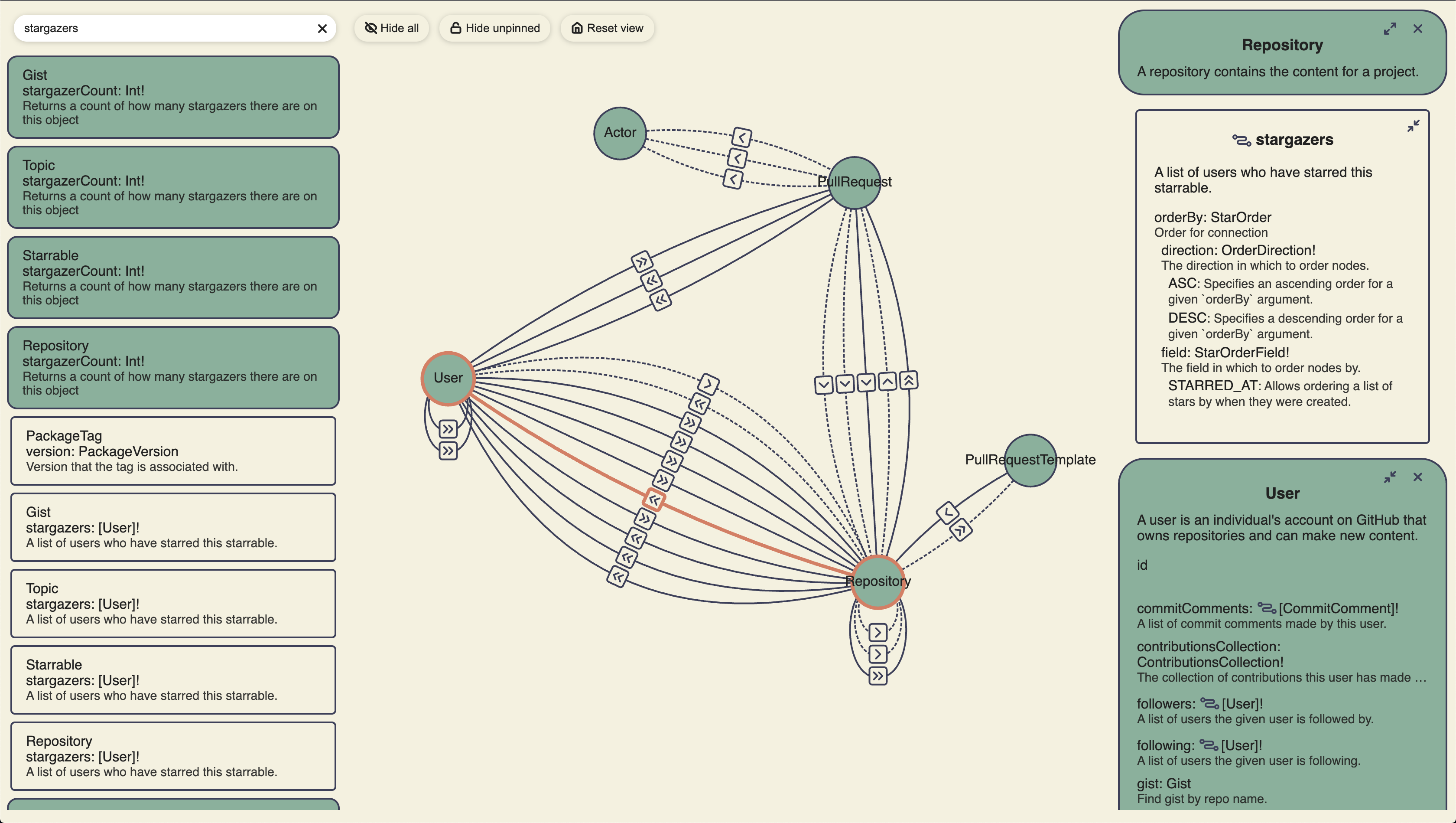
DomainGraph
Beautiful, interactive visualizations for GraphQL schemas
Quick Start
Import the script and styles from unpkg and mount your schema:
<html>
  <head>
    <script src="https://unpkg.com/domain-graph/umd/domain-graph.min.js"></script>
    <link
      href="https://unpkg.com/domain-graph/umd/domain-graph.min.css"
      rel="stylesheet"
    />
  </head>
  <body>
    <div id="app-root"></div>
    <script>
      var schema = 'type MyType { id: ID! }'; // The content of your GQL schema
      domainGraph.mount('app-root', 'my-schema-name', schema);
    </script>
  </body>
</html>
Alternatively, you can build DomainGraph into a React web application.
This library exposes two main components. The <DomainGraph /> component displays the interactive graph. The <DataProvider /> component provides an opinionated, cross-platform UI for opening or dropping files.
DomainGraph
This component renders a GraphQL IntrospectionQuery object as an interactive graph. Learn more about introspection queries from the GraphQL docs.
import React from 'react';
import { DomainGraph } from 'domain-graph';
import { IntrospectionQuery } from 'graphql';

export const App: React.FC = () => {
  const introspection: IntrospectionQuery = useIntrospection(); // Some data source

  return <DomainGraph introspection={introspection} />;
};
DataProvider
This component provides an opinionated, cross-platform UI for opening or dropping files. The result is an DocumentNode object that is passed via a render prop. The resulting object can then be passed to a <DomainGraph /> component. If the GraphQL SDL file (*.gql or *.graphql) is not valid, parse errors will be displayed in the UI.
import React, { useCallback } from 'react';
import { DataProvider, DomainGraph } from 'domain-graph';

export const App: React.FC = () => {
  const handleDrop = useCallback(() => {
    // TODO: Implement platform-specific confirmation before opening the dropped file
    return Promise.resolve(true);
  });

  const handleShowFileDialog = useCallback(() => {
    // TODO: Implement platform-specific "open file dialog" here.
    return Promise.resolve({ canceled: true, files: [] });
  });

  return (
    <DataProvider onDrop={handleDrop} onShowFileDialog={handleShowFileDialog}>
      {(documentNode) => <DomainGraph documentNode={documentNode} />}
    </DataProvider>
  );
};
This component renders all of the of UI for opening or dropping files; however, the callbacks must be implemented in a platform-specific way. If a callback is not implemented, then that behavior will not be supported by the resulting application.
Examples:
- VSCode Extension: github.com/domain-graph/vscode
- Web implementation: github.com/domain-graph/website
- Desktop (Electron) implementation: github.com/domain-graph/desktop
Styles and Themes
The components are styled with LESS and the raw .less files are included in the package. You will need to use a transpiler/bundler such as webpack to generate CSS to include in your project. You will also need to include a theme file. This package provides an example theme in /lib/colors.less or you may include your own custom theme. Custom themes must export at least the same LESS variables as the included theme.
Include the theme in your build using the additionalData less-loader option in your webpack config:
config = {
  // ...
  module: {
    rules: [
      {
        test: /\.less$/,
        use: [
          'css-loader',
          {
            loader: 'less-loader',
            options: {
              additionalData:
                "@import '/node_modules/domain-graph/lib/colors.less';", // Or the path to your theme file
            },
          },
        ],
      },
    ],
  },
  // ...
};
Note that if you don't include a theme file, you'll see an error message such as:
Variable @color-some-color-description is undefined
How To:
Run the Dev Server with Hot Module Reloading (HMR)
This project contains a development server than can be started by running npm start. This will load a bootstrap web application that contains a <DataProvider /> and a <DomainGraph />.
To run the server:
npm start- Open
localhost:9999in your browser
Any changes to index.html, *.ts, or *.less files will be immediately reflected in the browser without required a page refresh.
Run unit tests
The test script will run any file ending with .tests.ts:
npm test
Code coverage may be viewed in ./coverage/lcov-report/index.html.
Publish a new version to NPM
Publishing is automated via a workflow. To run this workflow:
- Checkout
masterand pull latest changes. - Run
npm version [major|minor|patch]to create a new version commit and tag - Run
git push origin master --follow-tagsto push the tag (and version commit) and start the workflow - Wait for the workflow to detect the tag and publish the package.
Add code or style files
Code
The entry point of the Typescript files is ./src/index.ts; therefore, any file that will be included in the .js bundle must be ultimately imported from index.ts.
Styles
*.less files must be imported from Typescript in order to be included in the .css bundle. Note that even though the styles are "imported" into a code file, they are NOT inlined into the .js bundle. The MiniCssExtractPlugin ensures that any LESS styles imported into code are moved from the code into the style bundle. (The less.d.ts file prevents compile-time errors when importing non-Typescript content.)
Example:
import './index.less';

const code = 'goes here';
Markup
Add your markup to ./src/index.html. This file is used as the "template" when running Webpack. The resulting file will include script and link tags to the .js and .css bundles.
Generated with generator-ts-website