README
🔌</> DOMponent
Build UI Components with the HTML You Already Have.
2kb gzipped and 6kb minified! 👌


How To:
- Drop a few
dataattributes into your existing HTML 💻
<div data-component="Counter">
  <p data-bind="state:Counter.count">0</p>
  <button data-action="click->Counter.decrement">
    -1
  </button>
  <button data-action="click->Counter.increment">
    +1
  </button>
</div>
- Write a JavaScript
classcomponent 🔌
import { Component } from "domponent";

export default class Counter extends Component {
  constructor(el) {
    super(el);
  }

  increment() {
    this.setState({ count: this.state.count + 1 });
  }

  decrement() {
    this.setState({ count: this.state.count - 1 });
  }
}
- Initialize the App ⚡
import { Init } from "domponent";
import Counter from "./Counter.js";

const config = {
  selector: document.getElementById("root"),
  components: {
    Counter
  },
  appCreated: callbackFunction
};

new Init(config);
And you're good to go!!
Checkout a practical example now:
https://dev.to/tamb/modern-front-end-with-older-tech-625
Docs 📖
- Purpose
- Demo
- Install
- Data API
- Extending the Component class
- Managing Component State
- Lifecycle Methods
- Watchers
- Stateless Components
- Component Fields
- Init Function
- Adding and Removing Components
- Namespacing Data Attributes
- Custom Syntax
- Development Mode
- Syntax Examples
- Component Lifecycle
- Contact
Purpose ✔️
What does this do?
This library sets up a clean and modern way to turn prerendered HTML into UI components. You can easily implement some data-binding, handle scope, pass data around, and create components by using some of the conventions in this script. It's meant to be a very very lightweight alternative to StimulusJS with a bit of a React flavor (lifecycle methods, props and component state).
What does this library not do?
DOMponent does not handle client-side rendering out of the box, does not create virtual DOM, does not diff DOM (though it does diff state and props). It's not meant to handle routing or entire application state. It's meant to take HTML fragments (Thymeleaf, Rails, Pug, whatever template engine you use) and create reusable functionality in the form of Components.
Differences to KnockoutJS
DOMponent is similar to Knockout in some ways:
- it is template language-agnostic
- the syntax looks similar
- ... that's kinda about it.
Unlike KnockoutJS, DOMponent:
- is component-driven
- has option for namespaced components
- can isolate scope
- is only 6kb (that's a 50kb savings)
- is highly declarative
- allows for highly specific DOM references
- has lifecycle methods
- performs insanely fast
Knockout
HTML
<p>First name: <input data-bind="value: firstName" /></p>
<p>Last name: <input data-bind="value: lastName" /></p>
<h2>Hello, <span data-bind="text: fullName"> </span>!</h2>
JS
var ViewModel = function(first, last) {
  this.firstName = ko.observable(first);
  this.lastName = ko.observable(last);

  this.fullName = ko.pureComputed(function() {
    return `${this.firstName()} ${this.lastName()}`;
  }, this);
};

ko.applyBindings(new ViewModel("Planet", "Earth"));
DOMponent
HTML
<div data-component="Hello" data-state="{"firstName": "Planet", "lastName": "Earth"}">
  <p>First name: <input data-action="input->Hello.setFirstName" /></p>
  <p>Last name: <input data-action="input->Hello.setLastName"/></p>
  <h2>Hello, <span data-bind="state:Hello.fullName"> </span>!</h2>
</div>
JS
import { Component } from "domponent";

export default class Hello extends Component {
  constructor(conf) {
    super(conf);
  }

  setFirstName(event) {
    this.setState({ firstName: event.target.value }, () => {
      this.setFullName();
    });
  }
  setLastName(event) {
    this.setState({ lastName: event.target.value }, () => {
      this.setFullName();
    });
  }

  setFullName() {
    this.setState({
      fullName: `${this.state.firstName} ${this.state.lastName}`
    });
  }
}
Demo 🤖
https://tamb.github.io/domponent/
Todo List: https://codesandbox.io/embed/domponent-todo-with-undo-redo-sp3s2?fontsize=14
Local Demo 😉
git clonethis reponpm installnpm run build:html-devornpm run build:html-prod
Install 📥
npm
npm install --save domponent
You can use an ES5 version by importing this file domponent/dist/domponent.es5.production.min.js
If you're not using a transpiler, it's recommended to use the ES5 UMD. So here's the JSDelvr link:
// production
<script type="text/javascript" src="https://cdn.jsdelivr.net/npm/domponent@VERSION/dist/domponent.es5.production.min.js" defer></script>

// development
<script type="text/javascript" src="https://cdn.jsdelivr.net/npm/domponent@VERSION/dist/domponent.es5.development.min.js" defer></script>
data API 💽
Note: Use as much or as little of this library as you want. You can use this for just data-component, data-ref and data-ref-array attributes and make your DOM selection a lot easier. You can make stateless components with the Exponent class. The sky's the limit. At its core, Domponent is a set of utility classes for your HTML.
data-component
We use this bad boy to match the component name to its corresponding class in the Init configuration object
example: if your HTML is data-component="Counter" | you must have a component in your config called Counter
data-bind
Binds state or props to the textContent of an element
First you specify if you want to bind state or props data-bind="state:Counter.count" or data-bind="props:Counter.count"
The left half of the : tells the component what object to bind to (state or props), the right half tells the component what key within the state or props to read from
data-action
Binds a DOM event with a component method. Consider the following:
<button data-action="click->Counter.increment">
  +1
</button>
The left half of the : represents the literal string for the DOM event to listen for. The right half corresponds to the component method
Note: You can add multiple listeners with a pipe |
example:
<button data-action="click->Counter.increment|mouseover->Counter.anotherMethod">
  +1
</button>
You can pass eventListener options in as well. Options must be after a . after the class method. The options must be separated by a comma ,.
<button
  data-action="click->Counter.increment.passive,capture|mouseover->Counter.anotherMethod.once,passive"
>
  +1
</button>
data-state
If you want to instantiate your component with a particular state in memory you must attach a data-state attribute to the root element of the component
example:
<div data-component="Counter" data-state='{"count":24, "isEven": true}'>
  ...
</div>
That's right. data-state takes any valid JSON object.
data-ref
If you need to reference DOM elements, you can use data-ref like so:
<div data-ref="Counter.myElement"></div>
You need to preface which component the element is on.
It is then stored in the components $refs object.
You can then access the element in Counter using this.$refs.myElement within the Component instance.
data-ref-array
You can create an array of elements in your component this way:
<div data-ref-array="Counter.elements"></div>
<div data-ref-array="Counter.elements"></div>
It is then stored in the components $refs object.
You can access the array of elements in your component with this.$refs.elements.
data-key
This is totally optional. It's a unique string for each component instance.
This is used internally to bind props. Therefore you must know the $key of the component you are receiving props from.
<div data-component="Counter" data-key="aUniqueKey">
  ...
</div>
Let's say you're looping over this in your templating language. You should ensure your keys are unique.
# for (let i=0; i<10; i++){
<div data-component="Counter" key="`aUniqueKey${i}`">...</div>
}
If you don't use this attribute, a unique key will be assigned to each component instance automatically. It can be accessed via this.$key
data-props
You can share state from a parent component as props in a child component.
The markup would look like this
<div data-component="Counter" key="parentCounter">
  <div
    data-props="myAwesomeProp<-parentCounter:ofFive"
    data-component="DisplayAnything"
  ></div>
</div>
The left side of the arrow <- is the name of the prop in the DisplayAnything component.
The Right side of the arrow is $key of the parent component, a colon : and the name of the piece of state to inherit.
You can then use the lifecycle methods propsWillUpdate and propsDidUpdate to make changes within your child component.
Extending the Component class 📏
Let's continue with Counter. The minimum js needed to create a component is below:
class Counter extends Component {
  constructor(conf) {
    super(conf);
  }
}
super adds the base methods and properties your component needs.
Managing Component State 🕹️
Don't mutate the state directly. Call this.setState
setState(stateObject, callbackFunction);
This is similar in concept to React's setState - although it's implemented differently.
You can add default states to your JS component and override them in the DOM
export default class Counter extends Component {
  constructor(conf) {
    super(conf);
    this.state = {
      count: parseInt(this.state.count) || 0,
      isEven: this.state.count
        ? this.state.count % 2 === 0
          ? true
          : false
        : true,
      stateFieldFromDOM: this.state.stateFieldFromDOM || "default cat",
      stateFieldDefault: "default iPhone 11"
    };
    this.setState(this.state);
  }
<div data-component="Counter" data-state="{"count": 4, "isEven":true, "stateFieldFromDOM": "some value here"}"
The above state fields will override the default JS state fields.
Rendering HTML from props and state
The value binding from setState will always be to textContent. If you wish to use state/props to render HTML, you can add a watcher for that value and update the $refs node that will house the new HTML.
watch(){
   return {
     count: {
      post(newCount){
        this.$refs.exclaimCount.innerHTML = `<div class="uppercase">${newcount}!</div>`;
      }
     }
   }
}
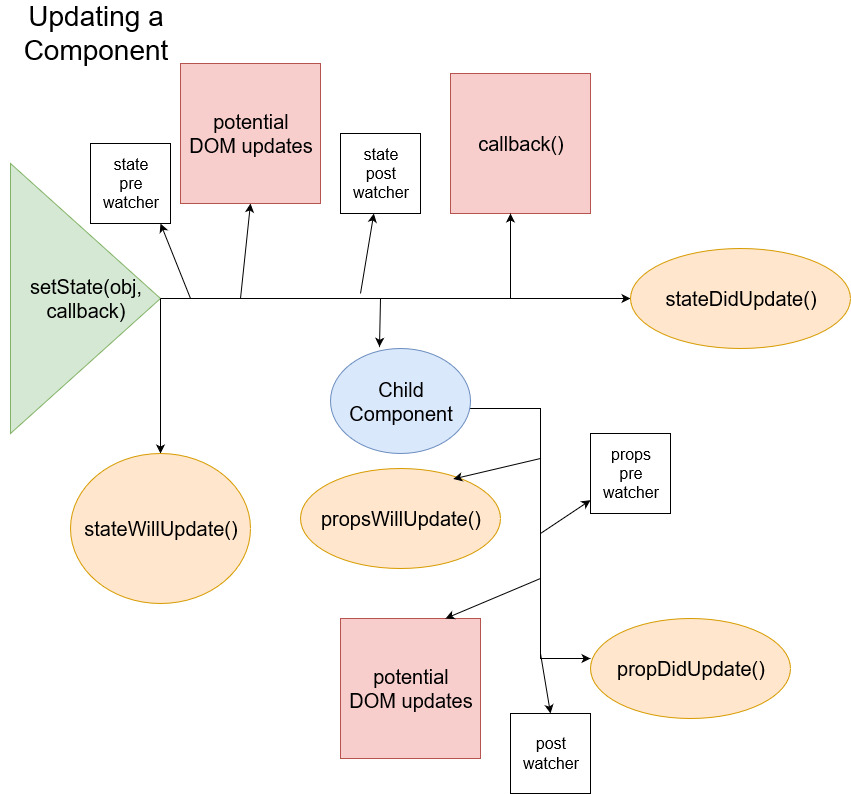
LifeCycle Methods 🌳
The following are methods you can use to access components at various points in their lifecycle
| Lifecycle Method | Context | Description |
|---|---|---|
| connecting | Component/Exponent | Before the library wires up any of your Component/Exponent and you have access to other methods |
| connected | Component/Exponent | After your Component/Exponent is wired up and all eventListeners are in place |
| disconnecting | Component/Exponent | Before removing eventListeners and deleting Component/Exponent from memory |
| propsWillUpdate | Component/Exponent | Before the props are updated within your component, no DOM mutations have happened |
| propsDidUpdate | Component/Exponent | After the props have updated and the DOM has changed |
| stateWillUpdate | Component | Before the state of the current component or any of its dependents' props have changed |
| stateDidUpdate | Component | Child components with inherited props have done their DOM manipulations and state and props have changed |
Watchers 👀
Component and Exponent classes have a watch method that must return an object. Watchers allow you to hook into specific state or props value changes during the component lifecyle. This allows your state logic to be isolated instead of clumping it all in with stateWillUpdate, stateDidUpdate, propsWillUpdate or propsDidUpdate. This is meant to closely mimic watchers in Vue.JS.
Note: Do NOT name your state and props fields the same. This is bad practice and will break the watchers.
watch(){
  return {
    myField: {
      pre(newValue, oldValue){
        // my logic
      },
      post(newValue){
        // my logic
      }
    }
  }
}
You can view your watched state fields in the components $watchers object.
Stateless Components 😐
Extend the Exponent class to create a component with only props
This is slightly lighterweight than a Component. Quicker to wire up and takes up less memory.
import { Exponent } from 'domponent'

class StatelessThing extends Exponent{
  constructor(conf){
    super(conf);
  }
}
You will then only have access to:
propsWillUpdatepropsDidUpdate
Why Exponent??
Because it simply interprets or expounds the data that it is given... and it sounds like Component.
Component Fields 🌵
Components or Exponents will be given the following fields.
| Field Name | Type | Access | Context | Description |
|---|---|---|---|---|
| $app | object | public | Component/Exponent | The entire Domponent application |
| $b | array | private | Component/Exponent | eventListener bindings for internal use |
| $d | object | private | Component | The parent components references to its children |
| $key | string | public | Component/Exponent | Unique identifier for the component instance |
| $name | string | public | Component/Exponent | The name of the component type |
| $p | object | private | Component/Exponent | Internal collection of props and its DOM references |
| props | object | public | Component/Exponent | Key/Value pairs of data passed |
| $root | element | public | Component/Exponent | The root DOM Node of the component |
| $s | object | private | Component | Internal collection of state and its DOM references |
| state | object | public | Component | Key/Value pairs of data which can be updated |
| $watchers | object | public | Component | stored change functions and their respective state and prop key |
Init function 🏇
This function creates the app and registers all the components. This takes a config object as required argument:
const config = {
  selector: document.getElementById("root"),
  components: { Counter },
  appCreated: callbackFunction
};

const App = new Init(config);
It then exposes the following methods:
- createComponent
- deleteComponent
- register
- unregister
And the following objects:
- component - all base classes for components in the app
- createdComponents - all instances of app components
You can also exclude the components object of the configuration and create an app without any components to begin with.
Adding and removing components 🤼
Adding components
createComponent
@params:
- {Element} a DOM element to create the component instance
- {Function} optional callback function
App.createComponent(document.getElementById("added-html"), callback);
register
@params
- {Component} a component definition
- {Function} optional callback function
App.register(NewComponent, callback);
Deleting components
deleteComponent
@params:
- {String} - key of the component instance you want to delete, can be assigned via
data-keyor accessed inside component viathis.$key - {Function} optional callback function
App.deleteComponent("my-component-instance-key", callback);
unregister
@params:
- {String} - The name of the key you used to register your component on app Init.
- {Function} optional callback function
App.unregister("NewComponent", callback);
Namespacing data attributes 📇
To avoid data- attributes clashing with other selectors, libraries, etc. you can override the default attribute names in the app config object:
Init({
  selector: getElementById('root),
  components: { Counter },
  dataAttributes: {
    component: 'mynamespace-component',
    state: 'cool-state',
  }
});
This means that your HTML will look like this:
<div data-mynamespace-component="Counter" data-cool-state='{"count":12}'>
  ...
</div>
Custom Syntax 🔧
You can optionally customize the syntax you use in your HTML. The following items can be customized.
INHERITS_FROM: '<-',
FROM_COMPONENT: '.',
KEY_VALUE: ':',
MULTIPLE_VALUES: "|",
METHOD_CALL: "->",
LIST: ","
This means that in your config you can add:
{
   customSyntax: {
      LIST: "!",
      METHOD_CALL: "#"
  }
}
And your HTML can use this!
Development Mode 🤓
When developing with Domponent, using the development build adds helpful errors and logs to your console from Development Dom (this guy->) 🤓
The easiest way to use this is with Webpack Aliases:
resolve: argv.mode === 'development'? {
      alias: {
        domponent: 'domponent/dist/domponent.development.js'
      }
    }: {},
This way your development build of webpack will swap out the production version of Domponent for the version sprinkled with help from Dom.
Syntax Examples 🔤
You can write your component HTML for various templating engines and include them as partials/fragments/whatever your engine refers to as "chunks of HTML".
Here are some examples of how you might use Domponent.
Note: Despite these syntax differences in the markup, remember that the component is simply a JS class ✌️
Pug Syntax Example 🐶
// counter.pug
mixin counter(count)
 div(data-component="Counter" data-state=`
    {
      "count": count,
      "isEven": count % 2 === 0
    }
  `)
   p(data-bind="state:Counter.count") #{count}
   button(data-action="click->Counter.increment") +1
   button(data-action="click->Counter.decrement") -1

// usage
+counter(101119)
+counter(61316)
Thymeleaf Syntax Example 🍃
// counter.html
<div
  data-component="Counter"
  th:fragment="Counter"
  th:data-state='|{"count":${count}, "isEven": ${count % 2 == 0}}|'
>
  <p data-bind="state:Counter.count" th:text="${count}"></p>
  <button data-action="click->Counter.increment">
    +1
  </button>
  <button data-action="click->Counter.decrement">
    -1
  </button>
</div>

// usage
<th:block th:replace="./counter.html  :: Counter(count: 1289)" />
<th:block th:replace="./counter.html  :: Counter(count: 491)" />
Razor Syntax Example ⚔️ coming soon...
Ruby on Rails Syntax Example 💎 coming soon...
Mustache Syntax Example 👺 coming soon...
Component Lifecycle 🕵️♂️
Contact 🤙
- Email:
domponent [at] gmail [dot] com(Please use the subjectDomponent Supportor we will not respond) - Twitter:
@domponent