dynamic-mat-table is an Angular component for presenting large and complex data with a lightning fast performance (at least 10x faster) and excellent level of control over the presentation.
Usage no npm install needed!
<script type="module">
  import dynamicMatTable from 'https://cdn.skypack.dev/dynamic-mat-table';
</script>
by binding the properties you can set columns, set the table settings , set a datasource and more to the table
Setting the columns
to set the columns you first need to import TableField and creat a porpery that takes this type as an arry like so:
import { TableField } from 'dynamic-mat-table'
...
export class MyTable {
  columns:TableField<any>[] = [];
}
then you can set each column as an object of this arry
...
const colusmnsConfig:TableField<any>[] = [
  {
    name: 'column-one',  //this is a key for data
    header: 'column-one', //this is the name displayed
    type:'number', //type of the data
  },
  {
    name:'column-two',
    header:'column-two',
    type:'number',
  },
  ...
];
The full column type is defined as follow:
export interface TableField<R extends TableRow> extends AbstractField {
    classNames?: string;
    rowClass?: string | AtClassFunc;
    customSortFunction?: AtSortFunc<R>;
    customFilterFunction?: AtSortFunc<R>;
    toPrint?: ToPrint;
    toExport?: ToExport;
}
export interface AbstractField {
    index?: number;
    name: string; //data  key
    type?: FieldType; //data type
    width?: number; //width of the column
    header?: string; //displayed name of the column
    isKey?: boolean; // turn column in to unqiue key column
    inlineEdit?: boolean; // allows column to have inline edit
    display?: FieldDisplay; // allow column to be hiddin or visiable
    sticky?: FieldSticky; // allow column to stick in horazental scrolling
    filter?: FieldFilter; // sets data filtering mode
    sort?: FieldSort; // set data sorting mode
    cellClass?: string; // set a class for column cells
    cellStyle?: any; //set a style for column cells
    icon?: string; // displayes a mat-icon in column header
    iconColor?: string; // set a color for column header icon
    dynamicCellComponent?: any; // set the component used in column cells
    draggable?: boolean; // allows column to be rearranged with drag and drop
    filterable?: boolean; // allows column to filter its data (shows filter button)
    sortable?: boolean; // allows column to sort its data (shows sort button)
    clickable?: boolean; // allows column to have a function when clicked
    clickType?: 'cell' | 'label' | 'custom'; // sets the clickability regon
    printable?: boolean; // allows column to print its data
    exportable?: boolean; // allows column data to be exported
    enableContextMenu?: boolean; // enables context menu in columns
    rowSelectionable?: boolean; // Coming soon...
    footer?: FooterCell[]; // creates footers for column
    cellEllipsisRow?: number; // maxmum number of cells shown before ellipsed
    cellTooltipEnable?: boolean; // allows column cell to have a tooltip
    headerEllipsisRow?: number;  // maximum number of rows shown in column before ellipsed
    headerTooltipEnable?: boolean; // allows column header to have a tooltip
    option?: any; // a spacial object for storing data state (like saving in inline edit)
    categoryData?: any[]; // Coming soon...
    toString?: (column: TableField<any>, row: TableRow) => string; // truns column data to a sring (used mostly for exporting data)
    customSort?: (column: TableField<any>, row: any) => string; // allows you costumize data sorting in column
}
Ceateing a data source
after setting the columns you need to set the data you want to use in your table.
Your data source must be a BehaviourSubject<any[]>
so in order to creat a data source you must do so like wise:
export interface TableSetting {
direction?: Direction; // sets the directopn of the table
columnSetting?: AbstractField[]; //
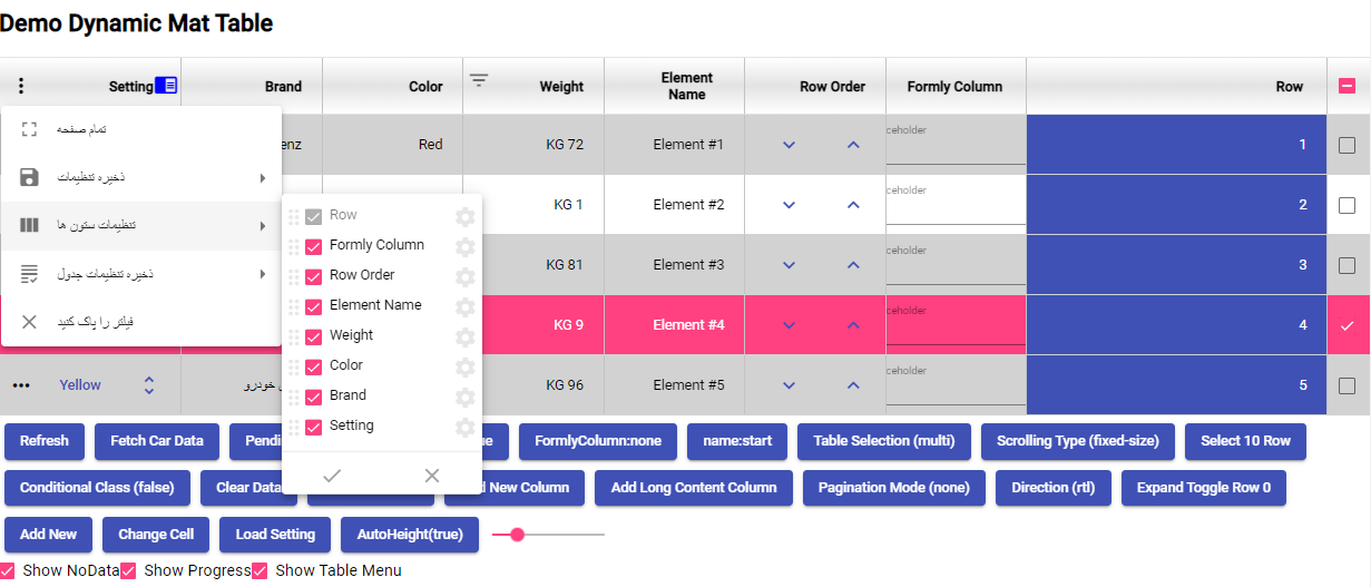
visibaleActionMenu?: VisibleActionMenu; // configures the actoin menu
visibleTableMenu?: boolean; // controls the table men's visablity
alternativeRowStyle?: any; // sets a style for the odd rows
normalRowStyle?: any; // sets a style for the even rows
scrollStrategy?: TableScrollStrategy; // sets a scroll strategy
rowStyle?: any; //
enableContextMenu?: boolean; // controls the context menu visablity
autoHeight?: boolean; // allows the table to automaticly controls its height
saveSettingMode?: 'simple' | 'multi' | 'none'; // controls the saving mode
settingName?: string; // name for the setting
settingList?: TableSetting[]; //
currentSetting?: string; //
}
Adding a paginator
adding a paginator is just like columns and setting.
first we add the Property with the TablePagination type then we configure it like so:
import { TablePagination } from 'dynamic-mat-table';
...
export class MyTable {
  pagination:TablePagination = {};
}
the full description for the TablePagination is as below:
export interface TablePagination {
    length?: number; // total number of data records
    pageIndex?: number; // initial page
    pageSize?: number; // number of rows in each page
    pageSizeOptions?: number[]; // page ination options
    showFirstLastButtons?: boolean; // controls the first/last button display
}
How to add international
to support new language you must declare new class and implement LanguagePack for example this is persian language: