README
flex-system
A fully customizable css grid system framework based on flexbox.
Installation
install with npm:
npm install flex-system
include using cdn.jsdelivr:
<link rel="stylesheet" href="https://cdn.jsdelivr.net/gh/Sanusihassan/flex-system/css/flex-system.min.css">
Containers
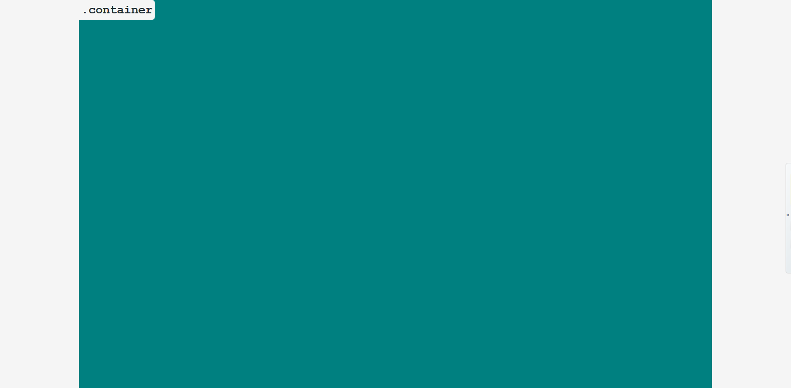
.container class creates a container that can be used center the content of the webpage.
  <!-- to create a container -->
  <section class="container">
    <!-- content -->
  </section>
| Breakpoint Name | Breakpoint Range | Container Width |
|---|---|---|
| Small (Mobile) | < 600px | 100% |
| Medium (Tablet) | >= 600px | 85% |
| Large (Small Laptops) | >= 992px | 80% |
| Larger (Laptops & Desktops) | >= 1200px | 80% |
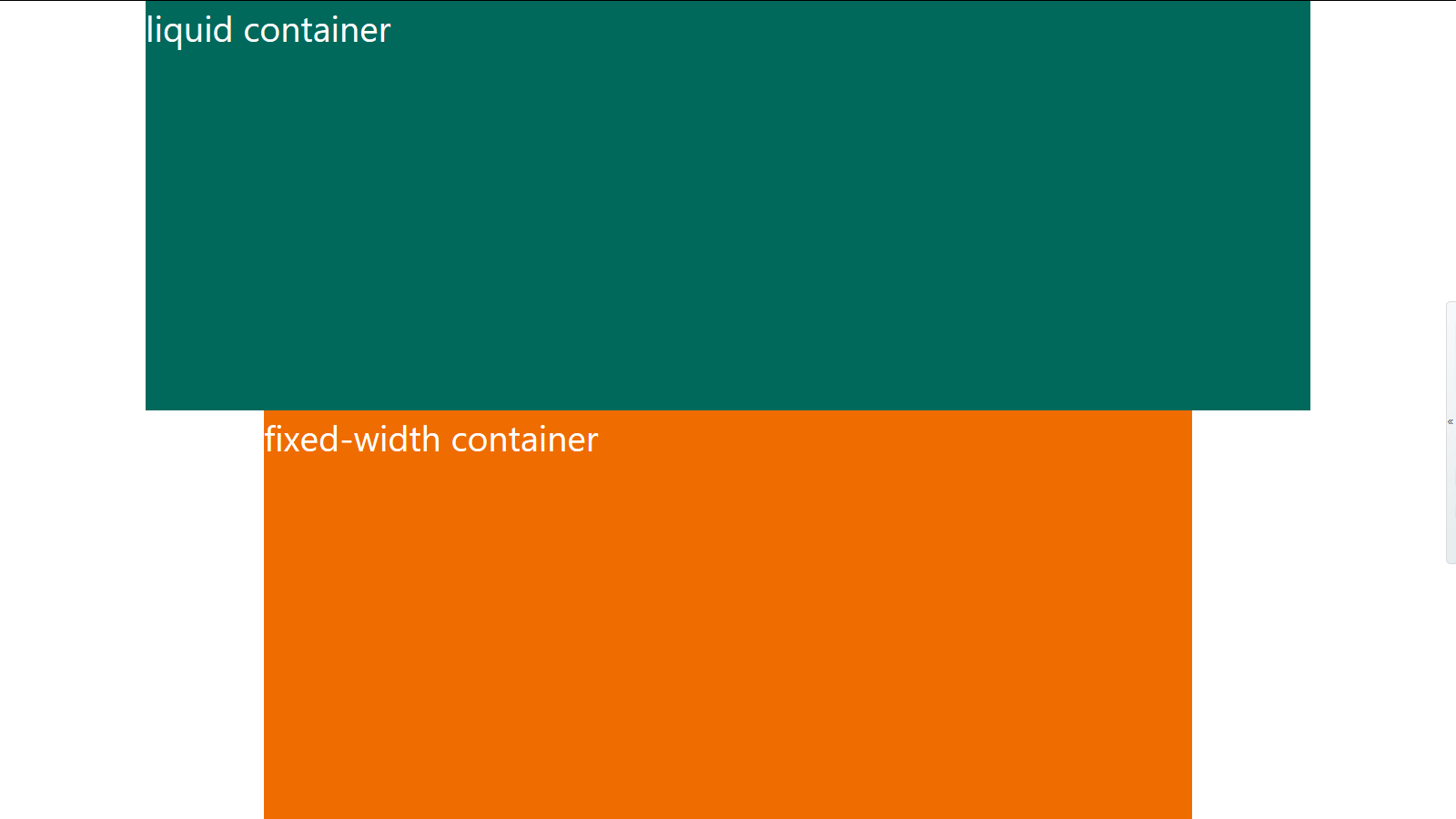
When you create a container, you have the option to make it either a fixed-width container, or
liquid-container which is the default behavior.
To customize the container width change any of the following css variables:
  :root {
    /* controls container width onsmall breakpoint - (Mobile). */
    --container-small-width: 100%;

    /* controls container width onmedium breakpoint - (Tablet). */
    --container-medium-width: 85%;

    /* controls container width onlarge breakpoint - (Laptops). */
    --container-large-width: 80%;

    /* controls container width onlarger breakpoint - (Laptops & Desktops). */
    --container-larger-width: 80%;
  }
Fixed Width Container
If you want your container to have a fixed in px instead of %, use .fixed-width class with the .container class:
  <!-- fixed-width container -->
  <section class="fixed-width container">
    <!-- content -->
  </section>
| Breakpoint Name | Breakpoint Range | Container Width |
|---|---|---|
| Small (Mobile) | < 600px | 100% |
| Medium (Tablet) | >= 600px | 510px (85% of 600px) |
| Medium to large (Tablet) | >= 768px <992 | 614.4px (85% of 768px) |
| Large (Small Laptops) | >= 992px | 843.2px (85% of 992px) |
| Larger (Laptops & Desktops) | >= 1200px | 1020px (85% of 1200px) |
To customize the Fixed width container use any of the following css variables:
  :root {
    /* controls the fixed-width container width onsmall breakpoint - (Mobile). */
    --container-small-fixed-width: 100%;

    /* controls the fixed-width container width onmedium breakpoint - (Tablet). */
    --container-medium-fixed-width: 510px;

    /* controls the fixed-width container width from 768px to 992px */
    --container-medium-to-large-fixed-width: 652.8px;

    /* controls the fixed-width container width onlarge breakpoint - (Laptops). */
    --container-large-fixed-width: 843.2px;

    /* controls teh fixed-width container width onlarger breakpoint - (Laptops & Desktops). */
    --container-larger-fixed-width: 1020px;
  }
  /*
    use this formula to calculate a fixed width for the container
    --container-var-name: #{(percentage)} * $breakpoint
  */
  :root {
    --container-large-fixed-width: #{(85/100)} * $large; // 85% * 992px = 843.2px
  }
Use .flex-sys class with .container to reduce conflict if you are using another css framework that uses the same name and you want to use flex-system container.
  <!-- flex-system container -->
  <section class="flex-sys container">
    <!-- content -->
  </section>
Flex Row And Flex Column Containers
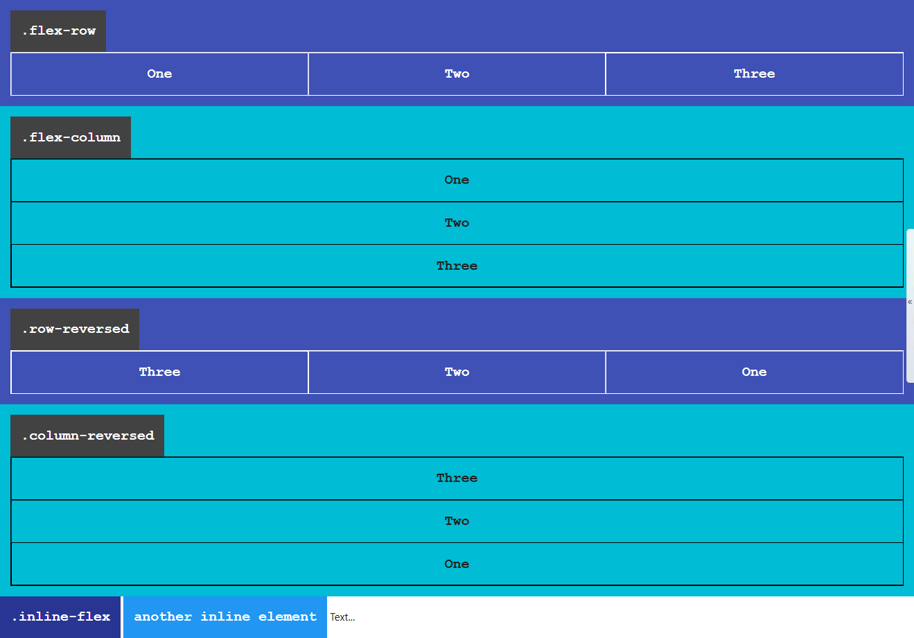
.flex-row and .row-reversed classes create row containers.
Their children/flex-items flows in a row direction, from left to right if you are using a ltr language like english.
Or from right to left if you are using a rtl language like arabic.
Whether you use english or arabic items are going to appear in a row.
  <!-- flex row container -->
  <div class="flex-row">
    <div>One</div>
    <div>Two</div>
    <div>Three</div>
  </div>
  <!-- .row-reversed same as .flex-row except the main-start and main-end directions are swapped -->
  <div class="row-reversed">
    <div>One</div>
    <div>Two</div>
    <div>Three</div>
  </div>
Responsive flex row containers
You can also define a flex row container within a breakpoint range
  <!-- row onsmall-only -->
  <div class="row-onsmall">
    <div>One</div>
    <div>Two</div>
    <div>Three</div>
  </div>
Posibilities:
.row-onsmall: flex row onsmall only.row-onmedium: flex row onmedium only.row-onlarge: flex row onlarge only.row-from-larger: flex row from larger and up
.flex-column, .column-reversed classes creates flex column containers.
Flex-items inside a flex column container are stacked on top of each other in a column direction.
  <!-- flex column container -->
  <div class="flex-column">
    <div>One</div>
    <div>Two</div>
    <div>Three</div>
  </div>

  <!-- .column-reversed same as .flex-column except the main-start and main-end directions are swapped -->
  <div class="column-reversed">
    <div>One</div>
    <div>Two</div>
    <div>Three</div>
  </div>
Responsive flex column containers
You can also define a flex column container within a breakpoint range
  <!-- column onmedium only -->
  <div class="column-onmedium">
    <div>One</div>
    <div>Two</div>
    <div>Three</div>
  </div>
  <!-- onsmall stack on top of each other, but from medium and up stay in one row -->
  <div class="column-onsmall flex-row">
    <div>item 1</div>
    <div>item 2</div>
    <div>item 3</div>
  </div>
Posibilities:
.column-onsmall: flex column onsmall only.column-onmedium: flex column onmedium only.column-onlarge: flex column onlarge only.column-from-larger: flex column from larger and up
The .inline-flex class makes an element to be displayed as inline-flex container.
  <div class="inline-flex flex-row">
    inline flex-row container
  </div>
Flex Item Shrinking
By default when using flex box, flex items are defined to shrink if there is no space available.
If you want to specify that flex items should not shrink use the .noshrink-each class with flex row containers, or flex column containers, or .noshrink with a flex item.
  <div class="flex-row noshrink-each">
    <div>my width will stay fixed</div>
    <div>me too!</div>
    <div class="flex-row">
        me too!
        <div>not me, i will shrink</div>
    </div>
  </div>
  <!-- .noshrink on individual flex items -->
  <div class="flex-row">
    <div class="noshrink">my width will stay fixed if you define it</div>
    <div>i will shrink</div>
  </div>
Wrapping Behavior
When using flex-system flex row container's direct children are defined to wrap (go to the next line) if there is no space available to take them on one line.
The .nowrap class overwrites this behavior.
  <!-- these items are going to stay in on line and they will shrink if there is no space available -->
  <div class="flex-row nowrap">
    <div>item #01</div>
    <div>item #02</div>
    <div>item #03</div>
  </div>
.wrap-reversed specifies that flex items should wrap in a reversed order.
  <div class="flex-column wrap-reversed">
    <div>item #01</div>
    <div>item #02</div>
    <div>item #03</div>
  </div>
Responsive Wrapping
These are set of classes that specifies that flex items should wrap within a breakpoint range.
Or starting from a breakpoint and up.
  <!-- nowrapping on each breakpoint except small -->
  <div class="row-reversed nowrap wrap-onsmall">
    <div>item #01</div>
    <div>item #02</div>
    <div>item #03</div>
  </div>
  <!-- wrap from medium screens and up -->
  <div class="flex-row wrap-from-medium">
    <div>item #01</div>
    <div>item #02</div>
    <div>item #03</div>
  </div>
Posibilities:
.wrap-onsmallwrap on small breakpoint only..wrap-onmediumwrap on medium breakpoint only..wrap-onlargewrap on large breakpoint only..wrap-from-mediumwrap from medium devices and up..wrap-from-largewrap from large devices and up..wrap-from-largerwrap only starting from larger breakpoint and up.
The .wrap class specifies that flex container direct children should wrap (go to the next line if necessary).
  <!-- flex row containers default behavior of wrapping is to wrap when using flex-system -->
  <div class="flex-column wrap">
    <div>item #01</div>
    <div>item #02</div>
    <div>item #03</div>
  </div>
Grid System
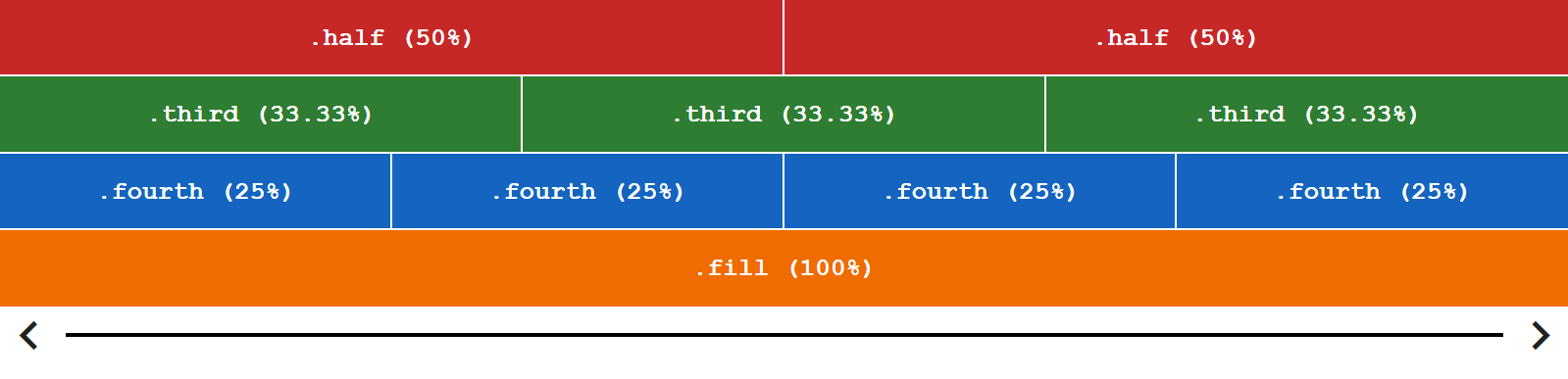
Grid system classes specifies element width inside a flex row container, and height inside a flex column container.
flex-system is using 12 columns grid system.
flex-system provides symantic easy to use class names for the grid system.
.halfmeans one half, the element will take50%width if it's parent is a flex row container and50%height if it's parent is a flex column container..third:33.33%.fourth:25%.fill:100%
Flex row container:
Flex column container:
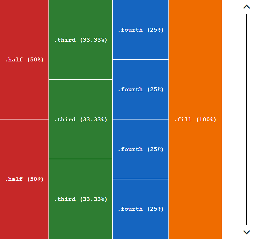
  <!-- flex row container -->
  <div class="flex-row noshrink-each">
    <div class="half">.half (50%)</div>
    <div class="half">.half (50%)</div>
    <div class="third">.third (33.33%)</div>
    <div class="third">.third (33.33%)</div>
    <div class="third">.third (33.33%)</div>
    <div class="fourth">.fourth (25%)</div>
    <div class="fourth">.fourth (25%)</div>
    <div class="fourth">.fourth (25%)</div>
    <div class="fourth">.fourth (25%)</div>
    <div class="fill">.fill (100%)</div>
  </div>
  <!-- flex column container -->
  <div class="flex-column wrap">
    <div class="half">.half (50%)</div>
    <div class="half">.half (50%)</div>
    <div class="third">.third (33.33%)</div>
    <div class="third">.third (33.33%)</div>
    <div class="third">.third (33.33%)</div>
    <div class="fourth">.fourth (25%)</div>
    <div class="fourth">.fourth (25%)</div>
    <div class="fourth">.fourth (25%)</div>
    <div class="fourth">.fourth (25%)</div>
    <div class="fill">.fill (100%)</div>
  </div>
Imagine that the web page is devided into 12 slices or (columns) as follows:

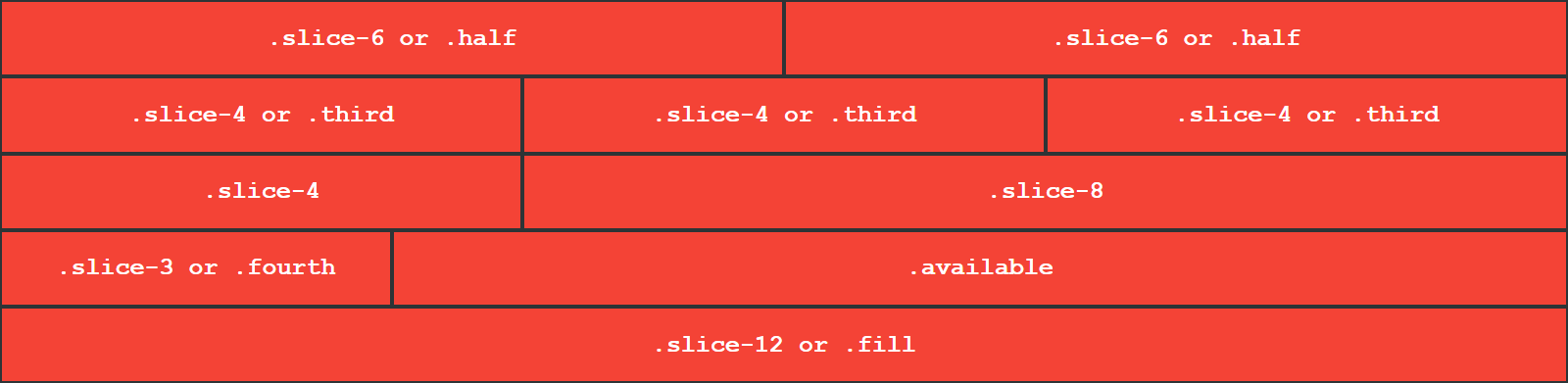
.slice-1 takes one slice out of 12 slices, .slice-6 takes 6 slices out of 12 slices, and so on.
The .available class specifies that an element should grow to takes the available space.
  <div class="flex-row">
    <div class="slice-1">one slice out of 12 slices</div>
    <div class="slice-2">2 slices out of 12</div>
    <div class="slice-7">slice-7 (7 slices)</div>
  </div>
Responsive Grid
So far, we've been using the global breakpoint to create our layout.
However, we may want to use a responsive grid, to have more control over the web page, across all defferent viewports.
To use responsive grid use one of the following prefexes as a class followed by a number or a name that represenets how many slices do you want your element to take.
onmedium(for tablets - screens less than 992px wide)onlarge(for laptops - screens equal to or greater than 992px wide)onlarger(for large laptops and desktops - screens equal to or greater than 1200px wide)
  <div class="flex-row">
    <div class="fill">full width on all viewports</div>
    <!-- fill, but take 5 slices starting from medium and up, one third from large and up one half onlarger -->
    <div class="fill onmedium-5 onlarge-third onlarger-half">fill onmedium-5 onlarge-third onlarger-half</div>
    <div class="onlarge-3">25% onlarge and up</div>
  </div>
Another Example:
<div class="flex-row">
    <div class="fill onmedium-4 onlarge-2">fill onmedium-4 onlarge-2</div>
    <div class="fill onmedium-4 onlarge-8">fill onmedium-4 onlarge-8</div>
    <div class="fill onmedium-4 onlarge-2">fill onmedium-4 onlarge-2</div>
</div>
Aliases for grid system classes
Sometimes you may have a long string of classes which is very hard to read and maitain if you have a big project.
That's why a short alias can be very handy.
The aliases are a set of data-* attributes, and bootstrap grid classes.
data-slice=$valuefor global viewport.data-onmedium=$valuefor medium viewport.data-onlarge=$valuefor large viewport.data-onlarger=$valuefor larger viewport.
If you have a long list of classes
instead of writing this:
  <div class="fill onmedium-5 onlarge-third onlarger-half">fill onmedium-5 onlarge-third onlarger-half</div>
  <div class="fill onmedium-4 onlarge-2 a b c d e f ...">fill onmedium-4 onlarge-2</div>
You should write this:
  <div
    data-slice="fill"
    data-onmedium="5"
    data-onlarge="third"
    data-onlarger="half"
  >
    fill onmedium-5 onlarge-third onlarger-half
  </div>

  <div
    data-slice="fill"
    data-onmedium="4"
    data-onlarge="2"
    class="a b c d e f ..."
  >
    fill onmedium-4 onlarge-2
  </div>
  <!-- or -->
  <div class="col-12 col-md4 col-lg2">
    fill onmedium-4 onlarge-2
  </div>
This can simplify your code alot!
Customizing The Grid
Lets say that we have two divs and each of them has a .half class.
As you know .half is 50%, but we want 49% insted.
And we will use the available 2% to align the two divs.
We need to customize the grid
To customize the grid we should change the --size, --size-onmedium, --size-onlarge, --size-onlarger values on each class that we want to customize.
There are predefined css variables that can be used to calculate the value.
They are defined in the root level element as follows:
  /* to see this in your browser open the inspector and select <html> from the Elements tab */
  :root {
    --slice-1: 8.3333333333%;
    --slice-2: 16.6666666667%;
    --fourth: 25%;
    --third: 33.3333333333%;
    --slice-5: 41.6666666667%;
    --half: 50%;
    --slice-7: 58.3333333333%;
    --slice-8: 66.6666666667%;
    --slice-9: 75%;
    --slice-10: 83.3333333333%;
    --slice-11: 91.6666666667%;
    --fill: 100%;
  }
We will use the --half variable and as a value for our --size property.
  .custom-half {
    --size: calc(var(--half) - 1%);/* 49% */
  }
This can be applied to any other class in the grid system.
  .fill {
    --size: calc(var(--fill) + 5%);
  }
  .onmedium-fourth {
    --size: calc(var(--fourth) / 3);
  }
You can also change the value from the html but it is not recommended, because it complicates your code.
  <div class="flex-row">
    <div style="--size: calc(var(--half) - 5%)" class="half">.half - 5%</div>
    <div style="--size: calc(var(--half) - 5%)" class="half">.half - 5%</div>
  </div>
If you are using sass, instead of calc(var(--var-name)) you can just use:
--size: calc($half - 5%);
By including this file to your project.
Taking The Available Space
To specify that an element should grow and take the available space use the .available class:
  <div class="flex-row">
    <!-- (2 slices) -->
    <div class="slice-2">two slices</div>
    <!-- the available space (10 slices) -->
    <div class="available">i'll take the available space</div>
  </div>
You can also use the .available-each class on a flex container to ensure that each flex item should grow and take the available space.
  <!-- each direct element should take the available space -->
  <div class="row-reversed available-each">
    <div>item 1</div>
    <div>item 2</div>
    <div>item 3</div>
  </div>
Instead of the .available class you can use data-slice=available, data-onmedium="available" and so on.
  <div class="flex-row">
    <div class="half">50%</div>
    <div data-slice="available">50%</div>
  </div>
Take The Available Space On Breakpoint Range
The .available and the .available-each classes are also available on all breakpoints.
  <div class="flex-row">
    <div
      data-slice="fill"
      data-onmedium="half"
      data-onlarge="8"
    >
      fill onmedium-half onlarge-8
    </div>
    <div class="fill onmedium-available">
      same as: fill onmedium-half onlarge-4
    </div>
  </div>
  <div class="flex-row onlarge-available-each">
    <div class="fill">
      same as: fill onlarge-half
    </div>
    <div data-slice="fill">
      same as: fill onlarge-half
    </div>
  </div>
You can use:
data-slice="available"for global viewport.data-onmedium="available"for medium viewport.data-onlarge="available"for large viewport.data-onlarger="available"for larger viewport.
Customizing The .available and .available-each
To Customize The .available and .available-each use the --portion.
Some Shortcuts
.flex-initial resets the item to the initial values of Flexbox, this is the same as using flex: 0 1 auto, in this case the flex item will not grow larger than it's initial size, and the item will shrink if it needs to rather than overflowing.
.flex-auto this is the same as .flex-initial but in this case the item can grow and fill the container as well as shrink if required, and this is the same as using flex: 1 1 auto
.flex-none this will create a fully inflexable flex item. It is as if you wrote flex: 0 0 auto. The items cannot grow or shrink but will be laid out using flexbox with a flex-basis of auto.
These classes are also available for all breakpoints:
use these prefexes = [onmedium-, onlarge-, onlarger-].
  <div class="flex-row">
    <div class="available onlarger-flex-initial">
      i'll stretch to take the available space untill larger screens
    </div>
  </div>
Element Order
.{$breakpoint}order-$n classes specifies element order inside the flex parent $n = [1 - 6].
$breakpoint = [onmedium-, onlarge-, onlarger-].
  <div class="flex-column">
    <div class="fill order-3 onmedium-order-1">first onmedium and up, third onsmall</div>
    <div class="order-2">second</div>
    <!-- reducing conflict -->
    <div class="flex-sys order-1">first</div>
    <!-- to customize order classes use .order-6/$breakpiont-order-6 then use --order variable on it -->
    <div style="--order: 0" class="order-6">im the first one</div>
  </div>
Alignment On The Main Axis
The .{$breakpoint}main-$direction classes specifies flex items alignment within the flex parent in the main axis direction.
$direction = [start, end, center].
start is the default value. and it can be used from medium and up.
The .space-$direction or .on{$breakpoint}sp-$direction classes are used to distribute available space in the main axis.
$direction = [between, around, evenly].
  <!-- alignment -->
  <div class="flex-row main-end onmedium-main-center onlarge-main-start">
    <div class="third">item</div>
    <div class="third">item</div>
    <div class="third">item</div>
  </div>
  <!-- available space distribution -->
  <div class="flex-row space-between onmedium-sp-around">
    <div class="third">flex-item</div>
    <div class="third">flex-item</div>
    <div class="third">flex-item</div>
  </div>
You can use the data-$breakpoint-main=$value attributes.
  <!-- alignment -->
  <div
      class="flex-row"
      data-main="end"
      data-onmedium-main="center"
      data-onlarge-main="start"
    >
    <div class="third">item</div>
    <div class="third">item</div>
    <div class="third">item</div>
  </div>
  <!-- available space distribution -->
  <div
    class="flex-row"
    data-main="space-between"
    data-onmedium-main="space-around"
    >
    <div class="third">flex-item</div>
    <div class="third">flex-item</div>
    <div class="third">flex-item</div>
  </div>
Flex Lines Alignment
Flex lines alignment classes sets the distribution of space between and around content items along the cross-axis.
Flex lines alignment classes are the same as main axis alignment classes with some expectations.
- insteade of
mainprefix use thelineprefix. - insteade of
spaceprefix use theline-sp-prefix.
  <!-- alignment -->
  <div class="flex-row line-end onlarge-line-center">
    <div class="available">flex-item</div>
    <div class="available">flex-item</div>
    <div class="available">flex-item</div>
  </div>
  <!-- space distribution -->
  <div class="flex-row line-sp-between onmedium-line-sp-around onlarge-line-stretch">
    <div class="available">flex-item</div>
    <div class="available">flex-item</div>
    <div class="available">flex-item</div>
  </div>
You can also use the data-$breakpoint-line=$value attributes.
  <!-- alignment -->
  <div
    class="flex-row"
    data-line="end"
    data-onmedium-line="start"
    data-onlarge-line="center"
  >
    <div class="available">flex-item</div>
    <div class="available">flex-item</div>
    <div class="available">flex-item</div>
  </div>
  <!-- space distribution -->
  <div
      class="flex-row"
      data-line="space-between"
      data-onmedium-line="space-around"
      data-onlarge-line="stretch"
    >
    <div class="available">flex-item</div>
    <div class="available">flex-item</div>
    <div class="available">flex-item</div>
  </div>
Alignment On The Cross Axis Classes For Flex Parent
The .{$breakpoint}cross-$direction classes are used to distribute space in the cross axis of a flex container.
$direction = [start, center, end, baseline, stretch]
  <div class="flex-row main-start cross-end onmedium-cross-stretch onlarge-cross-start">
    <div class="available onlarge-8">item</div>
    <div class="half onlarge-third">item</div>
  </div>
You can also use the data-$breakpoint-cross=$value attributes as follows:
  <div
      class="flex-row main-start"
      data-cross-align="end"
      data-onmedium-cross-align="stretch"
      data-onlarge-cross-align="start"
    >
    <div class="available onlarge-8">item</div>
    <div class="half onlarge-third">item</div>
  </div>
Alignment On The Cross Axis Classes For Flex Item
The .{$breakpoint}self-$direction classes specifies the distribution of the available space in the cross axis for a flex item.
$direction = [start, center, end, baseline, stretch].
  <div class="flex-row">
    <div class="available self-stretch">item #01</div>
    <div class="available self-end">item #02</div>
    <div class="available self-center">item #03</div>
  </div>
You can also use the data-$breakpoint-self=$value attributes.
Auto Margins
.{$breakpoint}push-$direction, classes are used to push an element into a direction.
$direction = [top, right, bottom, left, center-x, center-y].
  <div class="flex-row">
    <div class="push-right">i will be pushed to the right</div>
  </div>
  <div class="flex-row">
    <div class="onmedium-push-center-y">vertically centered from medium and up</div>
  </div>
  <div class="flex-row">
    <div class="onlarger-right">i'll go right onlarger screens and up</div>
  </div>
You can also use the data-$breakpoint-push=$value attributes.
Display Toggling Classes
The .none class and data-display="none" attribute hides an element.
  <div class="none">this element is invisible</div>
  <div data-display="none">this element is invisible</div>
After that you can decide to display the element on a breakpoint range or starting from a breakpoint.
Display On Breakpoint Ranges
The .display-on$breakpoint classes and data-display-on$breakpoint=$value attributes displays an element as flex within a breakpoint range.
$breakpoint = [onsmall, onmedium, onlarge, onlarger]
  <div class="none display-onmedium">
    i'll be displayed as flex onmedium only
  </div>
  <!-- or -->
  <div
    class="none"
    data-display-onmedium="flex"
    >
    i'll be displayed as flex onmedium only
  </div>
If you don't want to display the element as flex use one of the following classes.
.blockdisplays the element as block..inline-blockdisplays the element as inline-block..inline-flexdisplays the element asinline-flexcontainer..initialdisplays the element with it's initial value of thedisplayproperty.
  <div class="none display-onlarge block">
    i'll be visible on large screens only as block level element
  </div>
  <table class="none display-onlarge initial">
    display:none, onlarge display: initial
  </table>
Display Starting From A Breakpoint
To display an element starting from a breakpoint use the .display-from-{$breakpoint} classes or data-display-from-$breakpoint=$value attributes.
$breakpoint = [onsmall, onmedium, onlarge, onlarger]
If you don't want to display the element as flex use one of the following classes.
.blockdisplays the element as block..inline-blockdisplays the element as inline-block..inline-flexdisplays the element asinline-flexcontainer..initialdisplays the element with it's initial value of thedisplayproperty.
  <div
    data-display="none"
    data-display-from-medium="flex"
  >
    i'll be displayed as flex from medium and up
  </div>
  <div class="none display-from-large block">
    i'll be visible from large screens and up as block level element
  </div>
  <div class="none display-onlarger">
    i'll be visible from larger screens and up
  </div>
Responsive Typography
flex-system.css supports responsive typography.
Headings
headings font-size is scalable automatically when using flex system.
  <h1>respnsive typography</h1>

  <!-- reducing conflict -->
  <h1 class="flex-sys h1">respnsive typography</h1>
  /* you can increase or decrease the amount of scaling by modifing the css --amount variable */
  :root {
    --amount: .25em;/* default value is 0.5rem */
  }
Responsive Paragraph
To make the font size of a paragraph responsive use the .responsive class.
<p class="responsive">this is a responsive paragraph (resize the window).</p>
/* you can increase or decrease the amount of scaling by modifing the css --p-amount variable */
.example {
  --p-amount: .25em;/* default value is 1.15em */
}
Fill parent Helper Classes
.fw, .fh classes specifies that an element should take full(width/height) of the containing element.
.fw-each, .fh-each means each direct element should take full(width/height) of their containing element.
  <div class="flex-column">
    <div class="fw">i will fill my parent</div>
  </div>
  <div class="flex-column fw-each">
    <div>i will fill my parent</div>
    <div>me too</div>
    <div>me too</div>
  </div>
You can also use the data-w=100, data-h=100, data-w=100-each attributes.
Or .w100, h100, w100-each, h100-each classes.
You might also want to use the .w-auto, .h-auto class wich is going to be ignored by the .full-* classes.
  <div class="flex-column fw-each">
    <div>i will fill my parent</div>
    <div>me too</div>
    <div class="w-auto">not me</div>
  </div>
Lastly
You may want to use these files.
Ask me any questions at any time :)