README
gm-tel-input
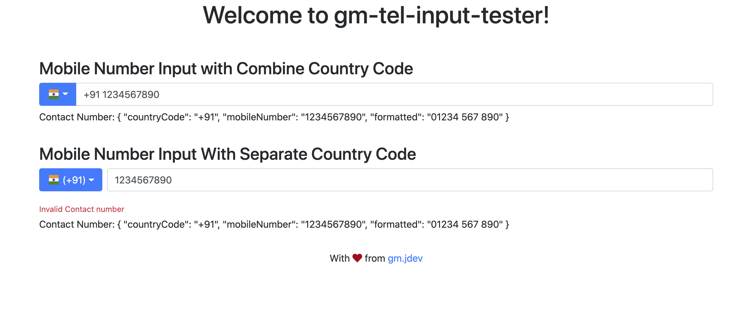
An Angular based module providing support for international mobile number input along with validation support using google-libphonenumber. Component styling is based on Bootstrap.
Installation
Install the package via npm:
npm install --save gm-tel-input
Install library dependencies
npm install --save jquery
npm install --save bootstrap
npm install --save flag-icon-css
npm install --save google-libphonenumber
Usage
Add and import GmTelInputModule module into application
import { GmTelInputModule } from 'gm-tel-input';

imports: [
    GmTelInputModule.forRoot()
]
Add following code snippet required to render element in your HTML file
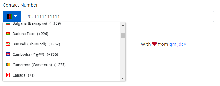
<gm-tel-input [value]="telNumber" [invalidFormatMsg]="'Invalid Contact number format'"
    [invalidTelMsg]="'Invalid Contact number'" [formControlSrc]="telNumberCtrl" [id]="contactNbr">
</gm-tel-input>
Initialized Form Control and value to be used by component
telNumberCtrl: FormControl = new FormControl('', []);
telNumber = {};
If you are interested to have basic phone number validation based on google-libphonenumber, kindly import phoneNumberValidator from gm-tel-input library and update FormControl initialization definition as below :
telNumberCtrl: FormControl = new FormControl('', [phoneNumberValidator()]);
Add following CSS and Script files to your angular.json file
"styles": [
  "node_modules/flag-icon-css/css/flag-icon.min.css",
  "node_modules/bootstrap/dist/css/bootstrap.min.css"
],
"scripts": [
  "node_modules/jquery/dist/jquery.min.js",
  "node_modules/bootstrap/dist/js/bootstrap.bundle.js"
]
Options
| Options | Type | Default | Description |
|---|---|---|---|
| value | object |
{ countryCode:'', mobileNumber:'' formatted:'' } |
Object containing selected country code and mobile number. |
| invalidFormatMsg | string |
'' |
Validation error message for invalid input format. |
| invalidTelMsg | string |
'' |
Validation error message for incorrect input number. |
| formControlSrc | FormControl |
Instance of FormControl to be used |
|
| id | string |
contactNbr | Id to be used in native HTML input element |
| separateCountry | boolean |
false | Flag which renders country coomponent as separate component |
Tests
Coming up
Changelog
Below are few latest change logs.
[1.0.4] - 2020-11-29
- Added Support for rendering Country Code and Mobile number input as separate fields
Acknowledgments / Attributions
- Country & Flag images from flag-icon-css
- Contact Number validation from google-libphonenumber
- Theme and Styling with help of Bootstrap
Support
If you like this library consider to add star on GitHub Repository.
Thank you!
Licenses
Copyright 2019 gm.jdev@gmail.com
Licensed under the Apache License, Version 2.0 (the "License"); you may not use this file except in compliance with the License. You may obtain a copy of the License at
http://www.apache.org/licenses/LICENSE-2.0
Unless required by applicable law or agreed to in writing, software distributed under the License is distributed on an "AS IS" BASIS, WITHOUT WARRANTIES OR CONDITIONS OF ANY KIND, either express or implied. See the License for the specific language governing permissions and limitations under the License.