README
module: '基础' title: '文本框'
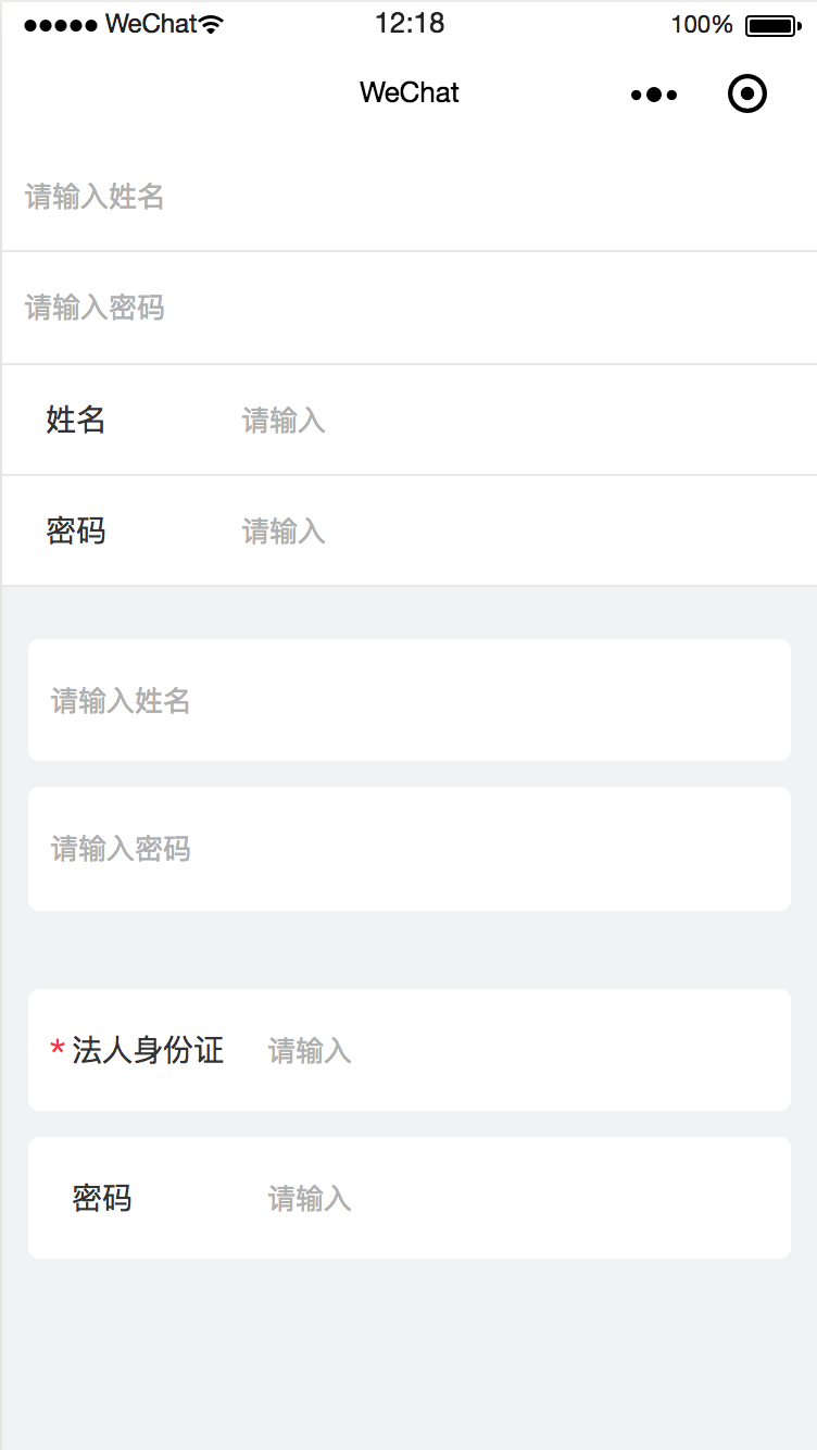
使用效果
安装方法
1、设置npm的源地址
sudo npm config set registry http://registry.npm.yangtuojia.com
2、安装
npm install @yt/wx-input --save
3、微信开发者工具---》工具---构建npm
使用方法
   <view class="mb-24">
      <view>
          <comp placeholder="请输入姓名" bindinputevent="iptVal"></comp>
          <comp placeholder="请输入密码"></comp>
      </view>

      <view class="mb-24">
          <comp label="姓名"></comp>
          <comp label="密码"></comp>
      </view>

      <view class="p-24">
          <comp placeholder="请输入姓名" bindinputevent="iptVal" wrapCls="card mb-24" name="pName"></comp>
          <comp placeholder="请输入密码" wrapCls="card mb-24"></comp>
      </view>

      <view class="p-24">
              <comp label="法人身份证号码" wrapCls="card mb-24" require="{{true}}" name="phone"></comp>
              <comp label="密码" wrapCls="card"></comp>
          </view>
   </view>

index.js
Page({
    iptVal(e) {
        console.log(e);
    }
})
api说明
| 属性名 | 类型 | 默认值 | 是否必须 | 说明 |
|---|---|---|---|---|
| wrapCls | String | '' | 否 | 最外层容器样式 |
| require | Boolean | false | 否 | 是否必填,控制是否显示* |
| placeholder | String | '' | 否 | placeholder 内容 |
| label | String | 否 | 左侧标题 | |
| value | String | 文本框value | ||
| type | String | 'text' | 否 | input 的类型 text文本输 入键盘 number数字输入键盘 idcard身份证输入键盘 digit带小数点的数字键盘 textarea 多行输入框 |
| maxlength | Number | 140 | 否 | 最长字符 |
| disabled | Booleanfalse 可否输入 | |||
| placeholder-class | String | '' | 否 | placeholder样式 |
| class | String | '' | 否 | 文本框样式 |
| bindinputevent | Function | '' | 否 | 键盘输入时触发 |
| bindinputfocus | Function | '' | 否 | 输入框聚焦时触发 |
| bindinputblur | Function | '' | 否 | 输入框失去焦点时触发 |
| bindinputconfirm | Function | '' | 否 | 点击完成按钮时触发 |