README
ink-multi-select 
Multi-Select input component for Ink
Based on ink-select-input
Install
$ npm install ink-multi-select
Usage
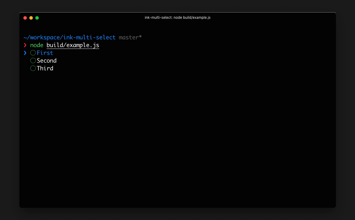
import React from 'react';
import {render} from 'ink';
import MultiSelect from 'ink-multi-select';

const Demo = () => {
    const handleSubmit = items => {
        // `items` = [{ label: 'First', value: 'first' }, { label: 'Third', value: 'third' }]
    };

    const items = [{
        label: 'First',
        value: 'first'
    }, {
        label: 'Second',
        value: 'second'
    }, {
        label: 'Third',
        value: 'third'
    }];

    return <MultiSelect items={items} onSubmit={handleSubmit}/>
};

render(<Demo/>);
Props
items
Type: array
Default: []
Items to display in a list. Each item must be an object and have label and value props, it may also optionally have a key prop.
If no key prop is provided, value will be used as the item key.
selected
Type: array
Default: undefined
List of the selected items. If undefined, the component will be uncontrolled and will store internally selected items.
defaultSelected
Type: array
Default: []
List of initial selected items (this works only when selected is undefined).
focus
Type: boolean
Default: true
Listen to user's input. Useful in case there are multiple input components at the same time and input must be "routed" to a specific component.
initialIndex
Type: number
Default: 0
Index of initially-selected item in items array.
onSelect
Type: function
Function to call when user selects an item. Item object is passed to that function as an argument.
onUnselect
Type: function
Function to call when user unselects an item. Item object is passed to that function as an argument.
onHighlight
Type: function
Function to call when user highlights an item. Item object is passed to that function as an argument.
onSubmit
Type: function
Function to call when user submits the selected list. Array of Item objects is passed to that function as an argument.
indicatorComponent
Type: Component
Custom component to override the default indicator component.
checkboxComponent
Type: Component
Custom component to override the default check-box component.
itemComponent
Type: Component
Custom component to override the default item component.
limit
Type: number
Number of items to display.
License
MIT © George Karagkiaouris