README
material-ui-address-input


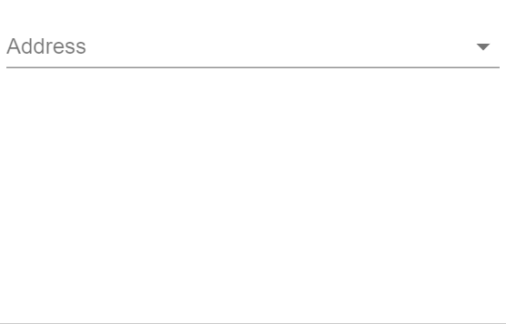
This component is an address picker component for Material-UI.
Installation
npm install --save material-ui-address-input
Note: material-ui-address-input only supports Material-UI 1.0.0 or later. There is not planned support for Material-UI 0.x. If you are using an earlier version of Material-UI, you should consider upgrading to v1.
Usage
The component only supports controlled input at the moment.
import React, {Component} from 'react'
import AddressInput from 'material-ui-address-input'

class ControlledAddressInput extends Component {
    constructor (props) {
        super(props)
        this.state = {
            address: '',
            addresses: []
        }
    }

    handleAddAddress = address => {
        this.setState({
            addresses: [...this.state.addresses, address]
        })
    }

    handleChangeAddress = addressIndex => {
        this.setState({
            address: addressIndex
        })
    }

    render () {
        return (
            <AddressInput
                onAdd={this.handleAddAddress}
                onChange={this.handleChangeAddress}
                value={this.state.address}
                allAddresses={this.state.addresses}
            />
        )
    }
}

export default ControlledAddressInput
Props
| Name | Type | Default | Description |
|---|---|---|---|
addressLabels |
shape |
{ houseNameNumber: 'House Name/Number', addressLine1: 'Address Line 1', addressLine2: 'Address Line 2', city: 'City', region: 'State/Province/Region', zip: 'ZIP/Postal Code', country: 'Country' } |
Custom labels to display when the user creates a new address. Note that if you wish to use custom labels you must specify each of the labels. |
addressResolver |
func |
If specified, the component will offer the user a choice to find their address automatically given their house name/number and zip/postal code (and their country if displayCountry is set to true). When the user types in this information and clicks 'Find Address', this function will be called. This function should add the resolved address and change the value of this component to correctly input the new address. Signature: function(houseNameNumber: string, zip: string, country: string) => void |
|
allAddresses* |
array |
Array containing all of the address objects that the user can choose from. Addresses should be of the form {addressLine1: string, addressLine2: string, city: string, region: string, zip: string, country: string} |
|
disabled |
bool |
false |
If true, the label, input and helper text should be displayed in a disabled state. |
displayCountry |
bool |
true |
Whether the address selector should allow users to choose their country. Often disabled if your application typically has users from a single country. |
error |
bool |
If true the address dropdown will be in an error state and appear red. |
|
helperText |
node |
The helper text content | |
id |
string |
'address' |
The id to be passed to the select element. |
label |
string |
'Address' |
The label to be shown on the address picker component. |
margin |
enum: 'none' | 'dense' | 'normal' |
'none' |
If dense or normal, will adjust vertical spacing of this component. |
name |
string |
'address' |
The name to be passed to the select element. |
native |
bool |
false |
If true, a native <select> element will be rendered. |
onAdd* |
func |
Callback that is fired when the user adds a new address. This function should add the new address to the allAddresses prop. The function is called with a single parameter address with the following shape: address: {addressLine1: string, addressLine2: string, city: string, region: string, zip: string, country: string} |
|
onChange* |
func |
Callback that is fired when the user changes the active address using the dropdown box. There is a single parameter addressIndex which represents the index in the array of all addresses that the selected address represents. |
|
required |
bool |
false |
If true, the label will indicate that the user must select an address from this component. Note that HTML5 validations for this feature only work with native set to true. |
value* |
union: string | number |
The index of the selected address in the array of all addresses. If you desire 'no address selected', then value should be the empty string ''. |
Contributing
PRs are welcome! :tada: