README


morfi logo"> morfi
 morfi logo"> morfi
Abstract form handling for any purpose (1.8 kb gzipped)
Why morfi?
I have invested a lot of time to read about and use forms from different
developers. Since I did not find the one solution in my year long
experience with react, I decided to spend some time and think about
an ideal solution.
I tried to target the following aspects. It should be a small bundle. Leave the flexibility to the developer. Make it type safe! Support the usage of any internationalization framework. Absolutely no dependencies, which have to be installed additionally. High performing and very assisting.
TypeScriptsupportflowsupport- No dependencies
- Small bundle size
- High performance
- Nice features
- Totally customizable
- Well documented
Installation
With yarn
yarn add morfi
With npm
npm install --save morfi
Introduction
Let's get a first impression...
import React from 'react';
import { Morfi, type FormData, type FormValidation } from 'morfi';
 // this can be replaced by any intl framework of your choice
import { myOwnIntlFramework } from 'my-own-intl-framwwork';

// first define your form value types
type MyFormValues = { phone: string };

const initialValues: MyFormValues = { phone: '' };
const initialData: FormData<MyFormValues> = { values: initialValues, errors: {} };
const validation: FormValidation<MyFormValues> = {}; // will be explained later

// initialize the used components
const { Form, Fields } = Morfi.create(initialValues);

// you can initialize the submit callback outside of the component
// if it does not depend on further component state
const onSubmit = (values: MyFormValues) => console.log(values);

const MyForm = () => {
    // you don't have to use hooks (see example below)
    const [data, setData] = React.useState<FormData<MyFormValues>>(initialData);

    return (
        <Form validation={validation}
              onChange={setData}
              data={data}
              onSubmit={onSubmit}>
            <Fields.phone>
                {({ onChange, onBlur, required, value, error }) => (
                    <div>
                        <label>{`Phone${required ? ' *' : ''}`}</label>
                        <input value={value}
                               onChange={e => onChange(e.target.value)}
                               onBlur={e => onBlur(e.target.value)} />
                        <span className="error">{myOwnIntlFramework(error)}</span>
                    </div>
                )}
            </Fields.phone>
            <button type="submit">Submit</button>
        </Form>
    );
}
By calling Morfi.create with the initial values, a React context will generated
and you get Form element together with Fields which itself contains different
elements for each specified initial value. ATTENTION: It is mandatory to supply all
relevant fields. Even values that will be initialized with undefined. Because the
keys of your initial values matter.
The Form element receives certain "control" props and needs to provide the current
context state to each of the Fields.
It expects the following props: (See below for the missing types)
| Props | Type | Description | Example |
|---|---|---|---|
className |
void \ string |
Will be applied to the form tag | 'my-form' |
validation |
FormValidation<V> |
Contains all validators | { name: { onChange: customValidator } } |
data |
FormData<V> |
Contains all values, errors and submitting state | { values: { name: 'Scotty' }, errors: { name: { id: 'does.not.know' } }, submitting: false } |
onChange |
(FormData<V>) => void |
Handles the next data after any changes have been made | |
onSubmit |
V => void \ Promise<void> |
Will be called if submitted without any failing validators | |
onSubmitFailed |
void \ ((Error, FormData<V>) => void) |
Will be called if submitting was aborted due to validation errors or if your submit returned a rejected promise | |
onSubmitFinished |
void \ ((FormData<V>) => void) |
Will be called after submitting finished |
In the above example was a single value specified with the key "phone". Hence
Fields.phone is a element mapped to the generic type "string". It accepts only
a single child function, which receives the following:
value: The current value of that field. It equals thedata.values.phone.error: The current error message of that field. It equals thedata.errors.phone.onChange: Receives the next value of the generic type, runs the onChange-Validator on it and calls theForm-onChangewhere e.g.data.values.phoneholds the updated value anddata.errors.phonewill maybe hold an occurred validation error.onBlur: Same as theonChangebut will be triggered if the input loses the users focus and triggers the onBlur-Validator.required: A boolean which indicates if the valueundefinedfor "phone" would pass all validations on that field. If not the value is treated as required.
The above example shows a form with a single field.
The label shows "Phone *" if the value is required.
It will update the form data accordingly to the specified onChange handler
supplied to the Form.
It will display an error message below the input if any error was encountered.
Asynchronous form field handling
To implement async form field validation, you simply have to return a promise, which will resolve the validation result. You can write validators which are both: async AND sync validator at the same time. One example:
import type { Validator } from 'morfi';

const specialValidator: Validator<string> = (val?: string) => {
    if (!val) { // if value is falsy we return sync error
        return {id: 'value.required'};
    }
    return myFetch('/my/api').then(result => {
        if (result.isInvalid) { // api answered that the value was invalid
            return {id: 'value.invalid'}; // return async error
        }
    });
}
HINT: You should always validate the value undefined synchronously, because
morfi determines the requirements by these criteria. So if you use the comfortable
async-await-Syntax, you should split your validator into two parts.
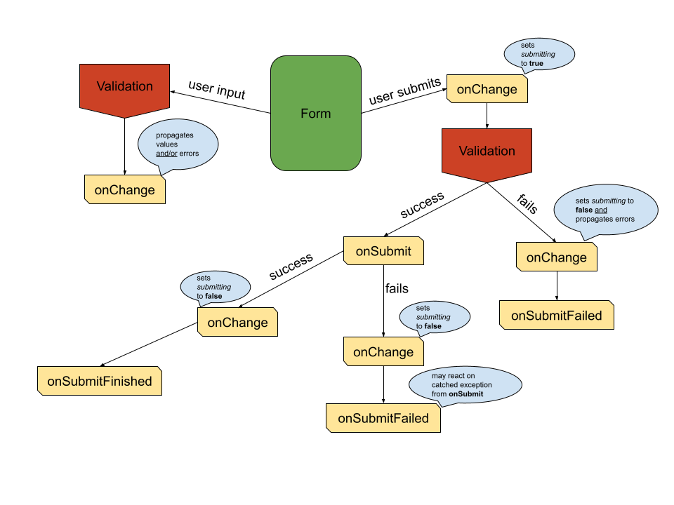
Control your submit
When the user submits the form, the following will happen:
- The
submittingproperty will be propagated astrueto youronChange - All registered validators will be executed and their validation results will be awaited
- When
2returned any errors youronChangewill be called with the found errors andsubmittingasfalse(Early exit) - When
2returned no errors youronSubmitwill be called - When
4took place, thesubmittingproperty will be propagated asfalse(if youronSubmitreturned a Promise, this will happen after this Promise resolved)
Types
morfi comes with a lot of types and exports FormData<T>, ErrorMessage
and Validator.
In this table you get an overview of relevant types.
| Name | TypeScript declaration | Information |
|---|---|---|
ErrorMessage |
{ id: string, values?: { [key: string]: ReactNode } } |
This structure allows to handle internationalization by transporting the required information like the intl key and placeholder values |
MaybeError |
ErrorMessage \ void |
This is the returned feedback of each validator |
Validator<F> |
(value?: F) => MaybeError \ Promise<MaybeError> |
The validator returns void if no error occurred or a Promise if the validation is asynchronous |
ValidationType |
'onChange' \ 'onBlur' \ 'onSubmit' |
The validation types that can be specified |
FieldValidation<F> |
Partial<{ [key in ValidationType]: Validator<F> }> |
An object containing all specified validators for one field |
FormValidation<V> |
Partial<{ [key in keyof V]: FieldValidation<V[key]>}> |
An object containing all validations for the whole form |
FormErrors<V> |
Partial<{ [key in keyof V]: ErrorMessage }> |
An object containing all current errors |
FormData<V> |
{ values: V, errors: FormErrors<V>, submitting?: boolean } |
This is the main structure for the data represent the form state |
Here the corresponding flow declarations:
| Name | Flow declaration |
|---|---|
ErrorMessage |
{ id: string, values?: { [string]: React$Node} } |
MaybeError |
ErrorMessage \ void |
Validator<F> |
(F \ void) => MaybeError \ Promise<MaybeError> |
ValidationType |
'onChange' \ 'onBlur' \ 'onSubmit' |
FieldValidation<F> |
$Shape<{ [ValidationType]: Validator<F> }> |
FormValidation<V> |
$Shape<$ObjMap<V, <F>(F) => FieldValidation<F>>> |
FormErrors<V> |
$Shape<$ObjMap<V, () => ErrorMessage>> |
FormData<V> |
{ values: V, errors: FormErrors<V>, submitting?: boolean } |
Example
In this chapter we will examine how a sample form could be implemented. The sample is hosted by GitHub Pages.
We first define the types of the form values...
type Gender = 'M' | 'F';
type MyFormValues = {
    firstName: string,
    lastName: string,
    gender: Gender,
    age: number,
};
// gender can be selected with the following available options
const genderOptions = [{ value: 'M', label: 'male' }, { value: 'F', label: 'female' }];
Let's initialize the form elements...
const initialValues: MyFormValues = { firstName: 'Nick', lastName: '', gender: 'M', age: 21 };
const { Form, Fields } = Morfi.create(initialValues);
Then we define the validations... (see here for the used validators below)
const validation = {
    firstName: { onChange: Validators.string({ min: 1, max: 10 }) },
    lastName: { onBlur: Validators.string({ min: 1, max: 10 }) },
    age: { onChange: Validators.number({ minLength: 1, maxLength: 3 }) },
};
Let's say we decide to control the form state inside our app state...
type AppProps = {};
type AppState = { data: FormData<MyFormValues> };
Now we define the first version of the app... (see here for all used custom components below)
import React, { Component } from 'react';
import { Morfi, type FormData } from 'morfi';

(...)

class App extends Component<AppProps, AppState> {
    // first we initialize the defaults
    // we could even start with initial errors
    state: AppState = { data: { values: initialValues, errors: {} } };

    // this handler will propagate the form changes to the state
    onChange = (data: FormData<MyFormValues>) => this.setState({ data });

    // for now we leave the submit handler empty
    onSubmit = ({ gender, firstName, lastName, age }: MyFormValues): void => {
        // do something
    };

    render(): React$Node {
        const { data } = this.state;
        return (
            <Form validation={validation} onChange={this.onChange} data={data} onSubmit={this.onSubmit}>
                <div className="row">
                    <FormInput Field={Fields.firstName} label="First name" className="form-group col-sm-6" />
                    <FormInput Field={Fields.lastName} label="Last name" className="form-group col-sm-6" />
                </div>
                <div className="row">
                    <FormSelect
                        Field={Fields.gender}
                        options={genderOptions}
                        label="Gender"
                        className="form-group col-sm-6"
                    />
                    <FormNumberInput Field={Fields.age} label="Age" className="form-group col-sm-6" />
                </div>
                <div className="btn-toolbar">
                    <button className="btn btn-secondary mr-2" type="button" onClick={this.onClear}>
                        Clear
                    </button>
                    <button className="btn btn-success" disabled={Morfi.hasErrors(data)}>
                        Submit
                    </button>
                </div>
            </Form>
        );
    }
}
This version does the specified validations on the fields and prevents our empty
onSubmit function from being called, when any validations would not succeed.
So now we add a table (see here
for the implementation and the new type Person) to hold all entered person data. What changes...
// the state interface
type AppState = {| data: FormData<MyFormValues>, persons: Person[] |};
// the initial state
state: AppState = { data: { values: initialValues, errors: {} }, persons: [] };
// we add below the form the table
<PersonTable persons={this.state.persons} />
// we implement functionality for the onSubmit
onSubmit = ({ gender, firstName, lastName = '', age }: MyFormValues): void => {
    this.setState({
        persons: [...this.state.persons, { gender, firstName, lastName, age }],
    });
};
Now each time we submit the entered data which succeeds all validations, a new
person entry will be displayed in the PersonTable.
Finally we will add a clear button for all inputs and disable the submit button if any errors are present. What changes...
// a new function inside our App
onClear = () => {
    this.setState({ data: { values: initialValues, errors: {} } });
};
// the submit button on the bottom of the form will be replaced by
<div className="btn-toolbar" role="toolbar">
    <button className="btn btn-secondary" type="button" onClick={this.onClear}>
        Clear
    </button>
    <button className="btn btn-primary" disabled={Morfi.hasErrors(data)}>
        Submit
    </button>
</div>
Now if we hit the clear button all entered values will be cleared.
Testing
Check out morfi-test-utils to write your tests almost as a user would test your form manually.
FAQ
Why are there no ready-to-use components exported like
FormSelectfrom the above examples?morfi is primarily made to handle updates, validations, storing of data, assist the developer with strict types and serve as a guideline for form handling.
Later there might be subdirectories which you can optionally use, but most often in larger projects you want to have full control over all form components.
Alternatives...
The following table includes results from bundlephobia.
| Package | Version | Size (minified + gzipped) |
|---|---|---|
morfi |
1.1.8 | 1.7 kB |
react-form |
4.0.1 | 4.5 kB |
redux-form |
8.2.6 | 27 kB |
react-redux-form |
1.16.14 | 22.5 kB |
formik |
2.0.10 | 14.9 kB |
react-final-form |
6.3.3 | 3.1 kB + 5.1 kB (hidden peer dependency: final-form@4.18.6) |
react-jsonschema-form |
1.8.1 | 68.8 kB |
The following statements represent only my personal opinion, although I did not work a lot with the following pretty good packages.
react-form: A lot of features, but a large package with less flexibility when it comes to very individual forms. No
flowsupport.redux-form: A lot of features, nice documented and easy to use form handling tool, but it comes with the cost of a little integrative work, the cost of big package size, forces you to hold the form data in the redux store and to connect every form and has poor
flowassistance. Almost the same for react-redux-form.formik: Indicates what it does better than
redux-form, but is not so much better because it uses its own pseudo store and pseudo connect-function calledwithFormikand still is not a very small package.react-final-form: A lot of features, optimized for performance, small bundle size, totally customizable and needs no integrative work, but is not as well documented, has
peerDependecieswhich you also need to install and has noflowassistance.react-jsonschema-form: A lot of features and very nice docs, but a large package with less flexibility when it comes to individual form templating. No
flowsupport.