README
material-ui-dropzone
Material-UI-dropzone is a React component using Material-UI and is based on the excellent react-dropzone library.


This components provide either a file-upload dropzone or a file-upload dropzone inside of a dialog.
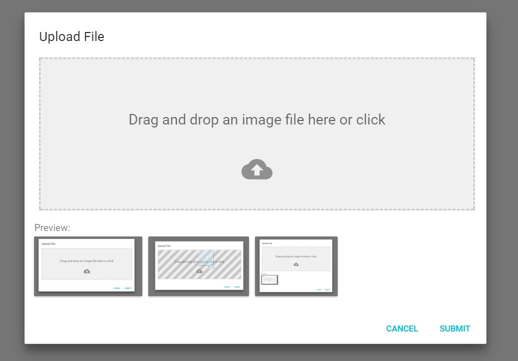
The file-upload dropzone features some snazzy "File Allowed/Not Allowed" effects, previews and alerts.
Installation
npm install --save mui-file-dropzone
or
yarn add mui-file-dropzone
Support
mui-file-dropzone complies to the following support matrix.
| version | React | Material-UI |
|---|---|---|
4.x |
17.0+ |
5.x |
3.x |
16.8+ |
4.x |
2.x |
15.x or 16.x |
3.x or 4.x |
Screenshots
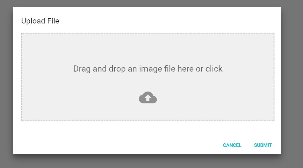
This is the Dialog component:
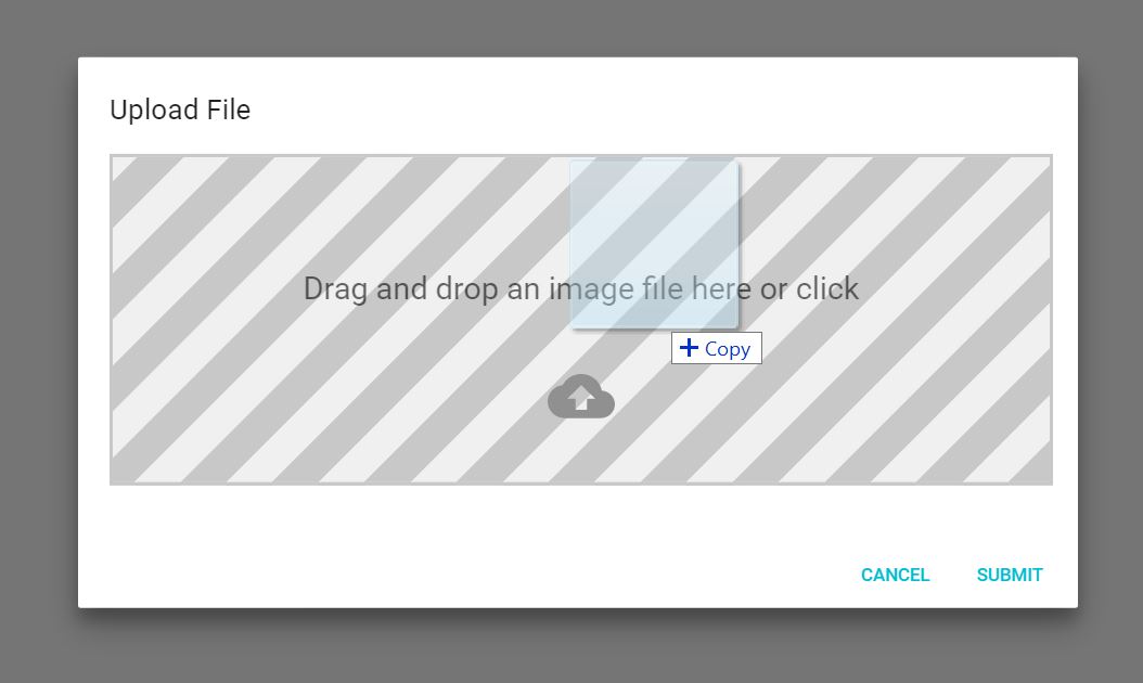
When you drag a file onto the dropzone, you get a neat effect:
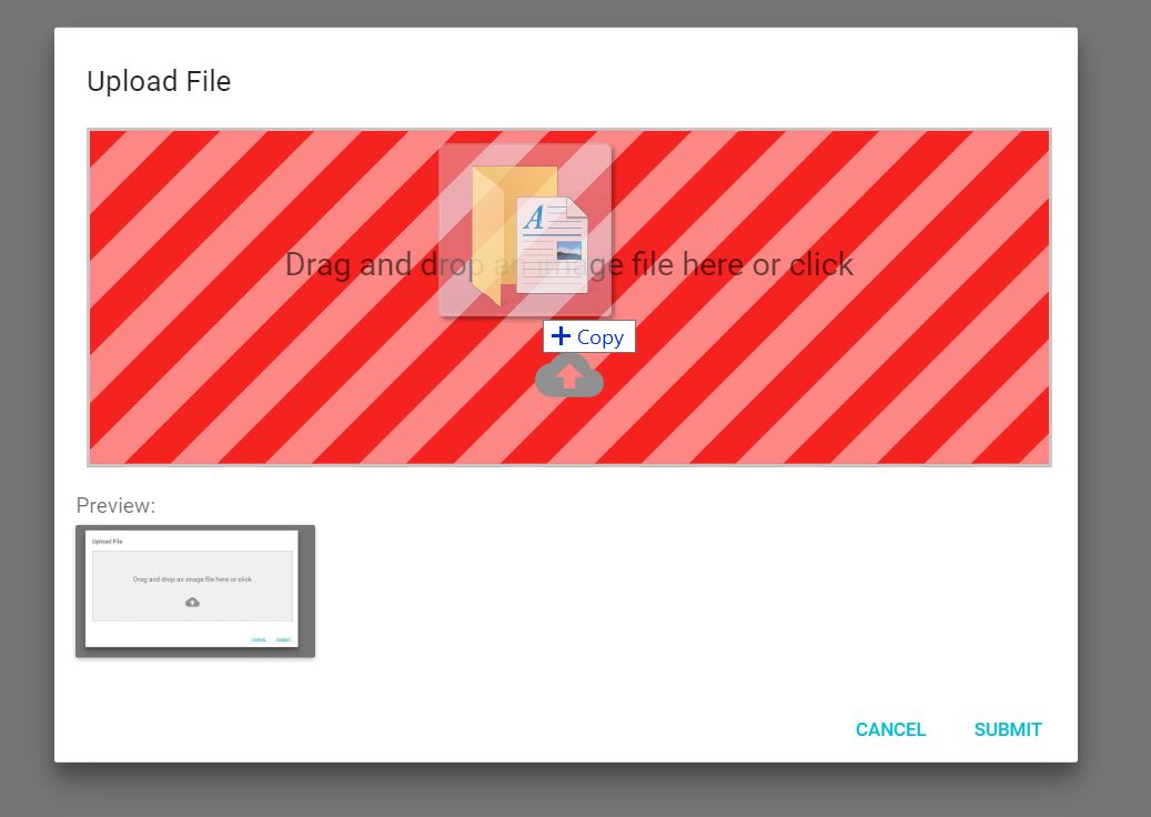
And if you drag in a wrong type of file, you'll get yelled at:
N.B. This has some limitations (see here for more details).
Documentation and Examples
See https://yuvaleros.github.io/material-ui-dropzone for Documentation and Examples.
Components
DropzoneArea
This components creates the dropzone, previews and snackbar notifications without a dialog
import React, { Component } from "react";
import { DropzoneArea } from "mui-file-dropzone";

class DropzoneAreaExample extends Component {
  constructor(props) {
    super(props);
    this.state = {
      files: [],
    };
  }
  handleChange(files) {
    this.setState({
      files: files,
    });
  }
  render() {
    return <DropzoneArea onChange={this.handleChange.bind(this)} />;
  }
}

export default DropzoneAreaExample;
DropzoneDialog
This component provides the DropzoneArea inside of a MaterialUI Dialog.
import React, { Component } from "react";
import { DropzoneDialog } from "mui-file-dropzone";
import Button from "@mui/material/Button";

export default class DropzoneDialogExample extends Component {
  constructor(props) {
    super(props);
    this.state = {
      open: false,
      files: [],
    };
  }

  handleClose() {
    this.setState({
      open: false,
    });
  }

  handleSave(files) {
    //Saving files to state for further use and closing Modal.
    this.setState({
      files: files,
      open: false,
    });
  }

  handleOpen() {
    this.setState({
      open: true,
    });
  }

  render() {
    return (
      <div>
        <Button onClick={this.handleOpen.bind(this)}>Add Image</Button>
        <DropzoneDialog
          open={this.state.open}
          onSave={this.handleSave.bind(this)}
          acceptedFiles={["image/jpeg", "image/png", "image/bmp"]}
          showPreviews={true}
          maxFileSize={5000000}
          onClose={this.handleClose.bind(this)}
        />
      </div>
    );
  }
}
License
MIT
Contributors
Thanks goes to these wonderful people (emoji key):
 Yuvaleros 🤔 💻 🎨 📖 💬 👀 🚧 |
 Mattia Panzeri 🤔 💻 🎨 📖 💡 🚇 🐛 💬 👀 🚧 |
 Max Carroll 🤔 💻 🎨 💡 👀 |
 Matthew Corner 🐛 🤔 💻 |
 Barry Loong 🤔 💻 |
 JF Blouin 🤔 💻 |
 Anthony Raymond 💻 💡 |
 isaacbuckman 🐛 💻 💡 |
 MatthijsMud 🐛 💻 |
This project follows the all-contributors specification. Contributions of any kind welcome!