README


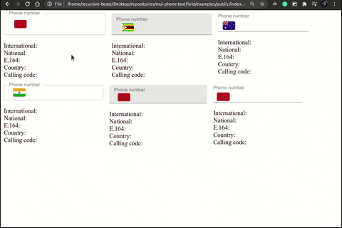
mui-phone-textfield
A phone number input for Material-UI.
Installation
First, make sure you can handle image import/require in your bundler of choice. For example, here's how to do it in webpack.
Then to install this package and its peerDependencies:
Via npm
npm install mui-phone-textfield react @mui/material @mui/styles @emotion/react @emotion/styled
Via yarn
yarn add mui-phone-textfield react @mui/material @mui/styles @emotion/react @emotion/styled
Usage
The component can be used the same way as the TextField component from Material-UI with some additional props:
import React, { useState } from "react";
import PhoneTextField from "mui-phone-textfield";

function Example() {
    const [value, setValue] = useState(""); // The input value.
    const [country, setCountry] = useState("US"); // The selected country.
    const [phoneNumber, setPhoneNumber] = useState(); // The PhoneNumber instance.

    const onChange = ({ formattedValue, phoneNumber }) => {
        setValue(formattedValue);
        setPhoneNumber(phoneNumber);
    };

    const onCountrySelect = ({ country, formattedValue, phoneNumber }) => {
        setValue(formattedValue);
        setCountry(country);
        setPhoneNumber(phoneNumber);
    };

    return <PhoneTextField
        label="Phone number"
        error={Boolean(value && phoneNumber?.country !== country)}
        value={value}
        country={country}
        onCountrySelect={onCountrySelect}
        onChange={onChange}
    />;
}
API
In addtion to TextField's props (except onChange, select and type), The component accepts the following:
| prop | type | description| |-|-|-| | country | string | The selected country. A two-letter ISO country code. | | onCountrySelect | function | Callback fired when a user selects a country from the menu. | | onChange | function | Callback fired when the input value changes. | | countryDisplayNames | object | An object that maps a two-letter ISO country code to a country name. can be used for localisation. |
Note: The startAdornment key of InputProps is reserved for the menu of countries, but all the other keys are left untouched.
Event listeners
onCountrySelect
Callback fired when a user selects a country from the menu. It receives an object with these properties:
formattedValue{string | undefined}: The formatted value for the selected country. Extracted from thevalueprop.phoneNumber{object | undefined}: An instance of the PhoneNumber class, orundefinedif no valid phone number could be parsed from thevalueprop.country{string}: The selected country. A two-letter ISO country code.
onChange
Callback fired when the input value changes. It receives an object with these properties:
formattedValue{string}: The formatted value for the selected country. Extracted from the input value.phoneNumber{object | undefined}: An instance of the PhoneNumber class, orundefinedif no valid phone number could be parsed from the input value.event{object}: The original event that triggered theonChangehandler.
Contributing
Prerequisites
Getting Started
After cloning this repo, ensure dependencies are installed by running:
npm install
And for python dependencies:
pipenv install
Generate the sprite image and stylesheet:
pipenv run python sprite.py
Development server
To run the development server run:
npm run start
This will serve the examples page to your browser and automatically reload on every change to either the example's files or the src files.
Commiting the changes
Please follow the conventional commits specification, because semantic-release is used to automate the whole package release workflow including: determining the next version number, generating the release notes and publishing the package.