README
NgxMultiSortTable
This is the implementation for a multiple sortable table based on the Angular Material Design. The focus is on server-side loaded and sorted data. Next to that the library provides some useful classes to reduce the duplicated code when using the material paginator.
The code is based on Francisco Arantes Rodrigues repository repo, so thanks for your great work.
Supported Angular Versions:
| Angular Version | Latest Update of this lib | Branch |
|---|---|---|
| Angular 13 | 0.8.0 (not tested) | current master |
| Angular 12 | 0.7.4 (tested) | angular-12 |
| Angular 11 | 0.6.2 (tested) | angular-11 |
| Angular 10 | 0.7.4 (tested) | angular-10 |
| Angular 8 | 0.7.4 (tested) | angular-8 |
Warning:
- Older versions might have know security issues. So keep up-to-date!
- Older versions of this library lack some features.
Discussion:
I like to improve the library, so please use this thread, if you have any feature requests, bug fixes or suggest api changes.
Demo
Visit the github-pages demo or clone and run it locally.
To run the demo:
clonethe repositorycd ngx-multi-sort-tablenpm installng build mat-multi-sortng serve
Changelog
Version 0.8.0
- Added Support for Angular 13 Thanks to Mohamed Salah
Version 0.7.4
- Security fixes
Version 0.7.3
- Making the scrollStrategy of the overlay configurable. Thanks to Lotec724.
Version 0.7.2
- Fixed bug where settings dialog was to large and not scrollable, if table has many columns. Thanks to Lotec724.
Version 0.7.1
- Fixed update to Angular 12. Thanks to SlasherZet and Hellyson Rodrigo Parteka .
Version 0.7.0
- Update to Angular 12. Thanks to Hellyson Rodrigo Parteka.
- Security Updates
Documentation
TableData
The TableData an an useful class, which handles a lot of work for your app, such as page events (next, previous, sizeChange) and sorting event. Next to that it keeps the current state of the table, again sorting and pagination.
Properties
| Name | Description | default | Exampe |
|---|---|---|---|
| columns | An array of the displayed columns of the table with id: name of the attribute and name: Name to display in the header |
none |
[{ id: 'first_name', name: 'First Name' }] |
| displayedColumns | An array of the currently displayed columns (id) and their order |
all columns |
|
| dataSource | A MatMultiSortTableDataSource, which is special DataSource for sorting. Only accesable via getter and setter |
none |
|
| data | The table data of the dataSource | Array<T> |
|
| pageSize | The current selected pageSize | first entry of pageSizeOptions |
|
| pageSizeOptions | The options for the pageSize, which the user can see in the menu | [10, 20, 50, 100] |
|
| pageIndex | The index of the page | 0 |
|
| totalElements | The total number of elements of the table, must be set from your component | none |
|
| sortParams | An Array of the columns (id), which the user had chosen to sort. The order of the sorting is represented by the order of the ids in the parameter |
[] |
['first_name', 'last_name'] |
| sortDirs | An Array of the column's sort-directions, which the user had chosen to sort. The order is the same like sortParams |
[] |
['asc', 'desc'] |
| nextObservable | An Observable that fires, when the user clicks the next button |
||
| previousObservable | An Observable that fires, when the user clicks the previous button |
||
| sizeObservable | An Observable that fires, when the user changes the pageSize |
||
| sortObservable | An Observable that fires, when the user changes the sorted columns or direction |
Methods
| Name | Description | Parameter |
|---|---|---|
| constructor | The constructor for the for the class, where you initialize your columns. Optionally, you can add the default ids of the default sort colum and direction. If defaultSortParams are provided, but not the directions asc will be default |
columns: Array<{ id: string, name: string }>, options: { defaultSortParams?: string[], defaultSortDirs?: string[], pageSizeOptions?: number[], totalElements?: number } |
| onSortEvent | The method to bind to the matSortChange output of the table |
none |
| onPaginationEvent | The method to bin to the page output of the mat-paginator |
$event: PageEvent |
| updateSortHeaders | The method triggers a rerendering of the headers to show the sorting directions correctly. The functions forces a complete new render of the data, what is not optimal, but only working solution right now. | none |
| updateColumnNames | The method allows you to change the displayed name of the columns | { id: string, name: string }[] |
| localStorageKey | A key to store the table settings, like selected columns, order of the columns, sorting directions in the local storage. If no key is passed the settings are not stored. Do not set the same key for different tables, this might lead to unexpected behavior. There is an validation of the loaded settings, if that fails, the defaults are used | string |
MatMultiSortHeaderComponent
This component manages the sorting of the table. To use the multi-sort add matMultiSort to your table and pass the mat-multi-sort-header="<your-column-id>" to the <th mat-header-cell>.
MatMultiSortTableSettingsComponent
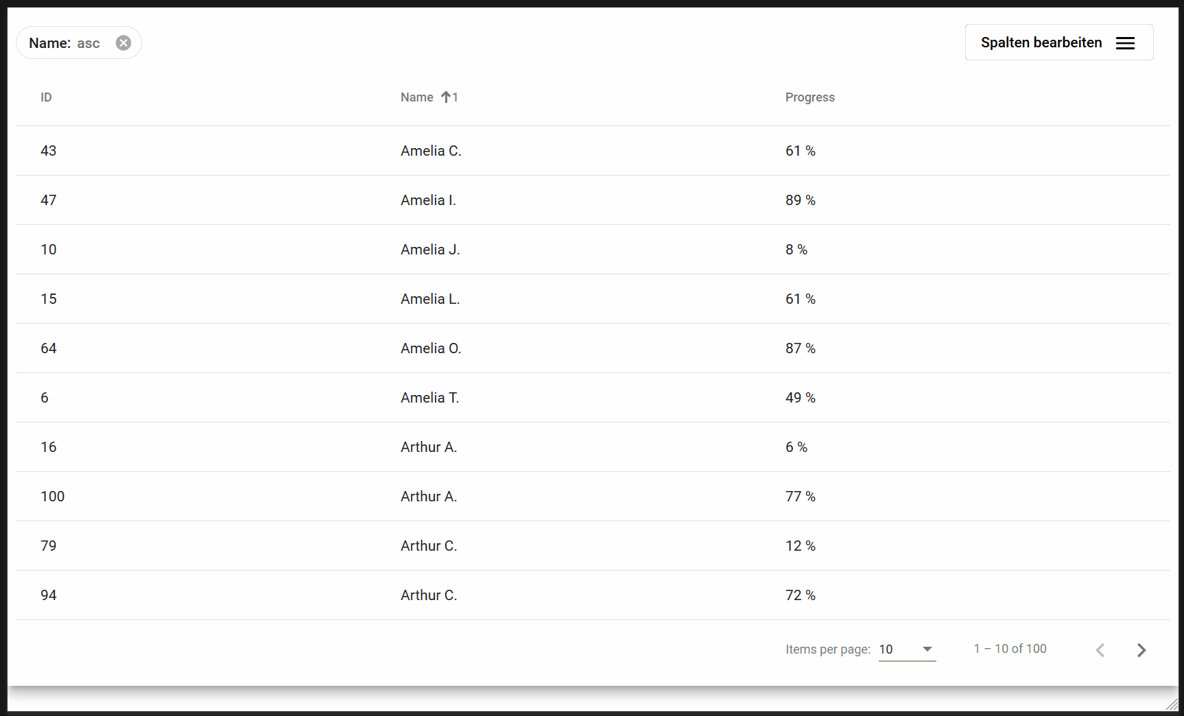
This component display some settings for your table. The user can select the columns he wants to see in his table, next to that he can change the order of the columns. Additionally, the component shows the current chosen sorting columns as chips above the table. The user can easyly change the sorting order by drag and drop the chips and also change the sorting direction of each column.
| Name | Description | Parameter |
|---|---|---|
| tableData | An input of tableData object which holds the complete table state |
@Input: TableData |
| sortToolTip | A input test for the tooltip to show up over the sorting chips | @Input: string |
| closeDialogOnChoice | A input to control the behavior of the settings menu. If set to true the dialog closes after the user has selected a column, if false it stays open, so the user can select/deselect multiple columns with out reopening the dialog. |
@Input: boolean |
| scrollStrategy | An input of ScrollStrategy for the CDK overlay. Sets the behavior for scrolling when the dialog is opened. Possible options are the predefined strategies: Noop, Close, Block or Reposition, with Block being the default value. | @Input: ScrollStrategy |
MatMultiSortTableDataSource
This is the datasource of the MultiSortTable, it works like the MatTableDataSource´.
| Name | Description | Parameter |
|---|---|---|
| constructor | The constructor of the class | sort: MatMultiSort, clientSideSorting: boolean = false |
Example code for the template
<mat-multi-sort-table-settings [tableData]="table" sortToolTip="Sortierreihenfole ändern" [closeDialogOnChoice]="false">>
<button mat-stroked-button>
Spalten bearbeiten
<mat-icon>menu</mat-icon>
</button>
<!-- Optional custom content for the sort indicator chip (here column name with icons) -->
<ng-template #sortIndicator let-direction='direction' let-columnName='columnName'>
{{columnName}}
<mat-icon *ngIf="direction">{{direction === 'asc' ? 'arrow_upward' : 'arrow_downward'}}</mat-icon>
</ng-template>
</mat-multi-sort-table-settings>
<table mat-table [dataSource]="table.dataSource" matMultiSort (matSortChange)="table.onSortEvent()">
<!-- Create all your columns with *ngfor, this is the lazy way out and only works if the display of the data does not differ -->
<ng-container *ngFor="let column of table.columns" [matColumnDef]="column.id">
<th mat-header-cell *matHeaderCellDef [mat-multi-sort-header]="column.id"> {{column.name}} </th>
<td mat-cell *matCellDef="let row"> {{row[column.id]}} </td>
</ng-container>
<!-- Or define your in a normal, more individuell way -->
<ng-container matColumnDef="id">
<th mat-header-cell *matHeaderCellDef mat-multi-sort-header="id"> ID </th>
<td mat-cell *matCellDef="let row"> {{row.id}} </td>
</ng-container>
<ng-container matColumnDef="progress">
<th mat-header-cell *matHeaderCellDef mat-multi-sort-header="progress"> Progress </th>
<td mat-cell *matCellDef="let row"> {{row.progress}} % </td>
</ng-container>
<ng-container matColumnDef="name">
<th mat-header-cell *matHeaderCellDef mat-multi-sort-header="name"> Name </th>
<td mat-cell *matCellDef="let row"> {{row.name}} </td>
</ng-container>
<tr mat-header-row *matHeaderRowDef="table.displayedColumns"></tr>
<tr mat-row *matRowDef="let row; columns: table.displayedColumns;">
</tr>
</table>
<mat-paginator [pageSize]="table.pageSize" [pageIndex]="table.pageIndex" [pageSizeOptions]="table.pageSizeOptions"
[length]="table.totalElements ? table.totalElements : 0" (page)="table.onPagnationEvent($event)" [disabled]="CLIENT_SIDE">
</mat-paginator>
Example code for the component.ts
export class AppComponent implements OnInit {
  CLIENT_SIDE = true;

  table: TableData<UserData>;
  @ViewChild(MatMultiSort, { static: false }) sort: MatMultiSort;

  constructor(
    private dummyService: DummyService
  ) {
    this.table = new TableData<UserData>(
      [
        { id: 'id', name: 'ID' },
        { id: 'name', name: 'Name' },
        { id: 'progress', name: 'Progess' }
      ], { localStorageKey: 'settings' }
    );
  }

  ngOnInit() {
    this.table.nextObservable.subscribe(() => { this.getData(); });
    this.table.sortObservable.subscribe(() => { this.getData(); });
    this.table.previousObservable.subscribe(() => { this.getData(); });
    this.table.sizeObservable.subscribe(() => { this.getData(); });

    setTimeout(() => {
      this.initData();
    }, 0);
  }

  initData() {
    this.table.dataSource = new MatMultiSortTableDataSource(this.sort, this.CLIENT_SIDE);
    if (this.CLIENT_SIDE) {
      this.getOfflineData();
    } else {
      this.table.pageSize = 10;
      this.getData();
    }
  }

  getData() {
    if (!this.CLIENT_SIDE) {
      const res = this.dummyService.list(this.table.sortParams, this.table.sortDirs, this.table.pageIndex, this.table.pageSize);
      this.table.totalElements = res.totalElements;
      this.table.pageIndex = res.page;
      this.table.pageSize = res.pagesize;
      this.table.data = res.users;
    }
  }

  getOfflineData() {
    const res = this.dummyService.list([], [], 0, 25);
    this.table.totalElements = 25;
    this.table.pageIndex = res.page;
    this.table.pageSize = res.pagesize;
    this.table.data = res.users;
  }
}