README
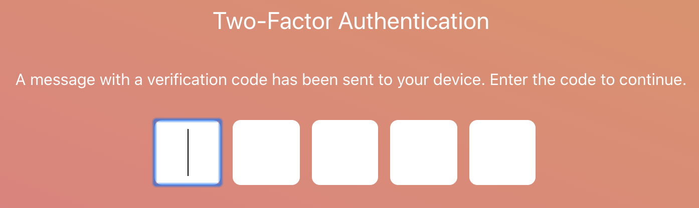
React Auth Code Input
One-time password (OTP) React input component, uncontrolled, zero dependencies, fully tested.


Demo
Install
npm install --save react-auth-code-input
or
yarn add react-auth-code-input
Usage
import React, { useState } from 'react';
import AuthCode from 'react-auth-code-input';

const App = () => {
  const [result, setResult] = useState('');
  const handleOnChange = (res: string) => {
    setResult(res);
  };

  return (
    <AuthCode
      length={5}
      onChange={handleOnChange}
      containerClassName='container'
      inputClassName='input'
    />
  );
};
Props
| Prop | Type | Description | Default Value | Observations |
|---|---|---|---|---|
allowedCharacters |
String | Type of allowed characters for your code. | alphanumeric |
alpha, alphanumeric, numeric |
ariaLabel |
String | Accessibility. | ||
length |
Number | The number of inputs to display. | 6 | |
containerClassName |
String | The styles to be applied to the container. | ||
inputClassName |
String | The styles to be applied to each input. | ||
onChange |
Function(value: String) | Callback function called every time an input value changes. | ||
isPassword |
Boolean | Whether to display the inputs as passwords or not. | false |
Changelog
3.0.0
- Change the way the allowed characters are handled by using 3 predefined modes: alpha, alphanumeric, and numeric, allowing to have more control when validating the values introduced in the inputs.
- Improved logic.
- Improved tests.
- Improved types.
2.1.0
- Support to fill one-time-codes directly from SMS's.
- Displays numeric keyboard on mobile devices when the
inputTypeprop is set tonumber - Add
ariaLabelprop for accessibility.
2.0.0
- Remove
inputStyleprop in favor ofinputClassName. - Remove
containerStyleprop in favor ofcontainerClassName. - Remove
passwordprop in favor ofinputTypewhich accepts text, password or number value.
1.2.1
- Add missing dist files.
1.2.0
- Add
inputClassNameandcontainerClassNameprops. - Deprecate
inputStyleandcontainerStyle. - Make
onChangeprop mandatory.
1.1.0
- Typescript support.
1.0.0
- Initial Version.
Props versions 1 and 2
| Prop | Type | Description | Default Value | Observations |
|---|---|---|---|---|
allowedCharacters |
String | Regex for allowed characters | [A-Za-z0-9]+ |
|
ariaLabel |
String | Accessibility | ||
characters |
Number | The number of inputs to display | 6 | |
containerClassName |
String | The styles to be applied to the container | ||
inputClassName |
String | The styles to be applied to each input | ||
inputType |
String | The type of the inputs | text | text, number or password |
onChange |
Function(value: String) | Callback function called every time an input value changes | ||
password |
Boolean | If present changes the type of the input to password, by default is set to text | false | deprecated since version 2.0.0 |
inputStyle |
Object | The styles to be applied to each input | deprecated since version 1.2.0 | |
containerStyle |
Object | The styles to be applied to the container | deprecated since version 1.2.0 |
License
Licensed under the MIT License, Copyright © 2020-present Luis Guerrero drac94.
See LICENSE for more information.