README
control-panel
This is a React port of control-panel that aims to replicate the functionality of the original exactly while making it easily usable from React. All of the features of the original have been brought over, and the API remains very similar.
Embeddable panel of inputs for adding parameter selection to your app or visualization. Modern and minimalist design. Fully encapsulated module including JS and CSS. Can easily be added to any app or page. Heavily inspired by dat-gui, but streamlined, simplified, and written as a npm module.
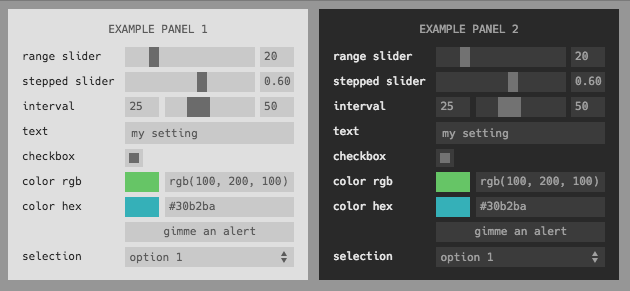
Supports the following input types
range•checkbox•text•color•button•interval•select•custom
Includes the following themes
dark•light
Want to contribute a new theme or input type? Submit a PR!
install
Add to your project with
npm install control-panel
The UI uses the Hack font which users may not have installed on their machines locally. To include a version dynamically, add the following line to your <head>:
<style type="text/css" rel="stylesheet"//cdn.jsdelivr.net/font-hack/2.019/css/hack.min.css></style>
example
Create a panel with four elements and add to your page in the top right.
import ControlPanel, {
  Button,
  Checkbox,
  Multibox,
  Select,
  Text,
  Color,
  Range,
  Interval,
  Custom,
} from 'react-control-panel';

const initialState = {
  'range slider': 20,
  'stepped slider': 0.6,
  interval: [25, 50],
  text: 'my setting',
  checkbox: true,
  'color rgb': 'rgb(100, 200, 100',
  'color hex': '#30b2ba',
  selection: 'option 1',
  'multiple checkboxes': [true, true],
};

const DemoPanel = () => (
  <ControlPanel
    theme="dark"
    title="Demo Panel"
    initialState={initialState}
    onChange={console.log}
    width={500}
    style={{ marginRight: 30 }}
  >
    <Range label="range slider" min={0} max={100} />
    <Range label="stepped slider" min={0} max={1} />
    <Interval label="interval" min={0} max={100} />
    <Text label="text" />
    <Checkbox label="checkbox" />
    <Color label="color rgb" format="rgb" />
    <Color label="color hex" format="hex" />
    <Button label="gimme an alert" action={() => alert('clicked')} />
    <Select label="selection" options={{ 'option 1': 1, 'option 2': 2 }} />
    <Multibox
      label="multiple checkboxes"
      colors={['rgb(100,120,230)', 'rgb(210,100,190)']}
      names={['box1', 'box2']}
    />
    <Custom
      Comp={({ value, onChange, theme }) => (
        <MyCustomComponent value={value} onChange={onChange} theme={theme} />
      )}
    />
  </ControlPanel>
);
classic setting definitions
It's also possible to use the old array-based definition system from the original version:
<DemoPanel
  theme="dark"
  title="Array-Declared Control Panel"
  position="bottom-right"
  settings={[
    { type: 'range', label: 'my range', min: 0, max: 100, initial: 20 },
    { type: 'range', label: 'log range', min: 0.1, max: 100, initial: 20, scale: 'log' },
    { type: 'text', label: 'my text', initial: 'my cool setting' },
    { type: 'checkbox', label: 'my checkbox', initial: true },
    { type: 'color', label: 'my color', format: 'rgb', initial: 'rgb(10,200,0)' },
    {
      type: 'button',
      label: 'gimme an alert',
      action: () => {
        alert('hello!');
      },
      onmousedown: () => console.log('button pressed'),
      onmouseup: () => console.log('button released'),
    },
    {
      type: 'select',
      label: 'select one',
      options: ['option 1', 'option 2'],
      initial: 'option 1',
    },
    { type: 'multibox', label: 'check many', count: 3, initial: [true, false, true] },
  ]}
/>
usage
The ControlPanel component takes an array of children setting components that all receive part of the state. They each take additional props that can be used to configure their behavior. The ControlPanel itself takes a variety of props itself:
initialStateis an object mapping label to initial value for each of the settings for the control panel. It is required, and a value should be supplied for each of the settings components.onChangeaccepts a callback that has the following signature:(label, newValue, state)wherestateis the full state object for the entire panel. The supplied function will be called every time that any of the settings are updated.themecan specifylight•darkor provide an object (seethemes.jsfor format)titlea title to add to the top of the panelwidthwidth of panel in pixelspositionwhere to place the panel astop-left•top-right•bottom-left•bottom-right, ifundefinedwill just use relative positioning. An object containing absolute positioning in terms of offsets from the sides of the page can also supplied like{ left: 8, top: 0 }or{ right: 200 }.draggablemakes the entire control panel draggable.styleis an object of inline styles that will be merged into the default styles of the panel's main component.settingsis an array of setting definitions in the same format as the orignal library; this can be used as an alternative to passing in setting components as children. See theclassic setting definitionssection above for an example.stateis an external state object that will be used to replace the state maintained by the panel itself. For more info, see theexternal statesection below.contextCbaccepts a callback that will be provided with an object that can be used to get and set the inner state used by the panel directly. For more info, see thepanel contextsection below.
Each child setting component must be one of Range • Input • Checkbox • Color • Interval • Select. Each label must be unique as it maps to a top-level key of the state object for the whole ControlPanel.
Some setting components have additional properties:
- Inputs of type
rangecan specify amin,max, andstep(or integersteps). Scale can be either'linear'(default) or'log'. If a log scale, the sign ofmin,max, andinitialmust be the same and onlystepsis permitted (since the step size is not constant on a log scale). - Inputs of type
colorcan specify aformatas eitherrgb•hex•array - Inputs of type
buttoncan specifyaction(onclick),onmousedown, andonmouseupcallbacks. Button inputs are not reflected in the state and do not trigger an'input'event. - Inputs of type
intervalobey the same semantics asrangeinputs, except the input and output is a two-element array corresponding to the low/high bounds, e.g.initial: [1, 7.5]. - Inputs of type
selectcan specify a list of options, either as anArray(in which case the value is the same as the option text) or as an object containing key/value pairs (in which case the key/value pair maps to value value/label pairs). - Inputs of type
multiboxcan specify a number of checkboxes, either by providing acountor a list ofnamesfrom which the number will be inferred, in which case the color of each box and a text name can also be provided as listscolorsandnames - Inputs of type
customcan specify a custom component to be rendered in place of the input. The custom component will be suppliedvalue,onChange, andthemeprops from the control panel. An additionalrenderContainerprop can be used to disable rendering aContaineraround the customCompif it is set tofalse. - Inputs of all types can take an optional
LabelComponentprop to be used as a wrapper component when rendering the label. If provided, it should be a React component that takes a single proplabeland renders it with any custom styling desired.
external state
It is sometimes desirable to hoist the state for a panel up into something like Redux rather than letting the component handle it itself. This is supported by passing a state prop into the ControlPanel which you are in charge of keeping updated with new values provided by the panel's onChange prop callback. Here's an example of how this would work with state hoisted into a parent component:
class Wrapper extends React.Component {
  constructor(props) {
    super(props);
    this.state = {
      label1: 'val',
      ...
    };
  }

  render() {
    return (
      <ControlPanel
        state={this.state}
        {/* \/ not necessary - this is inferred automatically when `state` is provided */}
        {/*initialState={this.state}*/}
        onChange={(key, val) => this.setState({ [key]: val })}
        title='Panel with External State'
      />
        ...
    </ControlPanel>
    );
  }
}
Please note that panel context will not work if you use external state.
panel context
As mentioned above, it's possible to pass a callback to the ControlPanel component which will be supplied with a special context object after the component has mounted. This allows the underlying state to be directly viewed and manipulated from other parts of the application while still being reflected dynamically in the UI. Here's an example:
const handleContext = (ctx) => {
  console.log(ctx['label']); // prints the stored value for that setting
  ctx['my range'] = 10; // this sets the value of the 'my range' setting to 10 in the panel
  ctx['multibox'][1] = false; // this doesn't work; you can only set top-level setting values
  ctx['multibox'] = [true, false, true]; // do this instead
  console.log(Object.entries(ctx)); // this works, even with the polyfill
};

<ControlPanel contextCb={handleContext}>...</ControlPanel>;
In browsers that don't support the ES6 Proxy API, a shallow polyfill is used which allows values to be get, set, and listed which should be enough for most applications.
Please note that you cannot use external state if you are supplying a panel context callback.
development
To develop on this library, simply run the following commands:
yarnyarn start
Then, open localhost:9000 in your web browser. The page being shown is found in /demo, and any changes to it or the library itself will be hot-reloaded.
building the demo for publishing
- Change
demo.jstoindex.jsindemo/index.html - Run
cp demo/index.html dist/index.html - Comment out the
externalsinwebpack.prod.js - Run
yarn build demo - The demo application will be built into
dist