README
React-Duration
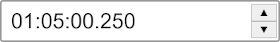
Easy-to-use duration input field for react.
Getting Started
First, install react-duration using npm:
npm i react-duration
Then import react-duration into your project:
import DurationInput from 'react-duration'
Now you're ready to render you're first duration input field:
class MyApp extends React.Component{

    constructor(props){

       this.state = {
           duration: 125.4 // Duration values are given in seconds.
       }
    }

    render(){

        return (
            <DurationInput
                value={ this.state.duration }
                onChange={ new_duration=> this.setState({duration: new_duration}) }
            />
        );
    }
}
Props
| Prop | Accepts | Description |
|---|---|---|
buttonIncrement |
Float | The amount, in seconds, to increment the duration by when the up or down butons are presssed. |
maxValue |
Float | The maximum value, in seconds, allowed. |
minValue |
Float | The minimum value, in seconds, allowed. |
onChange |
Callback | A function to be called whenever the duration is changed to and is in a valid format. |
style |
Object | A valid react style prop to be applied to the DurationInput wrapper. |
Styling
In addition to the passing in a style object for the container using the style prop, react-duration has the following classes for easy styling:
| Class | Assigned To |
|---|---|
duration-input-wrapper |
Wrapper around all internal elements |
duration-input |
Internal text input field |
duration-input-button-wrapper |
Wrapper around the up and down buttons |
duration-input-button |
Both the up and down buttons |
duration-up-button |
Up Button |
duration-down-button |
Down Button |