README
react-firebase-image-upload-control
A image uploader for react that uploads images firebase storage.
Installation
Run yarn add react-firebase-image-upload-control or npm i react-firebase-image-upload-control --save-prod to install the package in your app.
Prerequisites
You will need react, react-dom and firebase installed in your app. They are listed as peer depenencies only for this package, so installing the package will not automatically install those packages in your app.
Make sure you have initialized firebase somewhere in your app using your Firbase project's JSON file, e.g.:
import firebase from "firebase";

const config = {
  apiKey: "<API_KEY>",
  authDomain: "<PROJECT_ID>.firebaseapp.com",
  databaseURL: "https://<DATABASE_NAME>.firebaseio.com",
  storageBucket: "<BUCKET>.appspot.com"
};
const firebaseApp = firebase.initializeApp(config);
You can copy your firebase-config.json file down from your Firebase project. See Google's instructions on how download your config file; (you want the "web app" file). Your project must be enabled for Cloud Storage, in which case it will have the storageBucket property shown in the example apbove.
You will need to have logged into your Firebase project in your app before attempting to use the control. I use react-with-firebase-auth for that purpose in my example app.
Props
firebaseApp(required) - A reference to your Firebase app that was initialsed with a call such asfirebase.initializeApp(firebaseConfigObj)storageFolder(required) - The target folder in Firebase storage.disabled(optional) - A boolean to display the control in a disabled state. Defaults tofalsemultiple- A boolean to specify the control will accept multiple images. Defaults to false, i.e. the control handles only one image.progressControl(optional) - A React component that you can use to show upload progress as percentage. The control must take avalueprop, which is a number between 0 and 100. I use react-circular-progressbar for this in my example code. If not specified, the upload percentage will displayed as plain text.checkboxControl(optional) - A React control to display checkboxes next to each image preview, e.g.@material-ui/core/Checkbox. If not supplied, plain HTML checkboxes are used, i.e<input type="checkbox">.buttonControl(optional) - A React control to display buttons for Upload all and Remove checked files buttons, e.g@material-ui/core/Button. If not supplied, plain HTML buttons are used.uploadButtonIcon(optional) - IfbuttonControlis supplied then this React icon component will be display on the Upload all button. E.g.@material-ui/icons/CloudUpload.removeButtonIcon(optional) - IfbuttonControlis supplied then this React icon component will be display on the Remove checked files button. E.g.@material-ui/icons/Delete.uploadStartCallback(optional) - Function that is called when the Upload button on the control is clicked. This passes back one parameter, which is an array of all the files about to be uploaded.uploadCompleteCallback(optional) - Function that is called when all uploads have completed. This passes back one parameter, which is an object of info on the files that were uploaded. The object has afilesproperty, which is an array of all the files uploaded. Each member of thefilesarray is an object of File info, plus adownloadUrlproperty, which you can use to add the uploaded file to an HTML page as an<img \>tag.options(optional) - Use to pass additional styles to the control via thestylesproperty. Thestylesproperty had thee sub properties, which are:imgPreview: styles passed directly to the preview imagesimpPreviewLabel: styles passed to the labels of the preview imagesprogressControlWrapper: if you're passing aprogressControlprop, then that prop will be automatically wrapped inside a<div>tag by the control. TheprogressControlWrapperstyles will be passed to that wrapper.
Example
// Example code created with Create React App
import React, { useState } from "react";
import "./App.css";
import * as firebase from "firebase/app";
import "firebase/auth";
import "firebase/database";
import "firebase/storage";
import withFirebaseAuth from "react-with-firebase-auth";
import Checkbox from "@material-ui/core/Checkbox";
import Button from "@material-ui/core/Button";
import CloudUploadIcon from "@material-ui/icons/CloudUpload";
import DeleteIcon from "@material-ui/icons/Delete";
import { CircularProgressbar } from "react-circular-progressbar";
import "react-circular-progressbar/dist/styles.css";
import ReactFirebaseImageUploader from "./package";
import Login from "./Login";
// You must supply the Firebase config obj. Download it from your Firebase project page
import firebaseConfigObj from "./firebaseconfig/firebase-config.json";
const firebaseApp = firebase.initializeApp(firebaseConfigObj);
const firebaseAppAuth = firebaseApp.auth();
const providers = {
googleProvider: new firebase.auth.GoogleAuthProvider(),
githubProvider: new firebase.auth.GithubAuthProvider(),
twitterProvider: new firebase.auth.TwitterAuthProvider(),
facebookProvider: new firebase.auth.FacebookAuthProvider()
};
const App = props => {
const { user } = props;
return (
<div className="App">
<h1>React Firebase Image Uploader Test</h1>
<Login {...props} />
<div style={{ marginTop: 40 }}>
{user ? (
<>
<div>
<h4>Vanilla Example</h4>
<ReactFirebaseImageUploader
firebaseApp={firebaseApp}
storageFolder="rfiu-test"
multiple
/>
</div>
<div style={{ marginTop: "40px" }}>
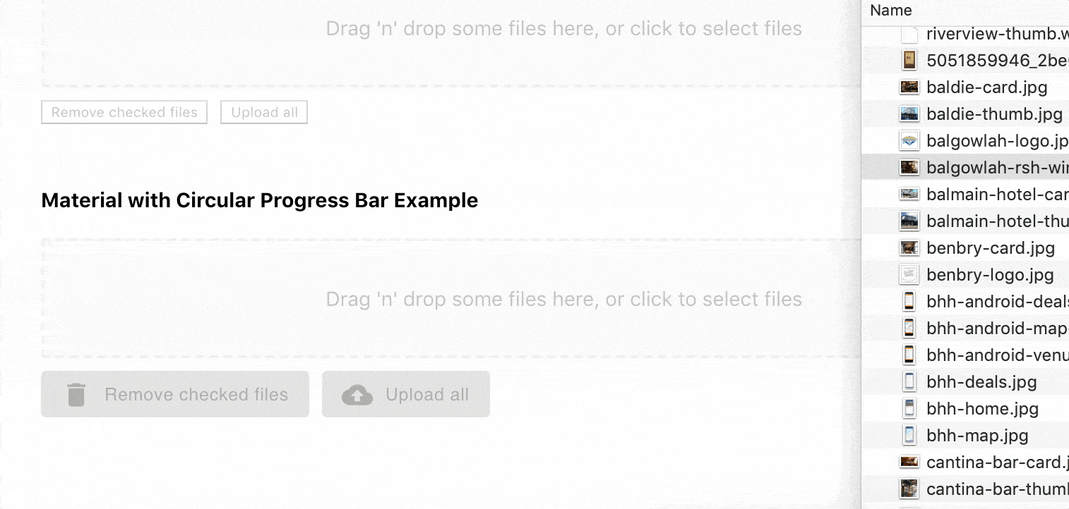
<h4>Material with Circular Progress Bar Example</h4>
<ReactFirebaseImageUploader
firebaseApp={firebaseApp}
storageFolder="rfiu-test"
progressControl={CircularProgressbar}
checkboxControl={Checkbox}
buttonControl={Button}
uploadButtonIcon={CloudUploadIcon}
removeButtonIcon={DeleteIcon}
options={{
styles: {
imgPreview: { maxWidth: "50px" },
imgPreviewLabel: { fontSize: "12px" },
progressControlWrapper: { height: "40px", width: "40px" }
}
}}
uploadCompleteCallback={statusObj => {
console.log("uploadCompleteCallback triggered, and we're done!, statusObj", statusObj);
}}
multiple
/>
</div>
</>
) : (
<div>Login to upload images</div>
)}
</div>
</div>
);
};
export default withFirebaseAuth({
providers,
firebaseAppAuth
})(App);
Contributing
You're a Dev and you want implement a fix or add a feature? Read the instructions on how to contribute to the this package.
Changes
Read the change log.
Acknowledges
This package is really just a stiching together of two other projects, react-firebase-file-uploader and react-dropzone.