README
React forms element
Flexible and customizable component to create forms easily.
Demo
There is a demo with some examples and a form creator here. The repo with the code is this one.
Quickstart
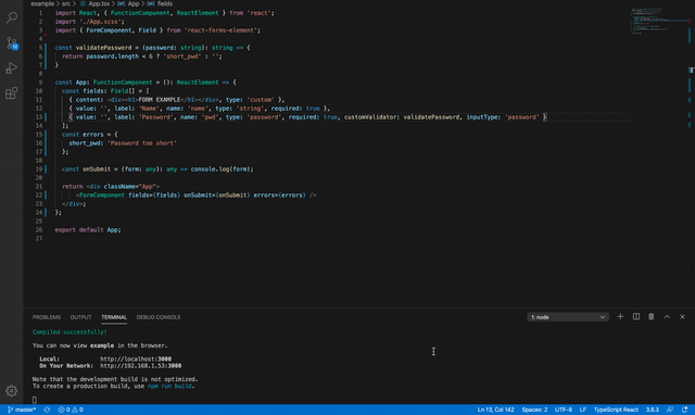
import React, { FunctionComponent, ReactElement } from 'react';
import './App.scss';
import { FormComponent, Field } from 'react-forms-element';

const validatePassword = (password: string): string => {
  return password.length < 6 ? 'short_pwd' : '';
}

const App: FunctionComponent = (): ReactElement => {
  const fields: Field[] = [
    { content: <div><h1>FORM EXAMPLE</h1></div>, type: 'custom' },
    { value: '', label: 'Name', name: 'name', type: 'string', required: true },
    { value: '', label: 'Password', name: 'pwd', type: 'password', required: true, customValidator: validatePassword, inputType: 'password' },
    { value: '', label: 'Business', name: 'business', type: 'checkbox', required: true }
  ];
  const errors = {
    short_pwd: 'Password too short'
  };

  const onSubmit = (form: any): any => console.log(form);

  return <div className="App">
      <FormComponent fields={fields} onSubmit={onSubmit} errors={errors} />
  </div>;
};

export default App;
Props and model
Default errors
| Name | Default | Description |
|---|---|---|
| required_field | Required field | Error message to show when a field is not set and is required. |
| wrong_email | Wrong email format | Error message to show when a field is of type email and the format is wrong. |
| wrong_number | Wrong number format | Error message to show when a field is of type number and the value is not a number. |
| wrong_min_n | Min value is n | Error message to show when a field is of type number and the value is lower than the min. |
| wrong_max_n | Max value is n | Error message to show when a field is of type number and the value is higher than the max. |
| no_selected | Select one option | Error message to show when a field is of type select and no option is selected. |
| no_file_selected | Select a file | Error message to show when a field is of type file and no file is selected. |
FormComponent props
| Name | Type | Required | Default | Description |
|---|---|---|---|---|
| fields | Field[] | true | - | The array of fields to create the form and display. |
| onSubmit | Function | true | - | The function to call when the form is submitted. It can return a JSON with errors where the key is the field name and the value the error code, if you want to show a non specific field error set the message in the generalError property of the JSON. |
| className | string | false | - | The class to add to the form main div. |
| errors | Record<string, string> | false | Default errors ↑ | A JSON containing the error messages, if one of above is specified it will be used, if not the default will be used. If one of your custom validations return a custom message it has to be added in this JSON (if it is not found the form will show the returned string). |
| calendarLocale | any | false | date-fns/locale/en-US | The calendar config for the date input, use the date-fns/locale option you need (check th examples). |
| submitButtonText | string | false | SEND | The submit button text. |
Field model
| Name | Type | Required | Default | Description |
|---|---|---|---|---|
| name | string | true | - | Name of the field, the returned JSON on submit will have the according value in this field. It MUST be unique. |
| value | any | false | - | Value of the field when creating the form, more details in the next table. |
| type | 'string' | 'textarea' | 'number' | 'select' | 'date' | 'checkbox' | 'file' | 'email' | 'checkbox-list' | 'list' | 'custom' | false | string | Type of the field that determines the type of input. |
| className | string | false | - | Class to add to the field container. |
| placeholder | string | false | - | Placeholder of the input. |
| title | string | false | - | Title for the fields of type list. |
| addButton | string | false | ADD | Text of the submit button for a list field. |
| label | string | ReactElement | false | - | Label for the field. |
| required | boolean | false | false | Whether the field is required or not. |
| fileType | string | false | - | Accepted file types. |
| multipleFiles | boolean | false | false | Whether to allow multiple file selection or not. |
| multipleSelected | boolean | false | false | Wheter to allow multiple option selection or not. |
| inputType | string | false | - | Type of the HTML input (for example, set tel if you want to display numbers keyboard in mobile devices). |
| customValidator | Function | false | - | A function to validate the field, it will be executed on blur and on submit. If it returns a string or a Promise, the field error will contain this string, if not the default validation will be executed. |
| content | ReactElement | false | - | The content to show for fields whose type is custom. |
| options | {label: any, value: any}[] | false | - | The array of options to show for a select or a checkbox-list input. |
| min | number | false | - | The min value of the input. |
| max | number | false | - | The max value of the input. |
| step | number | false | - | The step of the input for number fields. |
| mobileCalendar | boolean | false | - | Whether to show a different mobile friendly calendar or not when the screen width is small. |
| minDate | Date | false | - | Min date for date input. |
| maxDate | Date | false | - | Max date for date input. |
| onChange | Function | false | - | Function to call when the field value changes. |
| onBlur | Function | false | - | Function to call when the field blur event is triggered. |
| fields | Field[] | false | - | Fields to show for a list component, more details in the next table. |
| showInList | boolean | false | - | Fields of type list show a table with the current value, only the values of the fields with showInList as true will be shown. |
| listLabel | string | false | - | Fields of type list show a table with the current value, listLabel will be shown in the table header. If it is not defined label will be set as header for this field. |
| formatDate | Function | false | - | Function to call when showing a date in the list table of values. |
| dateFormat | string | false | dd/MM/yyyy | Date format for the date input. |
| onSubmit | Function | false | - | Function called when the form of a list element is submitted. |
Field types
| Type | Accepted values | Description |
|---|---|---|
| string | string | The string value. |
| textarea | string | The string value. |
| string | The email value. | |
| number | string | number | The number value, if it is not a valid number the validation will fail. |
| string | The email value. | |
| select | any | The selected value of the select input when it is not multipleSelected. |
| select | any[] | The array of the selected values of the select input when it is multipleSelected. |
| date | Date | The date value. |
| checkbox | boolean | The checkbox value. |
| checkbox-list | string[] | The checkbox selected values. |
| file | File | string | The File object or an url of the file. |
| file | File[] | string[] | The array of file objects or urls. |
| list | any[] | The array of custom objects. |
Custom styling
Provide a className attribute to the field you want to style or override the classes used by default:
| Class | Element |
|---|---|
| form-component | The main div that contains the form. |
| field | Container of the input. |
| input-error | Set to the input elements to paint the border when there is an error. |
| title | Title of the a list field. |
| submit-container | Container of the submit button. |
| error | Error messages. |
| select-component | Container of the select input. |
| date-component | Container of the date input. |
| file-component | Container of the file input. |
| list-component | Container of the list input. |
| checkbox-component | Container of the checkbox input. |
Support
Did you enjoy React Forms Element? Do you find it useful? Feel free to contribute and buy me a cup of coffee if you want to help!