README
react-igmweb
Global component packages for React & Bootstrap4:
- Login
- Notification
- Alert Confirm
- Pagination
- Table
- Modal
- Typeahead
- Calendar
- Loader
Global utilities for React:
- DownloadCSV
Instalation
To install, you can use npm or yarn:
npm install react-igmweb --save

or

yarn add react-igmweb
Usage
Example:
import {
    IGMLogin,
    IGMNotification,
    IGMAlertConfirm,
    IGMPagination,
    IGMTable,
    IGMModal,
    IGMTypeahead,
    IGMUtilidades,
    IGMCalendar,
    IGMOnBeforeUnload,
    IGMLoader
} from 'react-igmweb';
Login
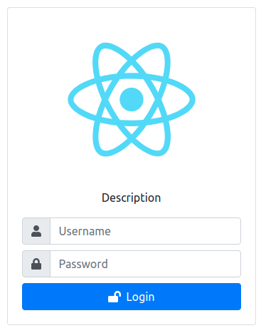
<IGMLogin
    className="myLogin"
    logo={logo}
    description={description}
    onLogin={(data)=>{/* object data*/}}/>
| Props | Options | Default | Description |
|---|---|---|---|
| className | String | none | Custom styles |
| logo | String | none | String URL image |
| description | String | none | Description for the login |
| onLogin | Function | none | Callback method |
Notification

onLogin = (datos) => {
    IGMNotification({
        classContainer: 'myNotification',
        text: 'Mensaje de pruebas',
        type: 'success',
        timer: 2000
    })
}

/*text HTML*/
onLogin = (datos) => {
    IGMNotification({
        classContainer: 'myNotification',
        html: '<h1>Text h1</h1>',
        type: 'success',
        timer: 2000
    })
}
| Props | Options | Default | Description |
|---|---|---|---|
| classContainer | String | none | Custom styles for the Modal |
| text | String | none | Description for the Modal |
| html | String HTML | none | Description HTML for the Modal |
| type | String | none | The type of the Modal: warning, error, success, info, and question |
| timer | Number | 3500 | Auto close timer of the Modal. Set in ms (milliseconds) |
Alert confirm

onClickConfirm = () => {
    IGMAlertConfirm({
        confirmButtonColor: '#3085d6',
        cancelButtonColor: '#aaa',
        position: 'center',
        title: 'title',
        text: 'text',
        type: 'success',
        confirmButtonText:'Ok',
        cancelButtonText: 'Cancel',
        allowOutsideClick: false,
        preConfirm: ()=> {
            /*Function to execute before confirm, may be async (Promise-returning) or sync*/
            return fetch(`[URL]`)
              .then(response => {
                //..
                //onConfirm
                return {value:true}
              })
              .catch(error => {
                //...
                //onConfirm
                return {value:true}
              })
        },
        onConfirm: ()=> {
            console.log('confirm')
        },
        onCancel: ()=> {
            console.log('cancel')
        }
    })
}
| Props | Options | Default | Description |
|---|---|---|---|
| confirmButtonColor | String | '#3085d6' | Use this to change the background color of the "Confirm"-button. The default color is #3085d6 |
| cancelButtonColor | String | '#aaa' | Use this to change the background color of the "Cancel"-button. The default color is #aaa |
| position | String | center | Modal window position, can be 'top', 'top-start', 'top-end', 'center', 'center-start', 'center-end', 'bottom', 'bottom-start', or 'bottom-end' |
| title | String | none | Title for the Alert |
| text | String | none | Text for the Alert |
| type | String | none | The type of the Alert: warning, error, success, info, and question |
| onConfirm | Function | none | Callback method for Confirm |
| onCancel | Function | none | Callback method for Cancel |
| confirmButtonText | String | 'Ok' | Text button confirm |
| cancelButtonText | String | 'Cancel' | Text button cancel |
| showCancelBtn | boolean | true | Set to false to remove cancel button |
| showCloseBtn | boolean | true | Set to false to remove close button |
| allowOutsideClick | boolean | false | f set to false, the user can't dismiss the modal by clicking outside it. |
| You can also pass a custom function returning a boolean value, e.g. if you want to disable outside clicks for the loading state of a modal. |
Pagination

<IGMPagination
    total={100}
    itemsPag={5}
    pag={pag}
    onPagination={(pag) => {/* pag selected */}}/>
| Props | Options | Default | Description |
|---|---|---|---|
| total | Number | none | Total items |
| itemsPag | Number | none | Items per page |
| pag | Number | none | Actual page |
| onPagination | Function | none | Callback method for return selected page |
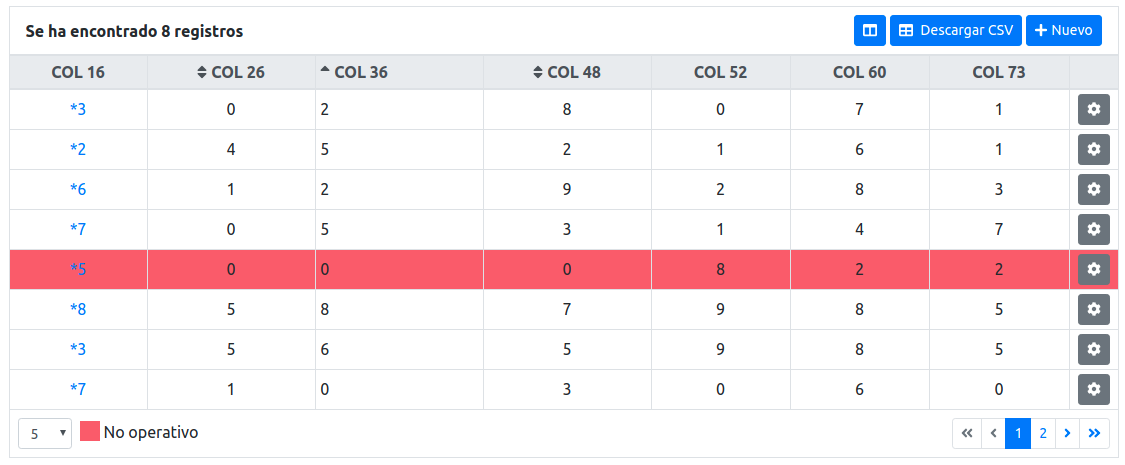
Table
<IGMTable
    className={"myTable"}
    header={header}
    visible={visible}
    body={body}
    pagination={pagination}
    selectItemPag={selectItemPag}
    options={options}
    loading={loading}
    order={order}
/>
| Props | Options | Default | Description |
|---|---|---|---|
| className | String | none | Custom styles |
| header | Object | none | Data header |
| body | Object | Array | Data body |
| options | Object | none | Options for the table |
| visible | Object | none | Columns visible |
| pagination | Object | none | Config pagination |
| selectItemPag | Object | none | Config items by page |
| loading | Object | none | Config loading |
| order | Object | none | Config order |
Example:
let header = [
    {key: 'col1', value: 'COLUMNA 1', className: 'text-left', order: 'asc'},
    {key: 'col2', value: 'COLUMNA 2', className: 'text-left'},
    {key: 'col3', value: 'COLUMNA 3', className: 'text-left'}
]

let body = [
    { col1: 0, col2: 1, col3: 3},
    { col1: 1, col2: 3, col3: 6},
    { col1: 2, col2: 5, col3: 9},
    { col1: 3, col2: 7, col3: 12},
    { col1: 4, col2: 9, col3: 15},
    { col1: 5, col2: 11, col3: 18}
]

let options = {
    table: {
        align: 'center',
        size: 'sm',
        color: 'dark',
        striped: false,
        bordered: true,
        borderless: false,
        hover: false
    },
    thead: {
        showHeaderResultados: true,
        showHeaderCabecera:true,
        textNone: 'No se ha encontrado registros',
        textOnly: 'Se ha encontrado {X} registro',
        textMore: 'Se ha encontrado {X} registros',
        color: 'light'
    },
    actions: ['get', 'update', 'delete', 'historial', 'export', 'create'],
    textActions: {
        get: 'Ver',
        update: 'Modificar',
        delete: 'Suprimir',
        historial: 'Cambios históricos',
        create: 'Nuevo',
        export: 'Descargar CSV',
    },
    callbacks: {
        onGet: (item, index) => {/**/},
        onUpdate: (item, index) => {/**/},
        onDelete: (item, index) => {/**/},
        onHistorial: (item, index) => {/**/},
        onExport: ()=> {/**/},
        onOrder: (item) => {/**/},
        onCreate: ()=> {/**/},
    },
    leyendas: [
        {text: 'No operativo', color: '#F45B67' }
    ],
    onColorRow: (item) => {
        /* Por si necesitamos colorear una row */
        if (item.col1 === 5) return '#F45B67'
        return ''
    },
    onFormatCell: (item, key, idxRow, idxCol, currentPage) => {
        /* Por si queremos formatear el valor de una celda */
        if (key === 'col1' && item[key] === 'S') return 'Sí'
        return item[key]
    },
    onFormatCellHead: (item, idxCol) => {
        /* Por si queremos formatear el valor de una celda del thead */
        if (item.key === 'col1') {
            return <button>*</button>
        }
        return item.value
    },
    onFormatCellAction: (item, index, action) => {
        /* Mostrar o ocultar el botón de action (get, update, delete, ..) en la celda de la fila segun sus datos */
        return true
    },
    onClassCell: (key, item, idxRow, idxCol) => {
        /* Por si queremos incluir classes de estilos a una celda (<td>)*/
        return ''
    },
    otherComponentsThead: () => {
        /* Añadir cualquier otro componente en el Thead */
        return (
            <>
                <button type="button" className="btn btn-sm btn-dark ml-1">Otro</button>
            </>
        )
    }
}

let visible = {
    show: true,
    cols: ['col1', 'col2', 'col3', 'col4'],
    onVisible: (data)=> {
        /* array visible keys columns */
        console.log('onVisible', data)
    }
}

let paginacion = {
    total: 100,
    itemsPag: 5,
    pag: 1,
    onPagination: (pag) => {/* pag selected */}
}

let selectItemPag = {
    options: ['5', '15', '30'],
    callback: (item) => {
        /* item selected */
    }
}

let loading = {
    show: true,
    message: 'Loading, please wait',
    renderChildren: true,
    type: 'ball-beat',
    color: '#02a17c',
    export: true // loading exportar
}

let order = {
    cols: ['col2', 'col3', 'col4'], // show columns with order
}
Más info:
Modal
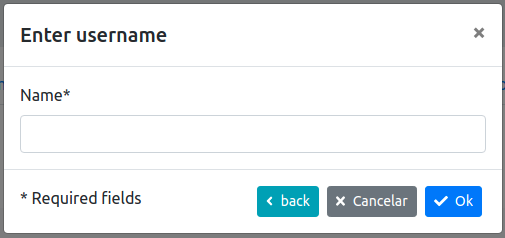
<IGMModal
    className="myModal"
    show={show}
    options={options}
    disableConfirm={false}
    loading={false}>
        <form>
            <label>Username</label>
            <input type="text" className="form-control"/>
        </form>
</IGMModal>
| Props | Options | Default | Description |
|---|---|---|---|
| className | String | none | Custom styles |
| show | Boolean | false | Show/Hide modal |
| options | Object | none | Options for the modal |
| disableConfirm | Boolean | none | Disabled button confirm |
| loading | Boolean | false | Loading content modal |
Example:
const options = {
    title:'Enter username',
    onOk: (action) => {/* 'OK' */},
    onCancel: (action) => {/* 'CANCEL' */},
    onBackdrop: (action) => {/* 'OUT' */},
    onOther: (action) => {/* 'OTHER' */},
    onClose: (action) => {/* 'CLOSE' */},
    textOk: 'Ok',
    textCancel: 'Cancelar',
    size: '', // sm, lg (size modal)
    btSize: 'sm', // sm, lg (size button OK, Cancel)
    iconButton: true,
    iconOK: faCheck, // 'add', 'update', 'ok' or Object Font Awesome (ex: faUsers) --> import {faCheck} from "@fortawesome/free-solid-svg-icons";
    iconCancel: faTimes,
    colorOk: 'primary', // ('primary', 'secondary', 'success', 'danger', 'warning', 'info', 'light', 'dark', 'link')
    colorCancel: 'secondary',
    textOther:'back',
    colorOther:'info',
    iconOther: faAngleLeft,
    footer: {
        textHtml: '* Required fields'
    }
}
Typeahead
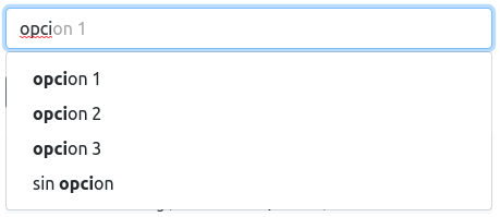
<IGMTypeahead
    isValid="{isValid}"
    mounted={flag}
    defaultInputValue={defaultInput}
    isLoading={loading}
    config={config}
    options={options}
    onSearch={onSearch}
    onChange={onChange}
    onKeyDown={onKeyDown}
    clear={clear}
    onBlur={onBlur}
    onInputChange={onInputChange}
    />
| Props | Options | Default | Description |
|---|---|---|---|
| isValid | Boolean | null | show input error/ok validation |
| mounted | Boolean | none | Mounted/Unmounted component |
| defaultInputValue | String | none | The initial value displayed in the text input |
| isLoading | Boolean | none | Show/Hide loading icon |
| config | Object | none | Configuration for the Typeahead |
| options | Array | none | Data |
| onSearch | Callback method | none | Callback to perform when the search is executed. query is the text string entered by the user. |
| onChange | Callback method | none | Invoked when the set of selections changes |
| onKeyDown | Callback method | none | Invoked when a key is pressed. Receives an event |
| clear | Boolean | false | Clear input text |
| onBlur | Callback method | none | Invoked when the input is blurred. Receives an event. |
| onInputChange | Callback method | none | Invoked when the input value changes. Receives the string value of the input (text), as well as the original event. |
While the component relies primarily on Bootstrap for styles, some additional CSS is necessary for everything to behave correctly. You must include the provided CSS file in your project:
// Import as a module in your JS
import 'react-bootstrap-typeahead/css/Typeahead.css';
let config = {
    id: 'idsearch',
    promptText: 'No hay registro',
    searchText: 'Buscando...',
    labelKey: 'text',
    filterBy: ['text'], // List searching
    placeholder: 'Buscar...',
    minLength: 3,
    size: 'sm' // "large", "lg", "small", "sm"
}

const onSearch = (text) => {
    /* execute request */
    // ...
    setOptions([
        {id: '1', text: 'opcion 1'},
        {id: '2', text: 'opcion 2'},
        {id: '3', text: 'opcion 3'}
    ])
}

const onChange = (search) => {
    /* Object selected */
}
const onKeyDown = (e) => {
    console.log(e.key)
}
const onInputChange = (text) => {
    console.log(text)
}
Calendar
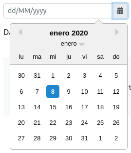
<IGMCalendar
    startDate={startDate}
    callback={(date, isEmpty) => { setStartDate(date) }}
/>
| Props | Type | Default | Description |
|---|---|---|---|
| startDate | Date | null | Date calendar |
| callback | Function | null | Callback set date |
| className | String | null | custom styles |
| isInvalid | Boolean | false | show error date invalid |
| size | String | null | Size calendar ('sm', 'lg') |
| dateFormat | String | 'dd/MM/yyyy' | Format date |
| locale | String | 'es' | Locale date |
| minDate | Date | null | Minimum date |
| maxDate | Date | null | Maximum date |
| disabled | Boolean | false | Calendar disabled |
| readOnly | Boolean | false | Calendar readOnly |
| showMonthDropdown | Boolean | true | Show month select |
| showYearDropdown | Boolean | false | Show year select |
| showPopperArrow | Boolean | false | Show arrow popper |
| popperPlacement | String | 'bottom-end' | Position calendar ('bottom-end','top-end', 'top-start', 'bottom-start') |
| tabIndex | Number | 1 | Position z-Index calendar |
| maskChar | String | '_' | Character mask |
Loader
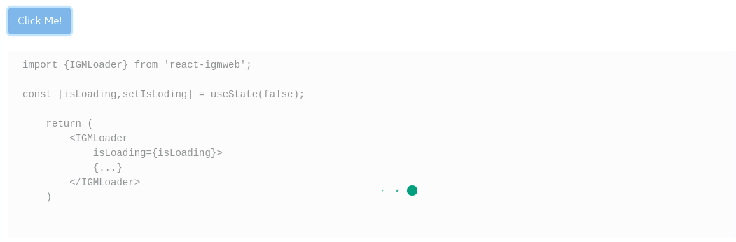
<IGMLoader
    isLoading={isLoading}
/>
| Props | Type | Default | Description |
|---|---|---|---|
| isLoading | Boolean | null | Show loading |
| isFullscreen | Boolean | true | Overlay fullscreen loading |
Utilidades
DownloadCSV
DownloadCSV is a function that allows you to download a csv file from some data information.
import { IGMUtilidades } from 'react-igmweb'
IGMUtilidades.downloadCSV(fileName, dataCSV, DataType)
| Parameters | Options | Default | Description |
|---|---|---|---|
| fileName | String | file.csv | The name of the file without extension |
| dataCSV | String, Array of arrays, Arrays of objects | none | The information of the table |
| DataType | String | String | The type of data that you are sending: 'String', 'Arrays' or 'Objects' |
This function accepts three kind of data types:
- A string concatenated variable separating each value with symbols or characters like ';'.
let dataCSV = "name;city;age\nkoldo;barcelona;38\npedro;sabadell;25"

IGMUtilidades.downloadCSV('example', dataCSV, 'String')
- An array of arrays with the header in the first position: dataCSV[0].
let dataCSV = [
    ["Name", "City", "Age"],
    ["Koldo", "Barcelona", 38],
    ["Jaime", "Málaga", 32],
    ["Javi", "Masnou", 35],
]

IGMUtilidades.downloadCSV('example', dataCSV, 'Arrays')
- An array of objects.
let dataCSV = [
    {name: 'Silvia', city:'Hospitalet', age: 32},
    {name: 'Silvia', city:'La Escala', age: 30},
    {name: 'Pedro Fernando', city:'Sabadell', age: 32}
]

IGMUtilidades.downloadCSV('example', dataCSV, 'Objects')