README
React Layout Areas
🍫 Powerful component-based layouts built with CSS Grid areas.
npm i --save react-layout-areas
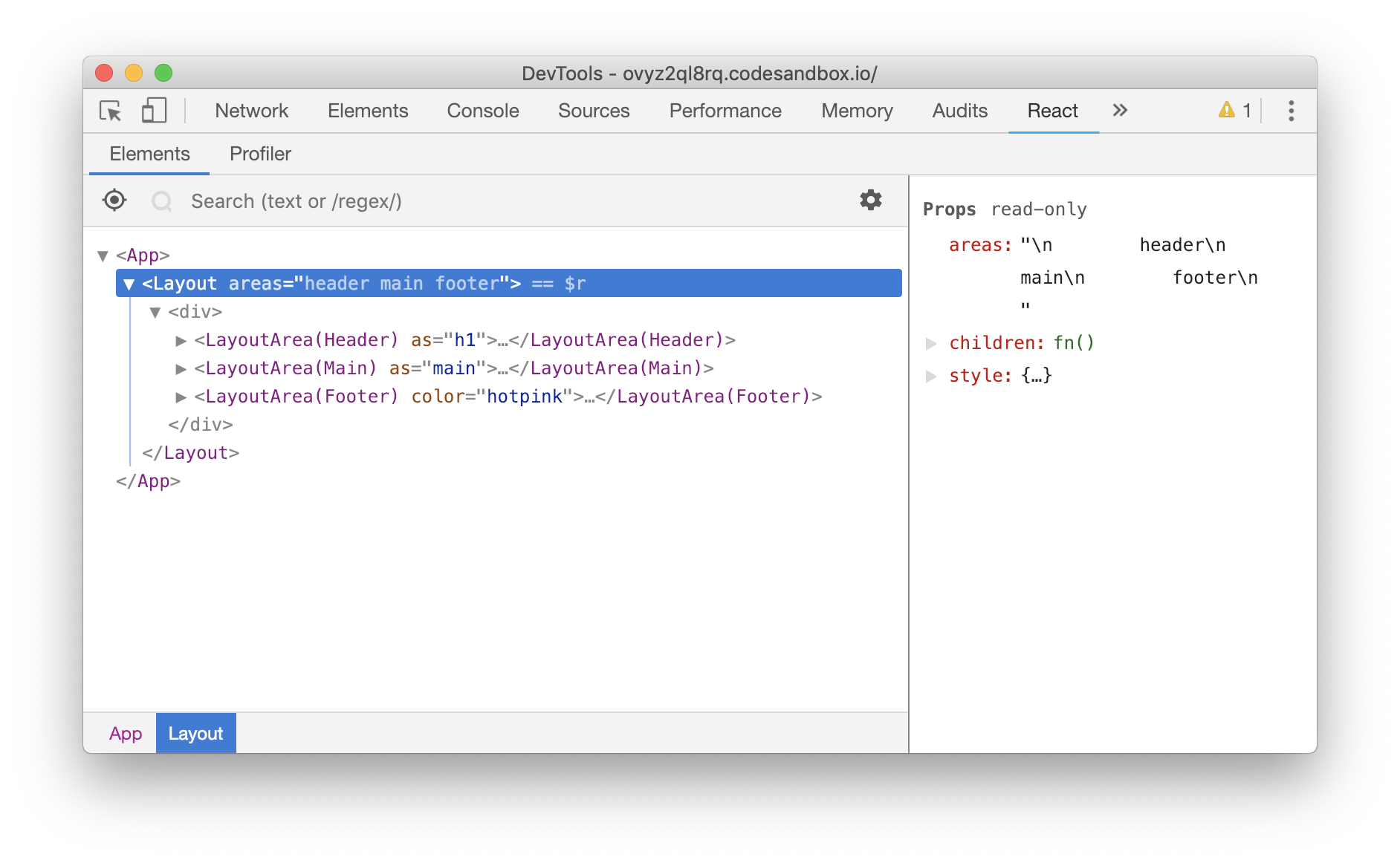
The library exports a Layout component that gets an areas prop to define grid template areas.
The Layout component generates matching components for each area defined in the areas template and calls its children with them.
import React from "react";
import Layout from "react-layout-areas";

function App() {
  return (
    <Layout
      areas={`
        header
        main
        footer
      `}
      style={{
        // Define the size of each area via regular css values
        // this can also be done with a className.
        gridTemplate: "1em 1fr 1em / 1fr",
        height: "100vh"
      }}
    >
      {({ Header, Main, Footer }) => (
        <>
          <Header as="h1" style={{ margin: 0 }}>
            howdy
          </Header>
          <Main as="main">main</Main>
          <Footer as={FooterComponent} color="hotpink">
            footer
          </Footer>
        </>
      )}
    </Layout>
  );
}
produces
Prior work and the reasoning behind this library
This library was inspired by atomic-layout and the amazing work of Artem Zakharchenko. I highly recommend you to watch the talk he gave at React Vienna in 2018.
I always believed that in order to reach the composition holy grail a layout shouldn't be built in UI components but rather created with ad-hoc layout components. You can read in length about this topic on my blog and in the SUIT CSS docs.
The reason why I implemented this library is because I wanted it to be simpler than atomic-layout and with 0 dependencies.
Responsive Grids
Because I wanted to keep the library (API) minimal I decided to not include any built-in machinary to make responsive grids (areas).
Responsive layouts can be implemented by changing the template areas prop and either the window.matchMedia API or ResizeObserver.
API
type LayoutProps = {
  // A valid grid-template-areas value.
  // See https://developer.mozilla.org/en-US/docs/Web/CSS/grid-template-areas
  areas: string,

  // By default the Layout component renders a div
  // but it can take an element name (string)
  // or another component to render.
  as?: string | React.ComponentType<*>,

  // Optional, inline o block level grids.
  display?: 'inline' | 'block'
}
// Passed to the children function. eg Header
type LayoutAreaProps = {
  // By default the Layout component renders a div
  // but it can take an element name (string)
  // or another component to render.
  as?: string | React.ComponentType<*>
}
Note that all the components use inline styles, therefore when setting the as prop to a React.ComponentType, the component needs to spread the style prop to its root element.
LICENSE
MIT