react-native-alert-utils
This lib provide some basic types of alert on your app.
Usage
import AlertProvider from 'react-native-alert-utils';

<Providers>
    <NavigationProvider>
        <Router />
------> <AlertProvider />
    </NavigationProvider>
</Providers>
After set provider on your root app, you can use methods to show modal inside your screens, by default, you can all customize your modal, defining the component will'be show, but, if you like a fast usage, we provide a basic layout of modal.
Showing modal
import { setModal } from 'react-native-alert-utils';
import { SimpleLayout } from 'react-native-alert-utils/Layout';
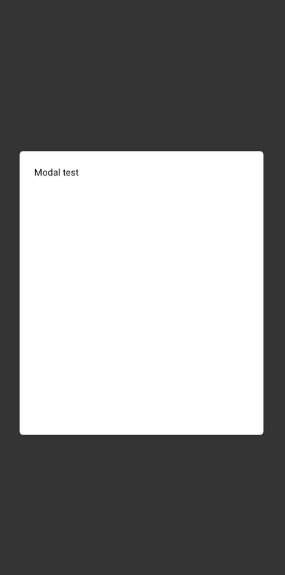
const Screen = () => {
const SimpleModal = () =>
<SimpleLayout>
<Text>Modal test</Text>
</SimpleLayout>
return (
<View>
<Button onPress={() => setModal(<SimpleModal />)} />
</View>
)
}
Methods
| Name |
Params |
Description |
| pushModal |
Component[] |
Push list of components to screen |
| popModal |
|
Pop first modal of screen, if exists |
| setModal |
Component, Options? |
Set modal on screen, you can add some options using a object |
| hideModal |
|
Hide modal from screen |
| showModal |
|
Show modal on screen if have some |
Layouts
You can get layouts from:
import { ... } from 'react-native-alert-utils/Layout'
| Name |
Props |
Description |
| SimpleLayout |
Container |
Simple layout used on example |
Types
Options
| Name |
Type |
Required |
Default |
Description |
| fixed |
boolean |
No |
false |
If true, the modal cannot be hide on click outside, then you need to provide way to hide. |
Container
| Name |
Type |
Required |
Default |
|
| backgroundColor |
string |
false |
#FFF |
|
| height |
number | % |
false |
50% |
|
| width |
number | % |
false |
90% |
|
| padding |
number |
false |
20 |
|