README
Based on johanneslumpe's react-native-selectablesectionlistview, thanks to him for the awesome component!
99% of this component was done by @johanneslumpe, and I just replaced the deprecated API for newer react native version(>=0.13), and used a little trick to support both iOS and Android platforms.
You can find this component on npm:
npm install react-native-alphabetlistview --save
Changelog
- v2.0.0
- Support RN 0.25+.(Thanks @mbernardeau). If you have problem with an earlier version of RN, try v0.1.3.
Following is the original readme
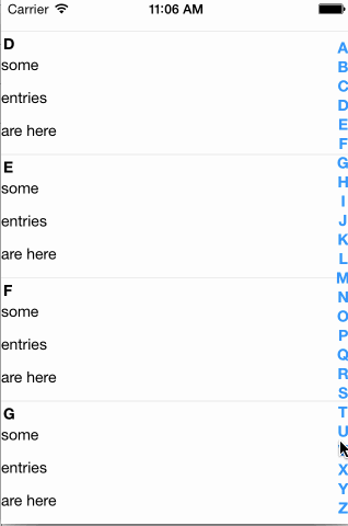
A Listview with a sidebar to directly jump to sections.
Please file issues for missing features or bugs.
I apologize for the bad name.
Usage
The most basic way to use this component is as follows:
var AlphabetListView = require('react-native-alphabetlistview');

// inside your render function
<AlphabetListView
  data={yourData}
  cell={YourCellComponent}
  cellHeight={100}
  sectionHeaderHeight={22.5}
/>
You can find a more complete example below
Props
SelectableSectionsListView
All props are passed through to the underlying ListView, so you can specify all the available props for ListView normally - except the following, which are defined internally and will be overwritten:
onScrollonScrollAnimationEnddataSourcerenderRowrenderSectionHeader
data
array|object, required
The data to render in the listview
hideSectionList
boolean
Whether to show the section listing or not. Note: If the data your are providing to
the component is an array, the section list will automatically be hidden.
getSectionTitle
function
Function to provide titles for the section headers
getSectionListTitle
function
Function to provide titles for the section list items
onCellSelect
function
Callback which should be called when a cell has been selected
onScrollToSection
function
Callback which should be called when the user scrolls to a section
cell
function required
The cell component to render for each row
sectionListItem
function
A custom component to render for each section list item
sectionHeader
function
A custom component to render for each section header
footer
function
A custom component to render as footer
This props takes precedence over renderFooter
renderFooter
function
A custom function which has to return a valid React element, which will be
used as footer.
header
function
A custom component to render as header
This props takes precedence over renderHeader
renderHeader
function
A custom function which has to return a valid React element, which will be used as header.
headerHeight
number
The height of the rendered header element.
Is required if a header element is used, so the positions can be calculated correctly
cellProps
object
An object containing additional props, which will be passed to each cell component
sectionHeaderHeight
number required
The height of the section header component
cellHeight
number required
The height of the cell component
useDynamicHeights
boolean
Whether to determine the y position to scroll to by calculating header and cell heights or by using the UIManager to measure the position of the destination element. Defaults to false
This is an experimental feature. For it to work properly you will most likely have to experiment with different values for scrollRenderAheadDistance, depending on the size of your data set.
updateScrollState
boolean
Whether to set the current y offset as state and pass it to each cell during re-rendering
style
object|number
Styles to pass to the container
sectionListStyle
object|number
Styles to pass to the section list container
sectionListFontStyle
object|number
Styles to pass to the section list letters
Cell component
These props are automatically passed to your component. In addition to these, your cell will receive all props which you specified in the object you passed as cellProps prop to the listview.
index
number
The index of the cell inside the current section
sectionId
string
The id of the parent section
isFirst
boolean
Whether the cell is the first in the section
isLast
boolean
Whether the cell is the last in the section
item
mixed
The item to render
offsetY
number
The current y offset of the list view
If you do not specify updateScrollState={true} for the list component, this props will always be 0
onSelect
function
The function which should be called when a cell is being selected
Section list item component
These props are automatically passed to your component
sectionId
string
The id of the parent section
title
string
The title for this section. Either the return value of getSectionListTitle or the same value as sectionId
Example
class SectionHeader extends Component {
  render() {
    // inline styles used for brevity, use a stylesheet when possible
    var textStyle = {
      textAlign:'center',
      color:'#fff',
      fontWeight:'700',
      fontSize:16
    };

    var viewStyle = {
      backgroundColor: '#ccc'
    };
    return (
      <View style={viewStyle}>
        <Text style={textStyle}>{this.props.title}</Text>
      </View>
    );
  }
}

class SectionItem extends Component {
  render() {
    return (
      <Text style={{color:'#f00'}}>{this.props.title}</Text>
    );
  }
}

class Cell extends Component {
  render() {
    return (
      <View style={{height:30}}>
        <Text>{this.props.item}</Text>
      </View>
    );
  }
}

class MyComponent extends Component {

  constructor(props, context) {
    super(props, context);

    this.state = {
      data: {
        A: ['some','entries','are here'],
        B: ['some','entries','are here'],
        C: ['some','entries','are here'],
        D: ['some','entries','are here'],
        E: ['some','entries','are here'],
        F: ['some','entries','are here'],
        G: ['some','entries','are here'],
        H: ['some','entries','are here'],
        I: ['some','entries','are here'],
        J: ['some','entries','are here'],
        K: ['some','entries','are here'],
        L: ['some','entries','are here'],
        M: ['some','entries','are here'],
        N: ['some','entries','are here'],
        O: ['some','entries','are here'],
        P: ['some','entries','are here'],
        Q: ['some','entries','are here'],
        R: ['some','entries','are here'],
        S: ['some','entries','are here'],
        T: ['some','entries','are here'],
        U: ['some','entries','are here'],
        V: ['some','entries','are here'],
        W: ['some','entries','are here'],
        X: ['some','entries','are here'],
        Y: ['some','entries','are here'],
        Z: ['some','entries','are here'],
      }
    };
  }

  render() {
    return (
      <AlphabetListView
        data={this.state.data}
        cell={Cell}
        cellHeight={30}
        sectionListItem={SectionItem}
        sectionHeader={SectionHeader}
        sectionHeaderHeight={22.5}
      />
    );
  }
}