README

React Native Awesome Alerts
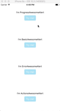
Demo (Watch it on YouTube)
Getting Started
Installation
$ npm i react-native-awesome-alerts --save
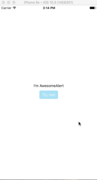
Basic Usage
import React from 'react';
import { StyleSheet, View, Text, TouchableOpacity } from 'react-native';

import AwesomeAlert from 'react-native-awesome-alerts';

export default class App extends React.Component {

  constructor(props) {
    super(props);
    this.state = { showAlert: false };
  };

  showAlert = () => {
    this.setState({
      showAlert: true
    });
  };

  hideAlert = () => {
    this.setState({
      showAlert: false
    });
  };

  render() {
    const {showAlert} = this.state;

    return (
      <View style={styles.container}>

        <Text>I'm AwesomeAlert</Text>
        <TouchableOpacity onPress={() => {
          this.showAlert();
        }}>
          <View style={styles.button}>
            <Text style={styles.text}>Try me!</Text>
          </View>
        </TouchableOpacity>

        <AwesomeAlert
          show={showAlert}
          showProgress={false}
          title="AwesomeAlert"
          message="I have a message for you!"
          closeOnTouchOutside={true}
          closeOnHardwareBackPress={false}
          showCancelButton={true}
          showConfirmButton={true}
          cancelText="No, cancel"
          confirmText="Yes, delete it"
          confirmButtonColor="#DD6B55"
          onCancelPressed={() => {
            this.hideAlert();
          }}
          onConfirmPressed={() => {
            this.hideAlert();
          }}
        />
      </View>
    );
  };
};

const styles = StyleSheet.create({
  container: {
    flex: 1,
    alignItems: 'center',
    justifyContent: 'center',
    backgroundColor: '#fff',
  },
  button: {
    margin: 10,
    paddingHorizontal: 10,
    paddingVertical: 7,
    borderRadius: 5,
    backgroundColor: "#AEDEF4",
  },
  text: {
    color: '#fff',
    fontSize: 15
  }
});
Props
Basic
| Prop | Type | Description | Default |
|---|---|---|---|
| show | boolean |
Show / Hide awesome alert | false |
| animatedValue | number |
Animated value | 0.3 |
| useNativeDriver | boolean |
Use native driver for animations | false |
| showProgress | boolean |
Show / Hide progress bar | false |
| title | string |
Title text to display | hidden |
| message | string |
Message text to display | hidden |
| closeOnTouchOutside | bool |
Dismiss alert on clicking outside | true |
| closeOnHardwareBackPress | bool |
Dismiss alert on hardware back press (android) | true |
| showCancelButton | bool |
Show a cancel button | false |
| showConfirmButton | bool |
Show a confirmation button | false |
| cancelText | string |
Cancel button text | Cancel |
| confirmText | string |
Confirm button text | Confirm |
| onCancelPressed | func |
Action to perform when Cancel is pressed | - |
| onConfirmPressed | func |
Action to perform when Confirm is pressed | - |
| onDismiss | func |
Callback for when alert is dismissed | - |
| customView | object |
Custom view to render inside alert | null |
| modalProps | object |
Additional props to pass for Modal | - |
| confirmButtonTestID | string |
Confirm button testID | awesome-alert-confirm-btn |
| cancelButtonTestID | string |
Cancel button testID | awesome-alert-cancel-btn |
Styling
| Prop | Type | Description | Default |
|---|---|---|---|
| alertContainerStyle | object |
Alert parent container style | - |
| overlayStyle | object |
Overlay style | - |
| progressSize | string |
Size of activity indicator | - |
| progressColor | string |
Color of activity indicator | - |
| contentContainerStyle | object |
Alert popup style | - |
| contentStyle | object |
Alert popup content style | - |
| titleStyle | object |
Title style | - |
| messageStyle | object |
Message style | - |
| actionContainerStyle | object |
Action container style | - |
| cancelButtonColor | string |
Background color | #D0D0D0 |
| confirmButtonColor | string |
Background color | #AEDEF4 |
| cancelButtonStyle | object |
Cancel button style | - |
| cancelButtonTextStyle | object |
Cancel button text style | - |
| confirmButtonStyle | object |
Confirm button style | - |
| confirmButtonTextStyle | object |
Confirm button text style | - |
Tests
For automated tests, buttons default to data-testid='awesome-alert-cancel-btn' and data-testID='awesome-alert-confirm-btn' properties for the cancel and confirm buttons, respectively. However, feel free to pass in your own via the props.
Inspiration
Pedant: sweet-alert-dialog (Github)
Questions
Feel free to Contact me or Create an issue
License
Released under the Mit License