README


React Native Button component
React Native Button component for iOS & Android.
Provided Components
This library provided the following button components:
ButtonComponent
CircleButton
RoundButton
RectangleButton
Note:
CircleButton, RoundButton, RectangleButton is on top of ButtonComponent. So I recommend you should use CircleButton, RoundButton, RectangleButton, rather than directly use ButtonComponent because those button components may have preset some options.
Installation
npm install --save react-native-button-componentreact-native link react-native-button-component
Note
If you didn't see this item libART.a under the Link Binary With Libraries or you get this error No component found for view with name "ARTSurfaceView"
Please open Xcode project and add libART.a under Build Phases -> Link Binary With Libraries
The detailed steps:
- Open Xcode project
- Build Phases -> Link Binary With Libraries
- Click the
+button and ClickAdd Other... - Open with
node_modules/react-native/Libraries/ART/ART.xcodeproj - Click the
+and select thelibART.aand clickAdd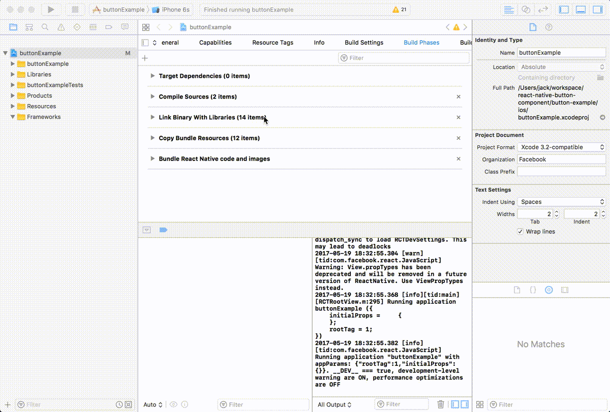
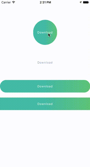
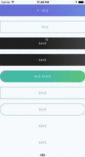
Some Simple Examples
One State ButtonMultiple States Button
Spinner Button
Progress Button
Circle Button
Documents
Props & Button OptionsOptions for Progress Button
Options for Spinner Button
Options for Circle Button
Usage - Basic
Button with one state
import ButtonComponent, { CircleButton, RoundButton, RectangleButton } from 'react-native-button-component';

// You can use CircleButton, RoundButton, RectangleButton to instead ButtonComponent
<ButtonComponent
  onPress={() => {}}
  image={require('button-image.png')}
  text="Button"
>
</ButtonComponent>
Button with multiple states
import ButtonComponent, { CircleButton, RoundButton, RectangleButton } from 'react-native-button-component';

// You can use CircleButton, RoundButton, RectangleButton to instead ButtonComponent
<ButtonComponent
  buttonState={this.state.buttonState} // "upload" or "uploading"
  states={{
    upload: {
      onPress: () => {
        this.imageUploader.upload();
        this.state.setState({ buttonState: 'uploading' });
      },
      image: require('upload-image.png'),
      text: 'Upload Image',
    },
    uploading: {
      onPress: () => {
        this.imageUploader.cancelUpload();
        this.state.setState({ buttonState: 'upload' });
      },
      spinner: true,
      text: 'Uploding Image...',
    },
  }}
>
</ButtonComponent>
Usage - With Your Configurations
Button with one state
<ButtonComponent
  text="Button"
  type="primary"
  shape="rectangle"
  backgroundColors={['#4DC7A4', '#66D37A']}
  gradientStart={{ x: 0.5, y: 1 }}
  gradientEnd={{ x: 1, y: 1 }}
  height={80}
  onPress={() => {}}
  image={require('button-image.png')}
>
</ButtonComponent>
Button with multiple states - different config for different states
import ButtonComponent, { CircleButton, RoundButton, RectangleButton } from 'react-native-button-component';

// You can use CircleButton, RoundButton, RectangleButton to instead ButtonComponent
<ButtonComponent
  buttonState={this.state.buttonState} // "upload" or "uploading"
  gradientStart={{ x: 0.5, y: 1 }}
  gradientEnd={{ x: 1, y: 1 }}
  states={{
    upload: {
      text: 'Upload Image',
      backgroundColors: ['#4DC7A4', '#66D37A'],
      image: require('upload-image.png'),
      onPress: () => {
        this.imageUploader.upload();
        this.state.setState({ buttonState: 'uploading' });
      },
    },
    uploading: {
      text: 'Uploding Image...',
      gradientStart: { x: 0.8, y: 1 },
      gradientEnd: { x: 1, y: 1 },
      backgroundColors: ['#ff4949', '#fe6060'],
      spinner: true,
      onPress: () => {
        this.imageUploader.cancelUpload();
        this.state.setState({ buttonState: 'upload' });
      },
    },
  }}
>
</ButtonComponent>
Button with multiple states - one config for different states
<ButtonComponent
  buttonState={this.state.buttonState} // "upload" or "uploading"
  gradientStart={{ x: 0.5, y: 1 }}
  gradientEnd={{ x: 1, y: 1 }}
  backgroundColors={['#4DC7A4', '#66D37A']}
  states={{
    upload: {
      text: 'Upload Image',
      image: require('upload-image.png'),
      onPress: () => {
        this.imageUploader.upload();
        this.state.setState({ buttonState: 'uploading' });
      },
    },
    uploading: {
      text: 'Uploding Image...',
      spinner: true,
      onPress: () => {
        this.imageUploader.cancelUpload();
        this.state.setState({ buttonState: 'upload' });
      },
    },
  }}
>
</ButtonComponent>
License
MIT