README
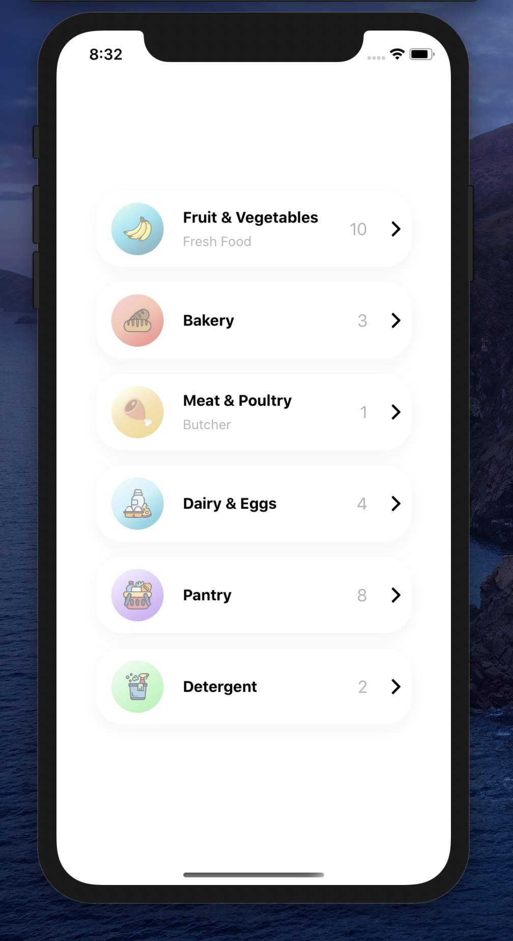
Demo
Installation
Add the dependency:
npm i react-native-category-card
Peer Dependencies
IMPORTANT! You need install them
"react": ">= 16.x.x",
"react-native": ">= 0.55.x",
"react-native-androw": ">= 0.0.34",
"react-native-linear-gradient": ">= 2.5.6",
"@freakycoder/react-native-helpers": ">= 0.1.3",
"@freakycoder/react-native-custom-text": ">= 0.0.12",
"@freakycoder/react-native-bounceable": ">= 0.1.1"
Usage
Import
import CategoryCard from "react-native-category-card";
CategoryCard Usage
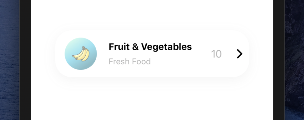
<CategoryCard onPress={() => console.log("Fruits")} />
<CategoryCard
  titleText={"Meat & Poultry"}
  customDescriptionComponent={<Text fontSize={20}>Butcher</Text>}
  count={1}
  gradientColors={["#FAF9D1", "#EECA66", "#E8B730"]}
  imageSource={require("./lib/assets/meat.png")}
  onPress={() => console.log("Meat & Poultry")}
/>
Configuration - Props
| Property | Type | Default | Description |
|---|---|---|---|
| shadowStyle | style | fdf | change the shadowStyle |
| shadowColor | string | '#757575' | change the shadowColor |
| height | number | 80 | change the containers height |
| width | number | ScreenWidth * 0.8 | change the the containers width |
| backgroundColor | string | '#fff' | change the containers backgroundColor |
| gradientColors | array | ['#9CF4DF', '#30C9E8', '#107C91'] | change the Linear Gradient Colors |
| imageStyle | style | default | change the left image style |
| imageSource | asset | default | change the image source |
| customImageComponent | component | default | set your own custom component instead of default Image one |
| titleText | style | default | change the title text |
| customTitleTextComponent | component | default | set your own custom component instead of default Text one |
| disableDescriptionText | boolean | false | change the disable description text |
| descriptionText | string | change the description text | |
| customDescriptionComponent | component | default | set your own custom component instead of default Text one |
| count | number | 10 | change the count |
| disableCountContainer | boolean | false | change the disable count container |
| customCountTextComponent | component | default | set your own custom component instead of default Text one |
| onPress | function | () | set your own function when onPress |
| rightButtonImageSource | asset | default | change the right button image source |
| buttonImageStyle | style | default | change the button image style |
Future Plans
LICENSE
Change Log
Change log will be here !
Author
Sevval Eygul, sevvalleygull@gmail.com
License
React Native Category Card is available under the MIT license. See the LICENSE file for more info.