README
React Native Collapsible Button
Installation
npm install react-native-collapsible-button
Usage
Example
import { StatusBar } from "expo-status-bar";
import React, { useState } from "react";
import { StyleSheet, Text, View } from "react-native";
import { CollapsibleButton } from "react-native-collapsible-button";
const App = () => {
const [value, setValue] = useState(true);
const handleValue = () => setValue(!value);
return (
<View style={styles.mainContainer}>
<StatusBar style="auto" />
<View style={styles.container}>
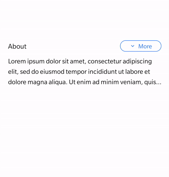
<Text style={styles.text}>About</Text>
<CollapsibleButton
value={value}
onPress={handleValue}
rippleColor="#2979FF"
textColor="#2979FF"
borderColor="#2979FF"
/>
</View>
<Text style={styles.sampleText} numberOfLines={value ? 3 : 100}>
Lorem ipsum dolor sit amet, consectetur adipiscing elit, sed do
eiusmod tempor incididunt ut labore et dolore magna aliqua. Ut
enim ad minim veniam, quis nostrud exercitation ullamco laboris
nisi ut aliquip ex ea commodo consequat. Duis aute irure dolor
in reprehenderit in voluptate velit esse cillum dolore eu fugiat
nulla pariatur. Excepteur sint occaecat cupidatat non proident,
sunt in culpa qui officia deserunt mollit anim id est laborum.
</Text>
</View>
);
};
export default App;
const styles = StyleSheet.create({
mainContainer: {
flex: 1,
padding: 20,
marginTop: 300,
},
container: {
alignItems: "center",
backgroundColor: "#fff",
justifyContent: "space-between",
flexDirection: "row",
},
text: { fontSize: 16 },
sampleText: { lineHeight: 25, marginTop: 10, fontSize: 15 },
});
Props
value
Default value of the button.
required:NO |type:boolean |default:true
onPress
Handler to be called when the user taps the button.
required:YES |type:function
width
Button width.
required:NO |type:number |default:100
borderRadius
Border radius of the button.
required:NO |type:number |default:50
borderWidth
Border width of the button.
required:NO |type:number |default:1
borderColor
Border color of the button.
required:NO |type:string |default:'#000000'
backgroundColor
Background color of the button.
required:NO |type:string |default:'transparent'
rippleCentered
Ripple starts from center.
required:NO |type:boolean |default:true
rippleColor
Ripple color
required:NO |type:string |default:'#000000'
paddingVertical and paddingHorizontal
Button padding.
required:NO |type:number |default:3
textStyle
Button text style object.
required:NO |type:object
iconSize
Icon size.
required:NO |type:number |default:15
iconColor
Icon color.
required:NO |type:string |default:'#000000'