README
React Native Group Button
I got this idea react-native-group-button from react-native-elements and changed something
Features
- You Can Use it as group of button horizontal or vertical
Installation
$ npm install react-native-group-button --save
Quick Start
import React, { Component } from 'react';
import { StyleSheet, TouchableOpacity, View } from 'react-native';
import ButtonGroup from 'react-native-gp-button';
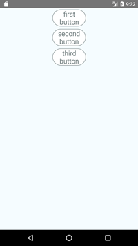
const buttons = ['first button', 'second button', 'third button'];
export default class App extends Component {
constructor(props) {
super(props);
this.state = {
selectedIndexes: []
}
}
render() {
return (
<View style={styles.container}>
<ButtonGroup
isHorizontal={false}
component={TouchableOpacity}
selectMultiple
onPress={(item) => {
this.setState({ selectedIndexes: item })
}}
selectedIndexes={this.state.selectedIndexes}
buttons={buttons}
containerStyle={styles.buttonGroupContainer}
containerBorderRadius={50}
innerBorderStyle={{ color: 'transparent' }}
buttonStyle={styles.buttonGroupStyle}
textStyle={styles.buttonTextStyle}
selectedButtonStyle={styles.buttonGroupSelectedStyle}
selectedTextStyle={styles.buttonTextSelectedStyle}
/>
</View>
);
}
}
const styles = StyleSheet.create({
container: {
flex: 1,
justifyContent: 'center',
backgroundColor: '#F5FCFF',
},
buttonGroupContainer: {
},
buttonGroupStyle: {
height: 50,
width: 100,
backgroundColor: 'white',
margin: 4,
padding: 2,
borderColor: '#6c797a',
borderWidth: 1,
borderRadius: 30,
},
buttonTextStyle: {
color: '#6c797a',
fontSize: 20,
textAlign: 'center',
},
buttonGroupSelectedStyle: {
height: 50,
width: 100,
backgroundColor: '#675beb',
borderRadius: 30,
margin: 4,
padding: 2,
borderColor: '#675beb',
borderWidth: 1
},
buttonTextSelectedStyle: {
color: '#ffffff',
fontSize: 20,
textAlign: 'center',
},
});