README
react-native-ios-popover
A react native wrapper component to use the native iOS popover by wrapping a react native view inside a UIViewController and presenting it.
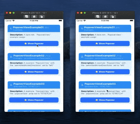
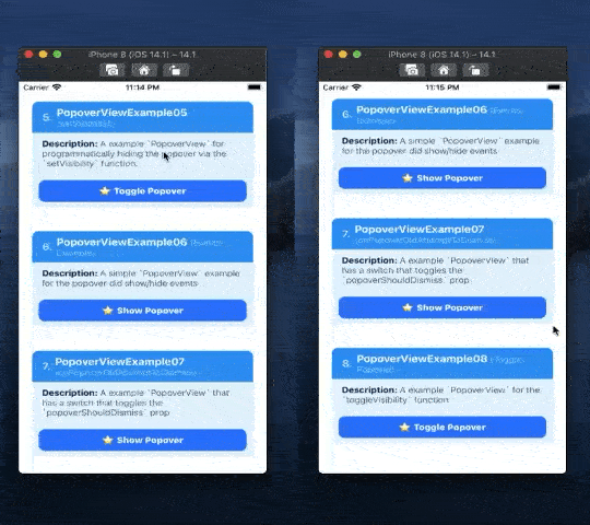
Show/Hide Gifs
PopoverView Left: Example 1, Example 2, and Right: Example 3, Example 4
PopoverView Left: Example 5, Example 6, and Right: Example 7, Example 8
🚧⚠️ Documentation WIP 🚧⚠️
(Check TODO for progress)
1. Installation
# install via npm
npm install react-native-ios-popover

# or install via yarn
yarn add react-native-ios-popover

# then run pod install (uses auto-linking)
cd ios && pod install
1.1 Installation Notes
If you encounter any errors/bugs while using this library, or want a particular feature implemented, please create an issue!
1.1.1 Xcode Build Error (Swift)
This library is written in Swift. If you are having trouble building your app after installing this library, try adding an empty swift file:
- Open up your
ios/project.xcworkspaceproject - On the project navigator panel (located on the right side of Xcode), right click on your project group (or another folder/group i.e the blue or yellow icons) and select the "New File..." option
- In the popup sheet, select "Swift" as the template and then click the "Next" button
- A "Save As" popup sheet should appear and then click "Create" (you can rename the file first if you want to)
- If Xcode asks you to create a "Objective-C Bridging Header" choose "Create Objective-C Bridging Header"
1.1.2 Cocoapods Static Libraries Error
If you encounter the following error when running pod install:
[!] The following Swift pods cannot yet be integrated as static libraries:

The Swift pod `react-native-ios-popover` depends upon `React-Core`, which does not define modules. To opt into those targets generating module maps (which is necessary to import them from Swift when building as static libraries), you may set `use_modular_headers!` globally in your Podfile, or specify `:modular_headers => true` for particular dependencies.
Then try following these steps:
- Open up your project's
ios/podfileconfiguration - Under
target 'ProjectName' doblock, find the'React-Core'pod, and append the following snippet to the end of the line:, :modular_headers => true - It should now look something similar to this:
pod 'React-Core', :path => '../node_modules/react-native/', :modular_headers => true - Try running
pod installagain.
2. Usage
Please check out the examples section or the examples directory for more on how to use it.
import { PopoverView } from "react-native-ios-popover";

function PopoverViewExample() {
  const popoverRef = useRef();

  return (
    <PopoverView
      ref={popoverRef}
      renderPopoverContent={() => (
        <View style={{padding: 20}}>
          <Text>
            {'Popover Content'}
          </Text>
        </View>
      )}
    >
      <TouchableOpacity onPress={() => {
        popoverRef.current.toggleVisibility();
      }}>
        <Text>
          {'Toggle Popover Visibility'}
        </Text>
      </TouchableOpacity>
    </PopoverView>
  );
};
3. Documentation
3.1 Modules/Components
PopoverView Props
| Prop Name | Type | Description |
|---|---|---|
renderPopoverContent |
Required: Function -> Element |
The elements to show in the popover. This prop accepts a function that returns an element. The element returned from this function will be shown in the popover. See example 1 section. |
popoverSize |
Optional: String or Object: {width: number, height: number} Default: INHERIT |
Controls the size the of the popover. This prop accepts either a String value ( i.e. a PopoverSize enum item e.g. INHERIT, STRETCH sring) or a "size" object (i.e. an object with a height and/or width property).If you provide a size object (e.g. {width: 100, height: 100}) then that object will be used for setting the size of the popover.See example 3 section. |
popoverBackgroundColor |
Optional: StringDefault: transparent |
Sets the background color of the popover. See example 4 section. |
permittedArrowDirections |
Optional: [String]Default: ["any"] |
Sets the arrow directions that you allow for the popover. Accept an array of 0 or more string values, i.e. an array of ArrowDirections enum items (e.g. up, down, etc.)Note If you pass in an empty array, then there will be no arrow shown. See example 2 section. |
lazyPopover |
Optional: BoolDefault: true |
Controls whether or not the popover content is always mounted. If set to true the popover content will only be mounted while the popover is visible.Set this to false to prevent the popover from closing. |
popoverShouldDismiss |
Optional: BoolDefault: true |
Controls whether or not a tap outside the popover will dismiss it. See example 7 section. |
popoverCanOverlapSourceViewRect |
Optional: BoolDefault: false |
Controls whether the popover can overlap its source view. If set to false the popover will avoid covering up the source view.See example 3 section. |
PopoverView Events
| Event Name | Description |
|---|---|
onPopoverDidShow |
Event that gets called after the popover is shown, i.e. this event is invoked after the popover entrance animation is finished. |
onPopoverDidHide |
Event that gets called after the popover is hidden, i.e. this event is invoked after the popover exit animation is finished. |
onPopoverWillShow |
Event that gets called before the popover is shown, i.e. this event is immediently invoked when the popover is about to become visible. |
onPopoverWillHide |
Event that gets called before the popover is hidden, i.e. this event is immediently invoked when the popover is about to become hidden. |
onPopoverDidHideViaTap |
Event that gets called before the popover is hidden due to a tap outside the popover's content, i.e. this event is immediently invoked when the popover is about to become hidden. |
onPopoverWillHideViaTap |
Event that gets called after the popover is hidden due to a tap outside the popover's content, i.e. this event is invoked after the popover exit animation is finished. |
onPopoverDidAttemptToDismiss |
This event is invoked when the popoverShouldDismiss prop is set to false, and a tap outside the popover's content is initiated to dismiss the popover. |
PopoverView Functions
| Function Name | Description |
|---|---|
async setVisibility(boolean) |
A function that you can call to set whether or not the popover is shown or hidden. This function returns a promise that gets resolved when the popover is successfully shown or hidden. This function throws an error if the popover is already hidden or shown. See Example 1 section |
async toggleVisibility() |
A function that you can call to toggle the popover's visibility. This function returns a promise that gets resolved when the popover is successfully shown or hidden. |
async getVisibility() -> Bool |
A function to query whether or not the popover is visible. Returrns a promise that resolves to a boolean value. |
3.2 Enum Values
3.2.1 PopoverSize Enum
This enum is used to for the PopoverView's popoverSize prop. Use this enum to control the size of the popover.
Import the enum like this:
import { PopoverSize } from "react-native-ios-popover";And use it like this:
{ popoverSize: PopoverSize.STRETCH }Or you can directly pass a string like this:
{ popoverSize: 'STRETCH' }
| Value | Description |
|---|---|
INHERIT |
The default value. Specifies that the popover's size should match the view you return from PopoverView.renderPopoverContent prop. It will automatically resize/scale the popover to fit the screen. |
STRETCH |
Specifies that we want the popover to be as big as possible, i.e. the popover should to stretch and fill up the screen. |
3.2.2 ArrowDirections Enum
This enum is used to for the PopoverView's permittedArrowDirections prop. This enum corresponds to the UIPopoverArrowDirection swift struct, check out the apple docs for more info.
- Import the enum like this:
import { ArrowDirections } from "react-native-ios-popover"; - And use it like this:
{ permittedArrowDirections: [ArrowDirections.up] } - Or you can directly pass a string like this:
{ permittedArrowDirections: ['up'] }
| Value | Description |
|---|---|
up |
An arrow that points upward. The popover will appear at the bottom with the arrow pointing up. |
down |
An arrow that points downward. The popover will appear at the top with the arrow pointing down. |
left |
An arrow that points toward the left. The popover will appear at the right with the arrow pointing left. |
right |
An arrow that points toward the right. The popover will appear at the left with the arrow pointing right. |
any |
An arrow that points in any direction. |
unknown |
The status of the arrow is currently unknown. |
4 Examples
Check out the examples directory. The example app contains a bunch of demos that showcases the different PopoverView configurations, props and events you can use. The assets directory contains gifs and screenshots for every example/test shown in the example app.
- Note: the section title on each example contains a link to the corresponding example code.
- Clone the repository:
git clone https://github.com/dominicstop/react-native-ios-popover.git cd react-native-ios-popover && yarn bootstrap- Go to the
react-native-ios-context-popover/exampledirectory and runyarn iosto build/launch the example app in the iOS simulator.
4.1 PopoverView Examples
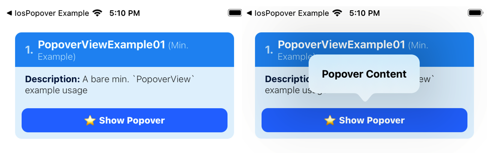
4.1.1 PopoverView Example #1
A bare minimum example showing how to present a popover via the setVisibility function.
function PopoverViewExample01() {
  const popoverRef = useRef();

  return (
    <PopoverView
      // get/store a ref to the popover component
      ref={popoverRef}
      // a function that returns the content to show
      // inside the popover
      renderPopoverContent={() => (
        <View style={{padding: 20}}>
          <Text>
            {'Popover Content'}
          </Text>
        </View>
      )}
    >
      <TouchableOpacity onPress={() => {
        // show the popover when the button is pressed
        // alt. you can call `toggleVisibility` to show/hide the popover
        popoverRef.current.setVisibility(true);
      }}>
        <Text>
          {'Show Popover'}
        </Text>
      </TouchableOpacity>
    </PopoverView>
  );
};
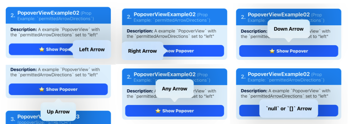
4.1.2 PopoverView Example #2
A example PopoverView for the permittedArrowDirections prop.
- This prop accepts an array of
ArrowDirectionsstring values (e.g: 'up', 'down', etc). You can also pass in an empty array or null to specify that the popover should not have an arrow. - The popover position and sizing will automatically adapt based on the
permittedArrowDirections.
function PopoverViewExample02() {
  const popoverRef = useRef();

  return(
    <PopoverView
      ref={popoverRef}
      // the allowed direction of the popover arrow.
      // accepts an array of `ArrowDirections` values,
      // e.g. "up", "down", etc.
      permittedArrowDirections={["left"]}
      renderPopoverContent={() => (
        <View style={{padding: 20}}>
          <Text>
            {'Left Arrow'}
          </Text>
        </View>
      )}
      >
      <TouchableOpacity onPress={() => {
        popoverRef.current.setVisibility(true);
      }}>
        <Text>
          {'Show Popover'}
        </Text>
      </TouchableOpacity>
    </PopoverView>
  );
};
4.1.3 PopoverView Example #3
A example PopoverView with the popoverSize prop set to "STRETCH".
- By default, the
popoverSizeprop is set toINHERITwhich means the size of the popover is determined by the size of the popover content. - However, if you set the prop to
STRETCH, the popover will be sized to be as big as possible based on thepermittedArrowDirectionsprop, its position on screen, etc.
function PopoverViewExample03() {
  const popoverRef = useRef();

  return(
    <PopoverView
      ref={popoverRef}
      // set the `popoverSize` prop to `STRETCH` to make the
      // popover as big as possible.
      popoverSize={'STRETCH'}
      // You also have to set `popoverCanOverlapSourceViewRect`
      // prop to false to prevent the popover from covering up
      // the popover source view.
      popoverCanOverlapSourceViewRect={false}
      permittedArrowDirections={["up", "down"]}
      // the style of the root popover content view must be set
      // to `{flex: 1}` so that it'll stretch to the size of the
      // popover.
      renderPopoverContent={() => (
        <View style={{flex: 1, alignItems: 'center', justifyContent: 'center'}}>
          <Text>
            {'Popover Content'}
          </Text>
        </View>
      )}
    >
      <TouchableOpacity onPress={() => {
        popoverRef.current.setVisibility(true);
      }}>
        <Text>
          {'Show Popover'}
        </Text>
      </TouchableOpacity>
    </PopoverView>
  );
};
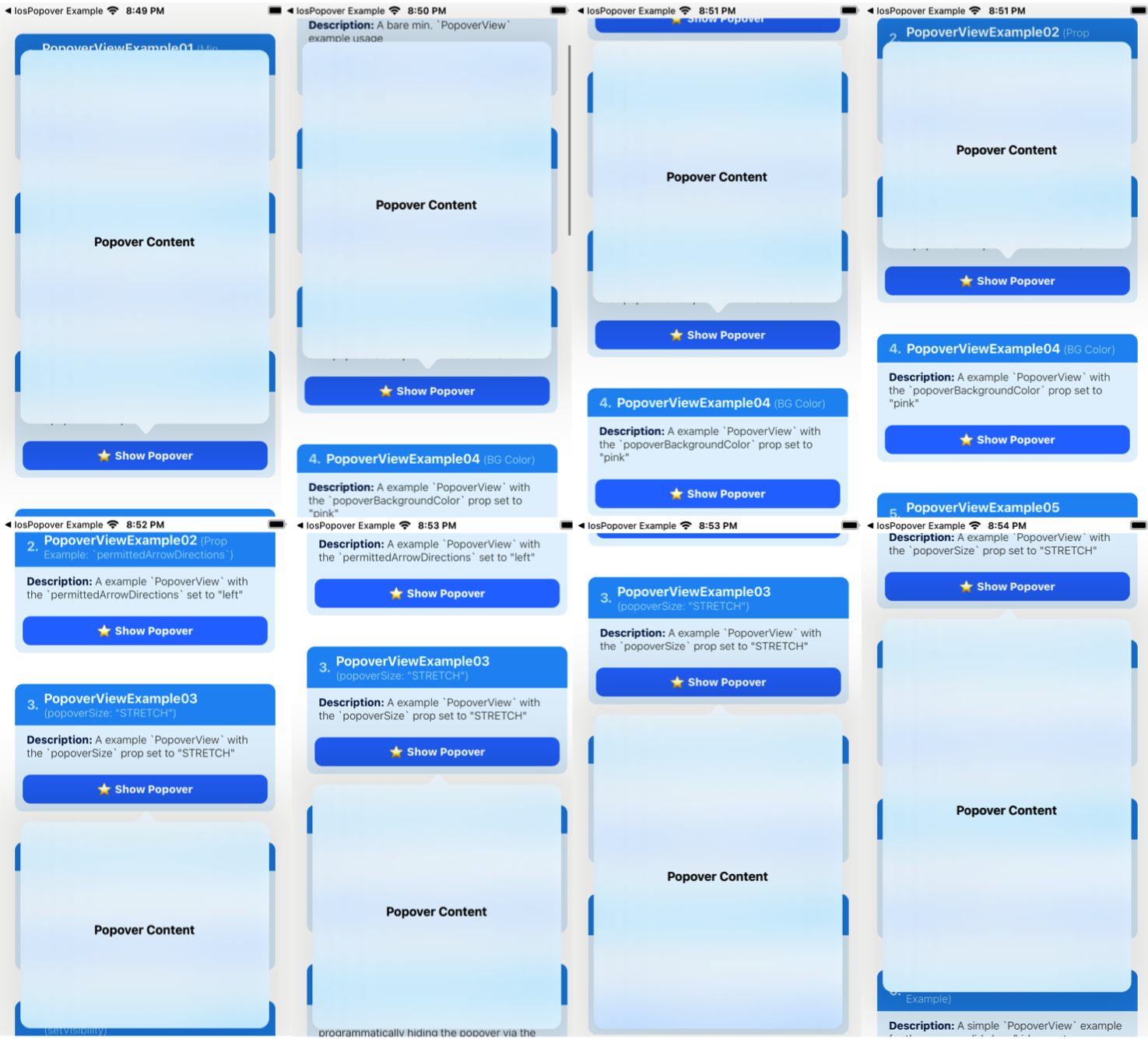
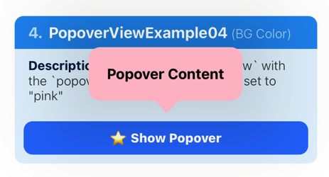
4.1.4 PopoverView Example #4
A example PopoverView with the popoverBackgroundColor prop set to "pink". By default, the PopoverView has a transparent background with a blur effect.
function PopoverViewExample04(props) {
  const popoverRef = useRef();

  return (
    <PopoverView
      ref={popoverRef}
      // pass in a valid color value
      popoverBackgroundColor={'pink'}
      renderPopoverContent={() => (
        <View style={{padding: 20}}>
          <Text>
            {'Popover Content'}
          </Text>
        </View>
      )}
    >
      <TouchableOpacity onPress={() => {
        popoverRef.current.setVisibility(true);
      }}>
        <Text>
          {'Show Popover'}
        </Text>
      </TouchableOpacity>
    </PopoverView>
  );
};
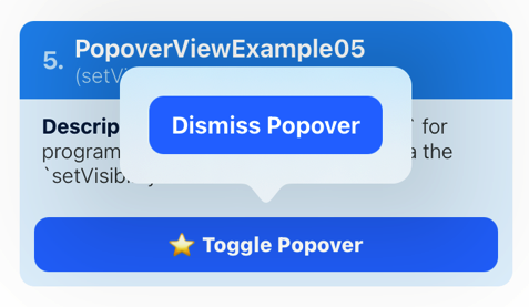
4.1.5 PopoverView Example #5
A example PopoverView for programmatically hiding the popover via the setVisibility function.
- The
setVisibility(bool)function will throw an error if it's already visible or hidden.
function PopoverViewExample05(props) {
  const popoverRef = useRef();

  return (
    <PopoverView
      ref={popoverRef}
      onPopoverDidHideViaTap={() => alert('onPopoverDidHideViaTap')}
      renderPopoverContent={() => (
        <View style={{padding: 20}}>
          <TouchableOpacity onPress={() => {
            // hide the popover
            popoverRef.current.setVisibility(false);
          }}>
            <Text>
              {'Dismiss Popover'}
            </Text>
          </TouchableOpacity>
        </View>
      )}
    >
      <TouchableOpacity onPress={() => {
        // toggle popover visibility
        popoverRef.current.toggleVisibility();
      }}>
        <Text>
          {'Toggle Popover'}
        </Text>
      </TouchableOpacity>
    </PopoverView>
  );
};
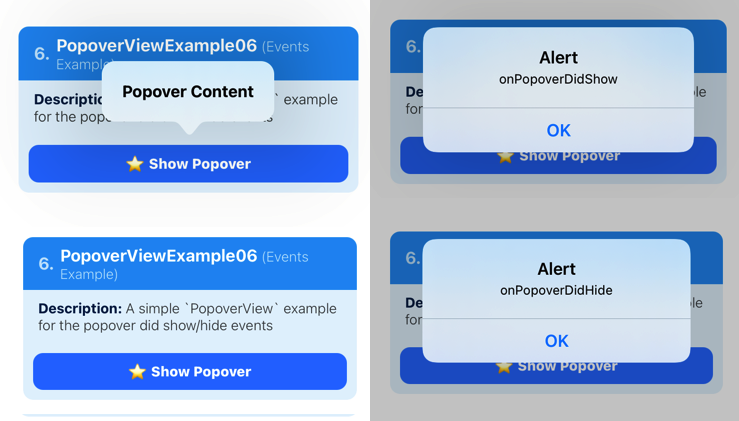
4.1.6 PopoverView Example #6
A simple PopoverView example for the popover did show/hide events.
function PopoverViewExample06(props) {
  const popoverRef = useRef();

  return(
    <PopoverView
      ref={popoverRef}
      // popover events
      onPopoverDidHide={() => alert('onPopoverDidHide')}
      onPopoverDidShow={() => alert('onPopoverDidShow')}
      renderPopoverContent={() => (
        <View style={{padding: 20}}>
          <Text style={styles.popoverText}>
            {'Popover Content'}
          </Text>
        </View>
      )}
    >
      <TouchableOpacity onPress={() => {
        popoverRef.current.setVisibility();
      }}>
        <Text>
          {'Toggle Popover'}
        </Text>
      </TouchableOpacity>
    </PopoverView>
  );
};
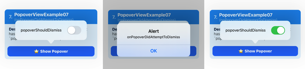
4.1.7 PopoverView Example #7
A example PopoverView that has a switch that toggles the popoverShouldDismiss prop.
- The
onPopoverDidAttemptToDismissprop is set totrueby default. This prop controls whether or not the popover should dismiss when there's a tap gesture outside the popover. - So setting the
onPopoverDidAttemptToDismisstofalsewill prevent the popover from dismissing via a tap outside the popover.
function PopoverViewExample07(props) {
  const popoverRef = useRef();

  const [isEnabled, setIsEnabled] = useState(false);
  // toggle `popoverShouldDismiss`
  const toggleSwitch = () => setIsEnabled(previousState => !previousState);

  return(
    <PopoverView
      ref={popoverRef}
      // set the `popoverShouldDismiss` prop
      popoverShouldDismiss={isEnabled}
      onPopoverDidAttemptToDismiss={() => alert('onPopoverDidAttemptToDismiss')}
      renderPopoverContent={() => (
        <View>
          <Text>
            {'popoverShouldDismiss'}
          </Text>
          <Switch
            onValueChange={toggleSwitch}
            value={isEnabled}
          />
        </View>
      )}
    >
      <TouchableOpacity onPress={() => {
        popoverRef.current.setVisibility(true);
      }}>
        <Text>
          {'Show Popover'}
        </Text>
      </TouchableOpacity>
    </PopoverView>
  );
};
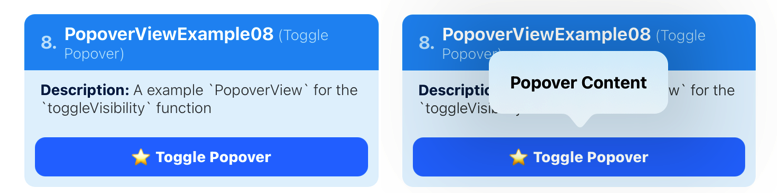
4.1.8 PopoverView Example #8
A example PopoverView for the toggleVisibility function.
function PopoverViewExample08(props) {
  const popoverRef = useRef();

  return(
    <PopoverView
      ref={popoverRef}
      popoverShouldDismiss={false}
      renderPopoverContent={() => (
        <View style={{padding: 20}}>
          <Text>
            {'Popover Content'}
          </Text>
        </View>
      )}
    >
      <TouchableOpacity onPress={() => {
        // toggle the popover visibility
        popoverRef.current.toggleVisibility();
      }}>
        <Text>
          {'Toggle Popover'}
        </Text>
      </TouchableOpacity>
    </PopoverView>
  );
};
License
MIT
Links
- I'm @DominicGo on twitter if you have any questions ✨
- Other libraries: react-native-ios-modal, react-native-ios-context-menu
- This library was generated/made using @react-native-community/bob