README

react-native-custom-modal
A simple and fully customizable React Native component that implements a modal.
| Success | Error | Warning |
|---|---|---|
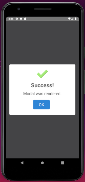 |
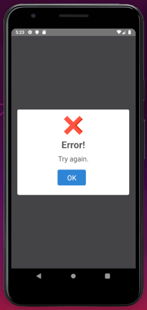 |
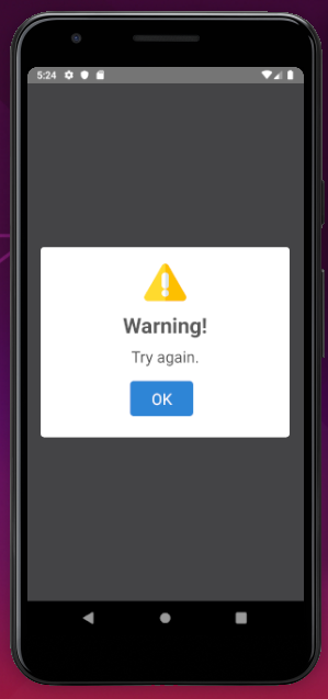 |
Installation
If using yarn:
yarn add react-native-irvs-modal
If using npm:
npm i react-native-irvs-modal
Usage
import React, { Component } from 'react';
import { Modal } from 'react-native-irvs-modal';

class ExampleScreen extends Component {

    constructor(props) {
        super(props);
        this.state = {
            isVisible: true
        }
    }

    render() {
        return (
            <Modal
                visible={this.state.isVisible}
                type="success"
                title="Success!"
                message="Modal was rendered."
                confirmButtonAction={() => { this.setState({isVisible:false}) }}
            />
        )
    }
}

export default ExampleScreen;
Documentation
Modal Component
| Name | Description | Default | Type |
|---|---|---|---|
| type | Modal type to render | null | String |
| animation | Animated effect for modal | none | String |
| visible | Sets the display status of the component | false | Boolean |
| title | Component header title | null | String |
| message | Text displayed in modal content | null | String |
| showConfirmButton | Display or not confirm button | true | Boolean |
| confirmButtonText | Text displayed on confirmation button | "OK" | String |
| confirmButtonColor | Confirmation Button Color | #3085d6 | String |
| confirmButtonAction | Function by clicking the confirm button | null | Func |
| showCancelButton | Display or not cancel button | false | Boolean |
| cancelButtonText | Text displayed on cancel button | "Cancel" | String |
| cancelButtonColor | Cancel Button Color | #aaa | String |
| cancelButtonAction | Function by clicking the cancel button | null | Func |
| image | Custom image in modal header | null | Object |
| imageWidth | Image width | 60px | Number |
| imageHeight | Image height | 60px | Number |
Contributing
Pull requests are always welcome! Feel free to open a new GitHub issue for any changes that can be made.
Author
Iago Ronan