README
Liquid Circular Progress
react native component Liquid Circular Progress for react native developers.This npm module is completly customizable and cool looking animations. hope this helps lot of us make your project even more cooler.
Table of Contents
Installation
npm install react-native-liquid-progress
Import
import { LiquidProgress } from react-native-liquid-progress
Usage
import React, { useState } from "react";
import { StatusBar } from "expo-status-bar";
import {
StyleSheet,
Text,
View,
Animated,
TouchableOpacity,
} from "react-native";
import LiquidProgress from "./index";
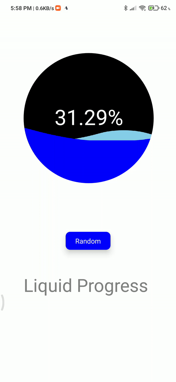
export default function App() {
const [value, setValue] = useState(0);
return (
<View style={styles.container}>
<LiquidProgress
backgroundColor={"black"}
frontWaveColor={"blue"}
backWaveColor={"skyblue"}
fill={value}
size={290}
customMask={<View style={{ backgroundColor: "red", width: 290, height: 290 }}></View>}
>
<Animated.View style={styles.row}>
<Text style={styles.text}>{(value * 100).toFixed(2)}%</Text>
</Animated.View>
</LiquidProgress>
<View style={styles.buttonLayer}>
<TouchableOpacity
style={styles.button}
onPress={() => setValue(Math.random())}
>
<Text style={styles.buttonText}>Random</Text>
</TouchableOpacity>
</View>
<Text style={styles.title}>Liquid Progress </Text>
<StatusBar style="auto" />
</View>
);
}
const styles = StyleSheet.create({
container: {
flex: 1,
backgroundColor: "#fff",
alignItems: "center",
justifyContent: "center",
},
row: {
alignSelf: "center",
flexDirection: "row",
height: 70,
},
text: {
color: "white",
fontSize: 47,
},
buttonLayer: { flex: 0.25, flexDirection: "row" },
button: {
width: 100,
height: 40,
backgroundColor: "blue",
justifyContent: "center",
alignItems: "center",
borderRadius: 10,
margin: 30,
elevation: 10,
},
buttonText: { fontSize: 15, color: "white" },
title: { fontSize: 40, flex: 0.5, color: "gray" },
});
Demo
Click here to navigate to snack code example
note:its not comptaible for react-native web yet;
Props table
| prop | description | default | type | required |
|---|---|---|---|---|
| fill | percentage of the progress to disply(0-1) | 0.5 | Number | yes |
| size | adjest size withsize |
290 | Number | yes |
| backgroundColor | change backgroundColor | black | hexcolor | no |
| frontWaveColor | wave color of front wave | blue | hexcolor | no |
| backWaveColor | wave color of back wave | skyblue | hexcolor | no |
children |
to render what ever u need inside (refer usage section for clear understanging) | null | JSX component | no |
| customMask | shape of loading container with custom shapes (can use svg view is supported) | React Component | Circle | React Component |
Support
Please open an issue for support.
Contributing
Please contribute using Github Flow. Create a branch, add commits, and open a pull request.