README
react-native-modal-swipe


Getting started
$ npm install react-native-modal-swipe --save
Usage
// Import react-native-modal-swipe in your component
import React, { useState } from 'react';
import { View, Text, TouchableOpacity, Image, StyleSheet } from 'react-native';
import ModalSwipe from 'react-native-modal-swipe';
export default () => {
const [visible, setvisible] = useState(false)
const onChangeMoadl = () => {
setvisible(!visible)
}
return (
<>
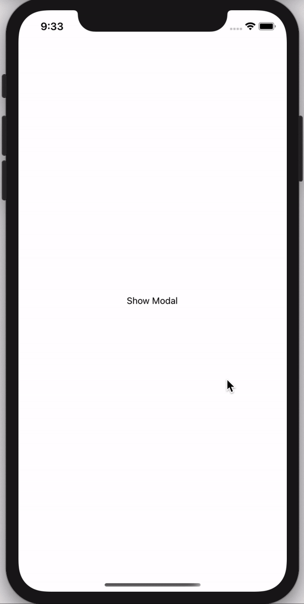
<TouchableOpacity style={styles.showModalBtn} onPress={onChangeMoadl}>
<Text>Show Modal</Text>
</TouchableOpacity>
<ModalSwipe visible={visible} onClose={onChangeMoadl} layoutBackgroundColor="#fff">
<>
<View>
<Text style={styles.title}> ! Paper Plane</Text>
<Text style={styles.smallText}>Lorem Ipsum is simply dummy text of the printing and typesetting industry.</Text>
</View>
<Image
style={styles.modalImage}
source={require('./assets/images/Paper-Plane-Transparent.png')}
/>
<View style={styles.modalContainer}>
<Text style={styles.modalText}>JOIN PREMIUM</Text>
</View>
</>
</ModalSwipe>
</>
)
};
const styles = StyleSheet.create({
showModalBtn: {
flex: 1,
justifyContent: 'center',
alignItems: 'center'
},
modalContainer: {
backgroundColor: 'rgba(0, 0, 0, 0.2)',
width: null,
borderColor: '#FFFFFF',
borderWidth: 1.5,
borderRadius: 100,
shadowColor: "#000",
shadowOffset: {
width: 5,
height: 2,
},
shadowOpacity: 0.1,
shadowRadius: 3.84,
elevation: 5,
marginBottom: 20
},
modalText: {
color: '#fff',
fontWeight: 'bold',
marginHorizontal: 30,
marginVertical: 15
},
modalImage: {
height: 250,
width: 200,
resizeMode: 'center'
},
title: {
fontSize: 22,
marginVertical: 10
},
smallText: {
fontWeight: '500',
fontSize: 16
}
});
Properties
| Prop | Default | Type | Description |
|---|---|---|---|
| visible | false | Boolean |
Show the modal |
| onClose | - | Function |
onClose the modal it's call the function |
| children | - | element |
You can pass your own view here it will render on modal |
| layoutBackgroundColor | rgba(0, 0, 0, 0.6) | String |
Modal BackDrop color |
| backgroundColor | rgba(255, 146, 43, 0.8) | String |
Show the modal BackGround color |