README
react-native-multi-segmented-control


Multi segmented control for iOS & Android
Status
- iOS & Android:
- based on attheodo/ATHMultiSelectionSegmentedControl & savvyapps/ToggleButtonLayout
- package exports two components -
MultiSegmentedControlandSingleSegmentedControl - only text segments are available
- react-native:
- supported versions ">= 0.60.0"
Installation
with react-native ">=0.60.0"0. Setup Swift and Kotlin
1. Install latest version from npm
2. Install pods
3. Final stepModify |
Demo
| Android | iOS |
|---|---|
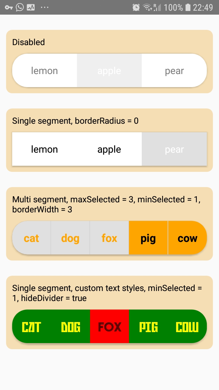 |
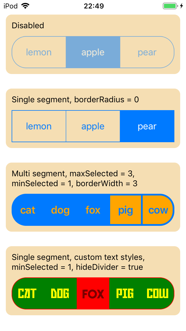 |
Example
import * as React from 'react'
import { MultiSegmentedControl } from 'react-native-multi-segmented-control'

export const Control = () => (
  <MultiSegmentedControl
    style={{ height: 55, width: '100%' }}
    values={['cat', 'dog', 'fox', 'pig', 'cow']}
    onChange={({ nativeEvent }) => console.warn(nativeEvent.changedIndex)}
    selectedIndices={[1, 2]}
  />
)
Reference
MultiSegmentedControl and SingleSegmentedControl components support all of View props and share some common props. MultiSegmentedControl additionally has maxSelected and selectedIndices props, and SingleSegmentedControl has additional selectedIndex prop.
| prop | type | default | desc |
|---|---|---|---|
| values | Array<string> |
- | required |
| tintColor | string |
- | |
| enabled | boolean |
true |
|
| selectedIndices | Array<number> |
- | MultiSegmentedControl only |
| selectedIndex | number |
- | SingleSegmentedControl only |
| onChange | (event: NativeSyntheticEvent<{
selectedIndices: Array<number>,
selectedValues: Array<string>,
changedIndex: number,
changedIndexSelected: boolean,
}>) => void |
- | |
| hideDivider | boolean |
- | ios only |
| dividerColor | string |
- | android only, no divider by default |
| minSelected | number |
0 |
disabled when 0 |
| maxSelected | number |
0 |
MultiSegmentedControl only, disabled when 0 |
| textStyle | TextStyle |
- | supports color, fontFamily, fontWeight, fontStyle and fontSize |
| selectedTextStyle | TextStyle |
textStyle | supports color, fontFamily, fontWeight, fontStyle and fontSize |