README
react-native-multicolor-progress-bar
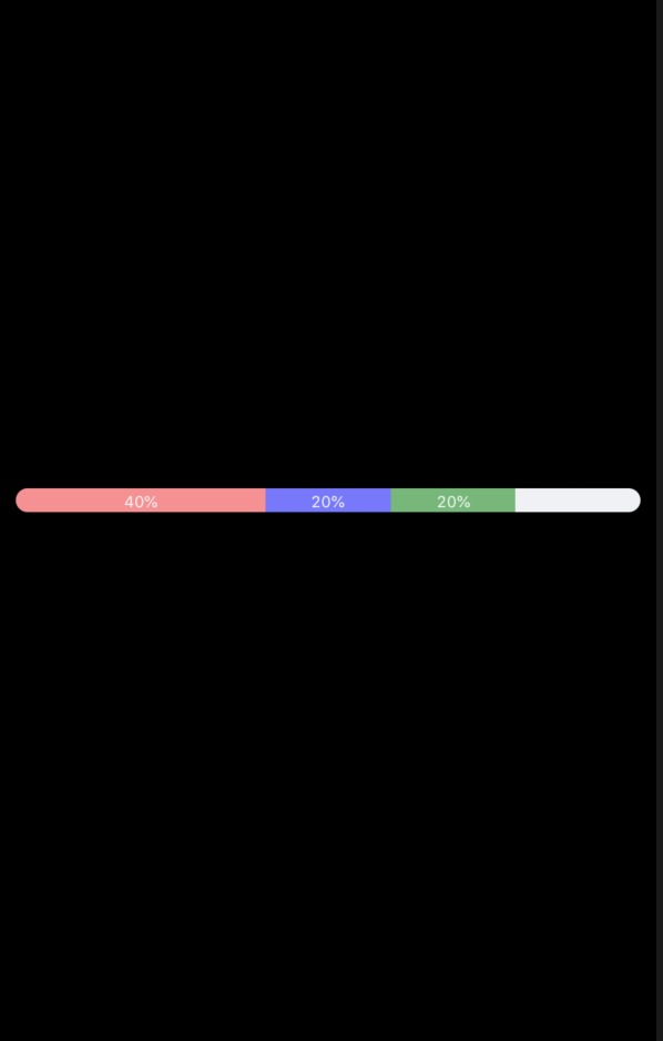
Progress indicators
example
Installation
npm install react-native-multicolor-progress-bar --save
Usage
import {ProgressBar} from 'react-native-multicolor-progress-bar';
<ProgressBar
  arrayOfProgressObjects={[
   {
     color: 'red',
     value: 0.4,
     nameToDisplay: "40%"
   },
   {
     color: 'blue',
     value: 0.6,
     opacity: 0.5
   },
  ]}
/>
Properties for progress component
| Prop | DataType | Description | Default |
|---|---|---|---|
| parentViewStyle | styles | Change the styling of the container view | {alignItems:'stretch'} |
| backgroundBarStyle | styles | Change the styling of base progress bar | {alignItems:'stretch',backgroundColor: '#EFF1F5',borderRadius: 8.5,height: 12} |
| onStartProgressStyle | styles | Change the border radius of starting progress bar | {borderTopLeftRadius: 8.5,borderBottomLeftRadius: 8.5} |
| onEndProgressStyle | styles | Change the border radius of ending progress bar if it reaches the end of base progress bar | {borderTopRightRadius: 8.5,borderBottomRightRadius: 8.5} |
| arrayOfProgressObjects | array of Objects | Contains the progress objects. | [] |
| onPress | function | if provided, this function will be called if the user taps on the progress bar | undefined |
| textStyle | styles | styling of the text displayed in each coloured progress bar | {fontSize:10} |
Progress Object
| Key | DataType | Value |
|---|---|---|
| color | string | color of the progress object |
| opacity | number | opacity of the progress object |
| nameToDisplay | string | if exists, displays this on the progress |
| value | number ranging from 0 - 1 | value of the progress |