README
<Onboarding /> 

 |
 |
 |
|---|
There are many ways to onboard people to your mobile app. But for React-Native, there is solely one component that is a) easy to setup and b) highly customizable:
react-native-onboarding-swiper.
Your new users shouldn't jump in at the deep end. First give them a pleasurable, delightful introduction and only then let them explore your awesome app.
Getting everything running merely takes a minute. Don't believe me? Try it out!
Install
npm i react-native-onboarding-swiper
import Onboarding from 'react-native-onboarding-swiper';
Usage
<Onboarding
pages={[
{
backgroundColor: '#fff',
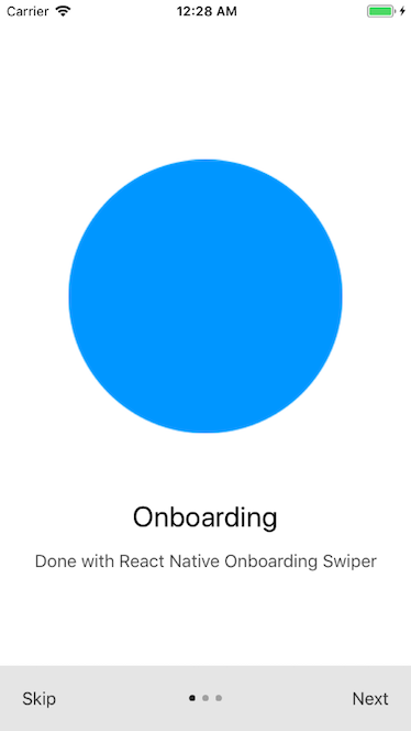
image: <Image source={require('./images/circle.png')} />,
title: 'Onboarding',
subtitle: 'Done with React Native Onboarding Swiper',
},
...
]}
/>
Examples
Try out the example running in your browser.
Also check out the three examples files: the simple example, the example with a Call-to-Action button or the example with custom button components.
Required Properties
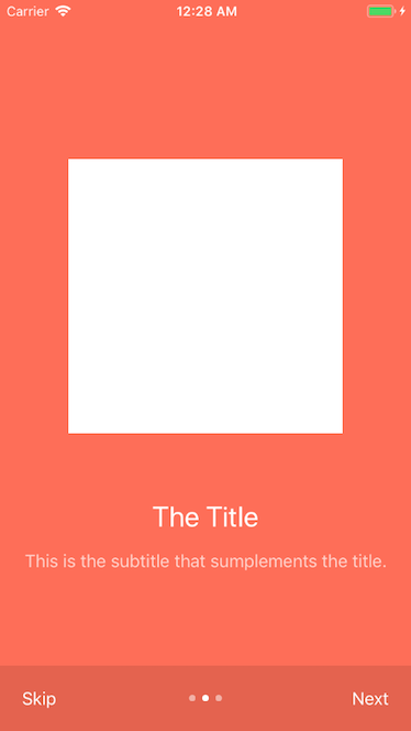
pages(required): an array of pages in the following shape:backgroundColor(required): a background color. The color of the font and dots adapts to the background color.image(required): a component (e.g.<Image />) to display at the top of the page.title(required): a string OR a React-Native component.subtitle(required): a string OR a React-Native component.
Optional Properties
Buttons
nextLabel(optional): a string OR a React-Native component for the Next label. Defaults toNext.showNext(optional): a bool flag indicating whether the Next button is visible. Defaults totrue.skipLabel(optional): a string OR a React-Native component for the Skip label. Defaults toSkip.showSkip(optional): a bool flag indicating whether the Skip button is visible. Defaults totrue.onSkip(optional): a callback that is fired if the Onboarding is skipped.skipToPage(optional): when pressing skip, go to that page (e.g.skipToPage={2}). If this prop is provided, ignoresonSkip.onDone(optional): a callback that is fired after the Onboarding is completed.showDone(optional): a bool flag indicating whether the Done checkmark button is visible. Defaults totrue.
General
bottomBarHeight(optional): a number for the height of the bottom bar. Defaults to60.bottomBarColor(optional): backgroundColor of the bottom bar. Defaults totransparent.bottomBarHighlight(optional): a bool flag indicating whether the bottom bar should be highlighted. Defaults totrue.controlStatusBar(optional): a bool flag indicating whether the status bar should change with the background color. Defaults totrue.showPagination(optional): whether to show the bottom pagination bar. Defaults totrue.flatlistProps(optional): additional props for the FlatList which holds all the pages.transitionAnimationDuration(optional): The duration in milliseconds for the animation of the background color for the page transition. Defaults to500.allowFontScaling(optional): Font scaling can cause troubles with high-resolution screens. You may want to disable it. Defaults totrue.pageIndexCallback(optional): a function that receives the pageindexas a parameter on page change. Example Usage
Default Page Styles
For the pages in the pages array, you can set the default styles (and override the styles set by this component).
containerStyles(optional): override the default container styles.imageContainerStyles(optional): override the default image container styles e.g. thepaddingBottomof 60.titleStyles(optional): override the default title styles.subTitleStyles(optional): override the default subtitle styles.
Adjust Individual Page Styles
For each page in the pages array, you can override the default page styles. An example.
titleStyles(optional): modify styles of a specific page's title.subTitleStyles(optional): modify styles of a specific page's subtitle.
Custom Components Properties
You can also provide your own custom components for the buttons and the dots. All of them have access to a isLight prop but it's up to you what you do with it. Also checkout this example.
SkipButtonComponent(optional): Skip Button, getsskipLabelas prop.NextButtonComponent(optional): Next Button, getsnextLabelas prop.DoneButtonComponent(optional): Done Button.DotComponent(optional): Dot for the pagination, getsselectedas prop to indicate the active page.
Contributing
If you have a question, found a bug or want to propose a new feature, have a look at the issues page.
Pull requests are especially welcomed when they fix bugs or improve the code quality.
Related
Acknowledgements
Built upon the work by Gosha Arinich which was originally inspired by AndroidOnboarder.
License
MIT.