README
react-native-otp-input-fields
This is a component for OTP Input fields.
Installation
npm i react-native-otp-input-fields
NOTE: This package uses react-native-reanimated under the hood for input field animation. If you are using React Navigation for navigation purpose in your app, then you don't have to do anything. Otherwise, Follow the installation process of React Native Reanimated.
Usage
Below are some examples to use this package
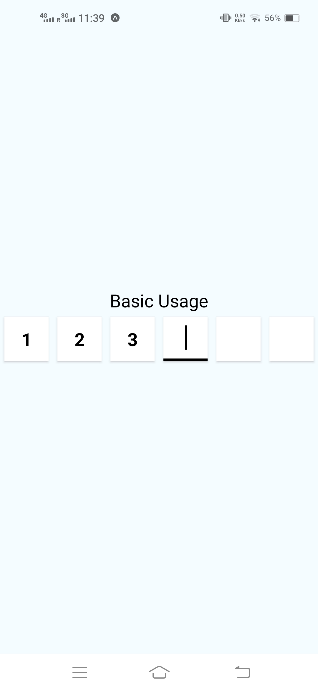
Basic Usage
import OTPInput from "react-native-otp-input-fields";

const [OTP, SetOTP] = useState("");
// Maintain a state variable

// Use it like this
<OTPInput onChangeText={SetOTP} value={OTP} />;
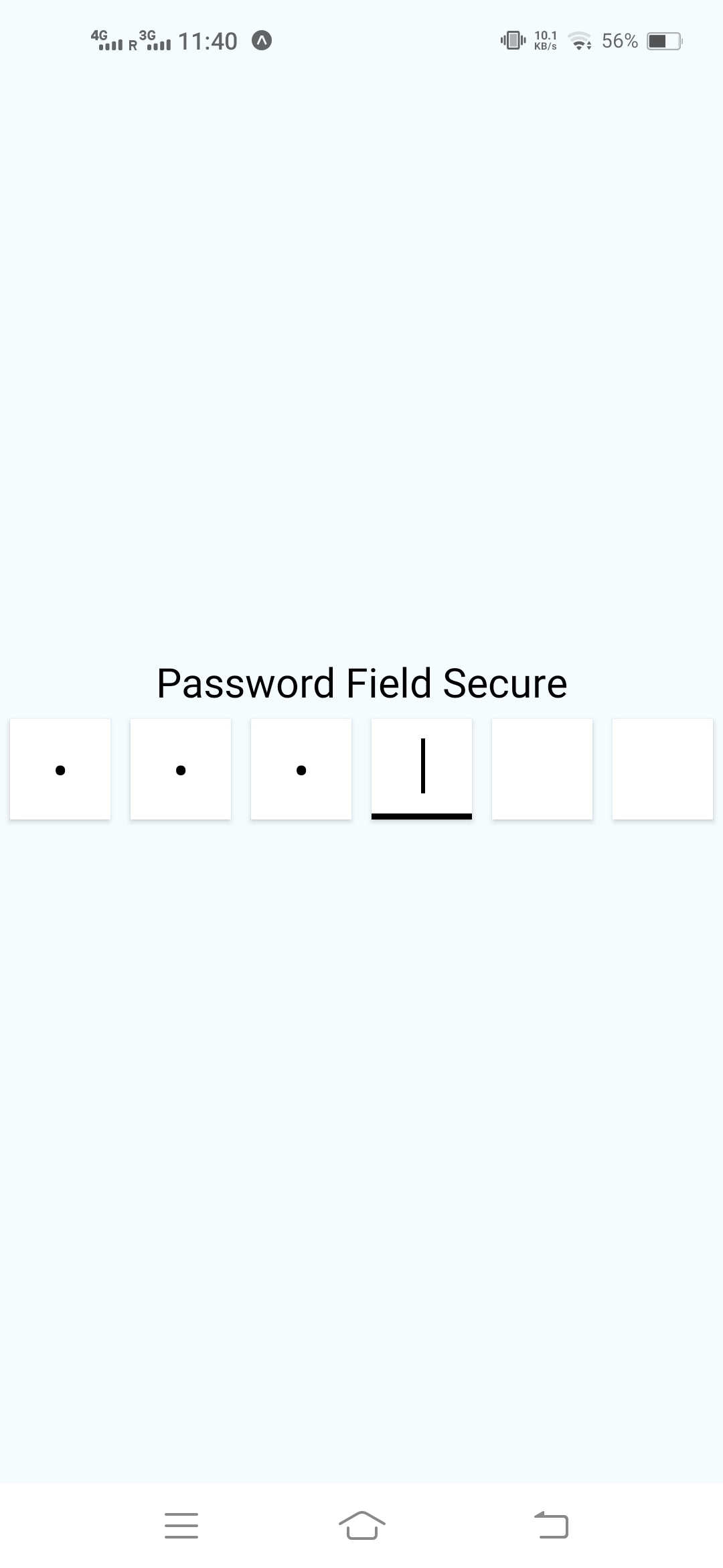
Password Secure Usage
import OTPInput from "react-native-otp-input-fields";

const [OTP, SetOTP] = useState("");
// Maintain a state variable

// Use it like this
<OTPInput onChangeText={SetOTP} value={OTP} secureTextEntry={true} />;
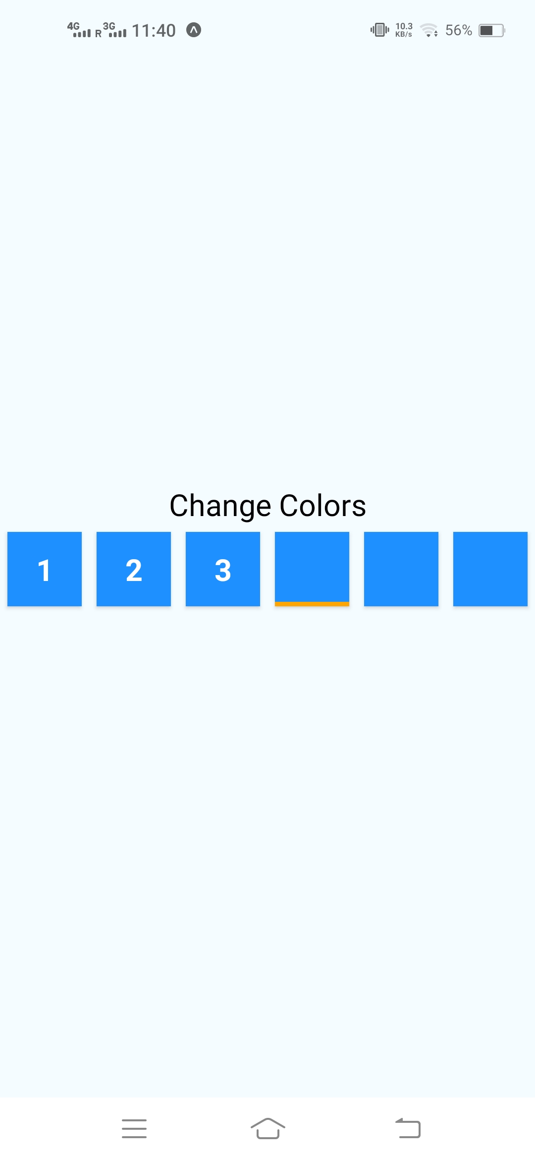
Change Colors and other styles
import OTPInput from "react-native-otp-input-fields";

const [OTP, SetOTP] = useState("");
// Maintain a state variable

// Use it like this
<OTPInput
  onChangeText={SetOTP}
  value={OTP}
  borderColor="orange"
  boxBackgroundColor="dodgerblue"
  cursorColor="orange"
  digitColor="white"
/>;
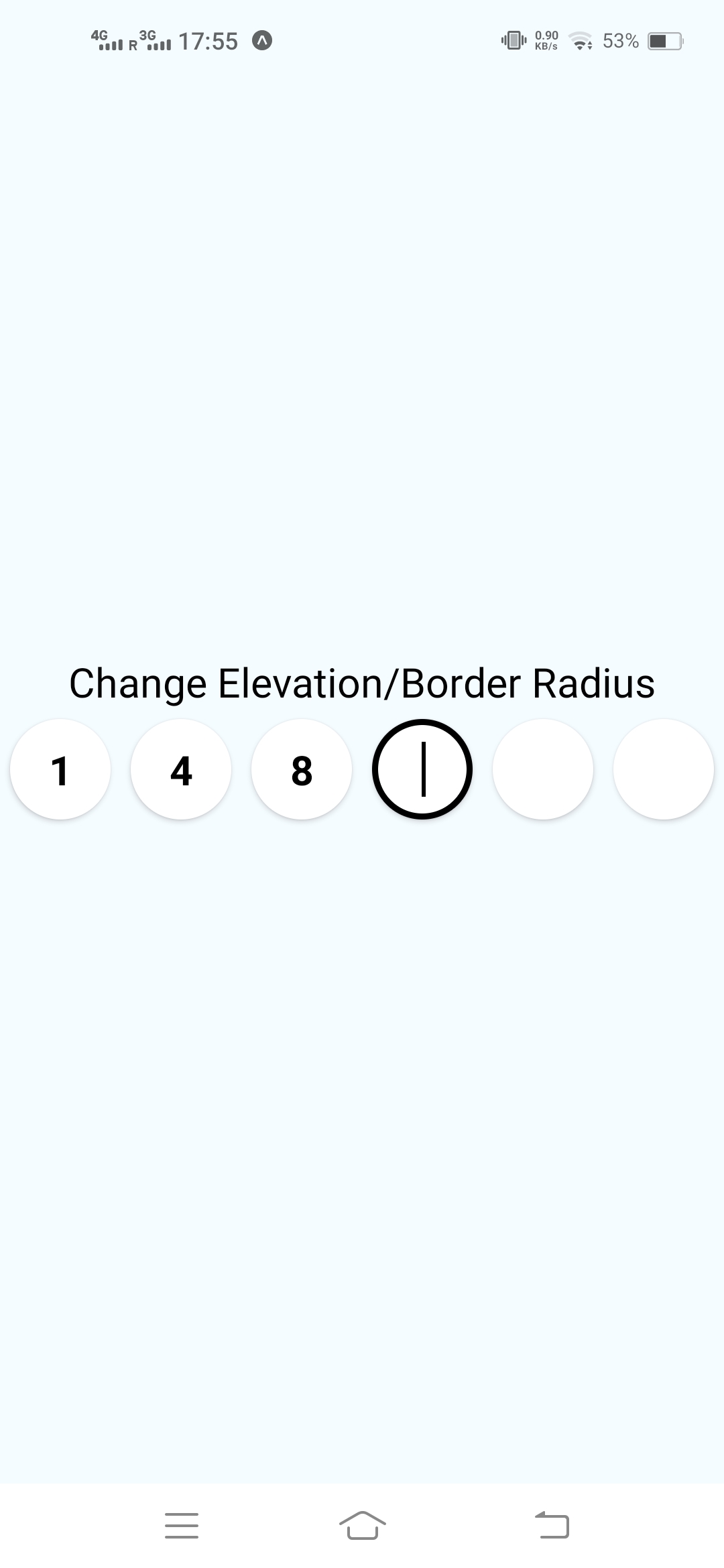
Apply Elevation and Border Radius etc.
import OTPInput from "react-native-otp-input-fields";

const [OTP, SetOTP] = useState("");
// Maintain a state variable

// Use it like this
<OTPInput
  onChangeText={SetOTP}
  value={OTP}
  boxBorderRadius={50}
  onlyBorderBottom={false}
  boxElevation={10}
/>;
Parameters
Basic Parameters
| Parameter | required | Default | Description |
|---|---|---|---|
| value | YES | Maintain a state in parent component and use it as a controlled input | |
| onChangeText | YES | the onChangeText function to update the state in parent component | |
| count | NO | 6 | Number of digits in the OTP |
| autoFocus | NO | false | Whether to autofocus the first field |
| removeOnBackspace | NO | true | Whether to clear the previous input while pressing the backspace button on a input field |
| onSubmitEditing | NO | function to execute when user presses the done button on keyboard | |
| containerWidth | NO | screenWidth | Width of the Input Field Container |
| boxHeight | NO | 60 | Height of each input field |
| margin | NO | 5 | margin between each input field |
Customization
| Parameter | required | Default | Description |
|---|---|---|---|
| secureTextEntry | NO | false | Mask the text input as password field or not |
| allowDigitsOnly | NO | false | Allow only digits to be entered in the text input |
| digitFontSize | NO | 25 | font size of the text inside input field |
| animateDuration | NO | 300ms | Duration for the animation to complete when input field is focused |
| cursorColor | NO | black | color of the blinking cursor |
| digitColor | NO | black | color of the digit inside the field |
| onlyBorderBottom | NO | true | whether to show border around whole box or just the border bottom |
| keyboardType | NO | true | type of Keyboard from KeyboardTypeOptions in react-native |
| borderBottomWidth | NO | 3 | width for the border bottom of box |
| borderColor | NO | black |
color for the border of box |
| boxElevation | NO | 6 |
elevation for the input field box |
| maxLength | NO | 1 | Max length of each input field |
| inputStyle | NO | styles for the TextInput component |
|
| boxHeight | NO | 60 | height of each input field |
| boxBorderRadius | NO | 0 | border Radius of input field |
| boxContainerStyle | NO | styles for the input containers | |
| containerStyle | NO | styles for the whole input box container (outer) | |
| boxBackgroundColor | NO | white |
backround Color of the input fields |