README
react-native-panning-scrollview


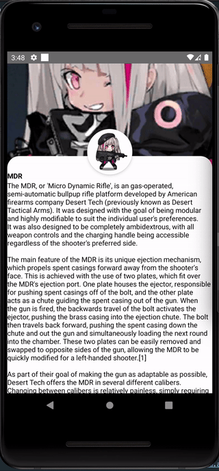
A ScrollView component that moves along with the header section, and only scrolls after the header has been pushed up
Props
| prop | type | description |
|---|---|---|
| children | ReactNode | ReactNodeArray |
The scrollview content |
| headerImage | ImageSourcePropType |
Optional. The header image. Defaults to a white background view if not supplied. |
| badgeImage | ImageSourcePropType |
Optional. The badge image. The component will automatically apply border radius and enforce a size. |
| translateRatio | number |
Optional. Affect the rate that the header translates. Higher values = shorter translate distance. Defaults to 3. Recommended 1 - 5 |
| useNativeDriver | boolean |
Optional. Control whether to use nativeDriver. For compatibility. Defaults to true |
| backgroundColor | ColorValue |
Optional. Change the color of the scrollview container. |
How it works
This component uses a scrollview and some Animated trickery to create the illusion of a scrollview that only scrolls after the header has been panned upwards.
Demo
- Clone this repo
cd demoyarnyarn androidoryarn ios