README
React Native Paper Select 🔽


- This module includes a customizable multi-select and a single select component for React Native Paper.
- The package is both Android and iOS compatible.
- The package is well-typed and supports TypeScript.
- Smooth and fast.
- Type-safe
Give us a GitHub star 🌟, if you found this package useful.

React Native Paper Select (NPM Link)
Would you like to support me?

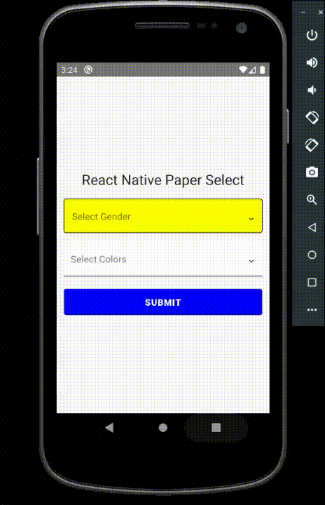
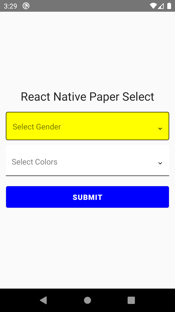
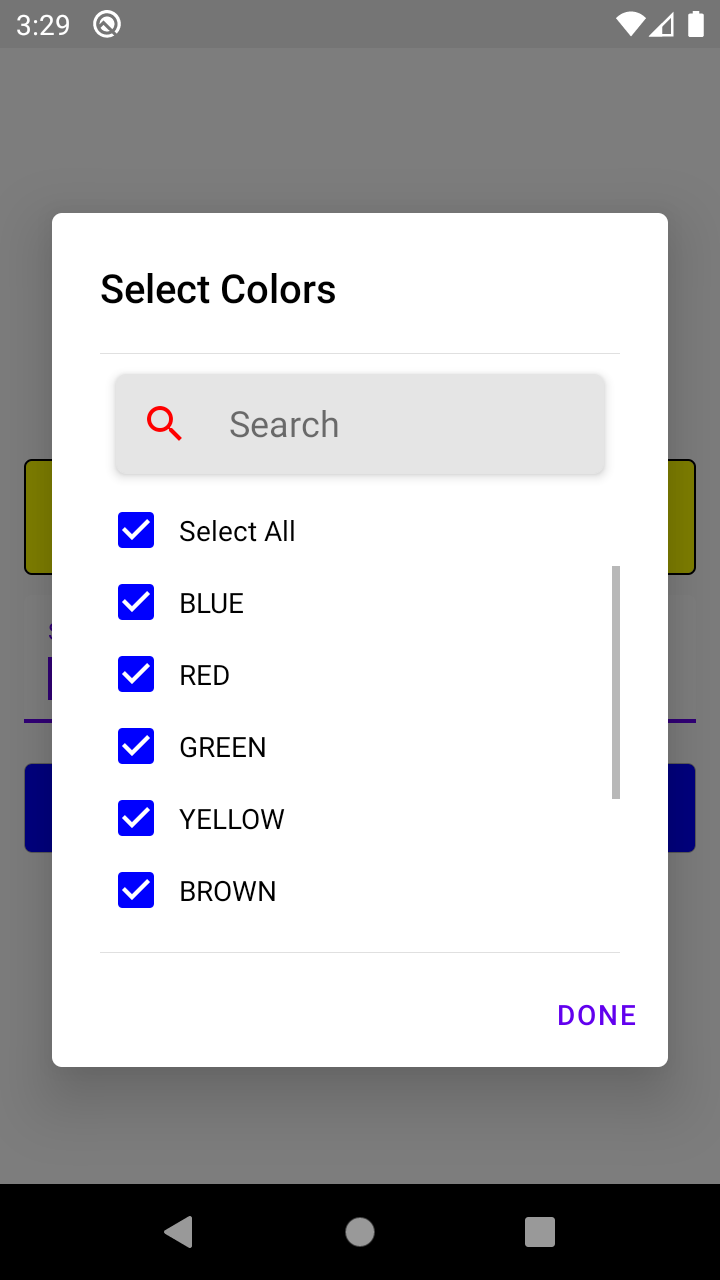
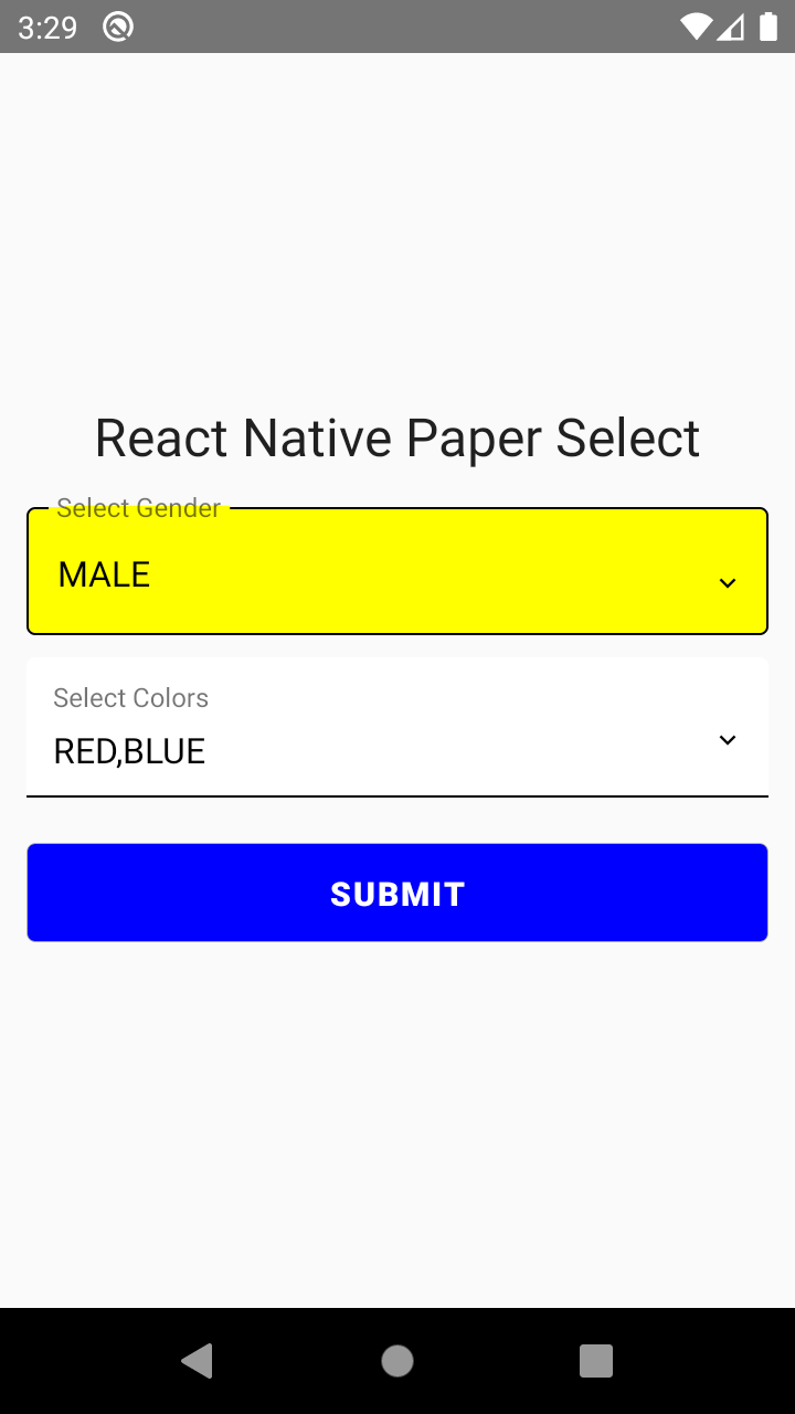
Demo/Screenshots
Dependencies
react-native-paper
react-native-vector-icons
Installation
npm install react-native-paper-select
or
yarn add react-native-paper-select
Basic Usage (Multi-Select)
import { PaperSelect } from 'react-native-paper-select';

// ...

const [colors, setColors] = useState({
  value: '',
  list: [
    { _id: '1', value: 'BLUE' },
    { _id: '2', value: 'RED' },
    { _id: '3', value: 'GREEN' },
    { _id: '4', value: 'YELLOW' },
    { _id: '5', value: 'BROWN' },
    { _id: '6', value: 'BLACK' },
    { _id: '7', value: 'WHITE' },
    { _id: '8', value: 'CYAN' },
  ],
  selectedList: [],
  error: '',
});

<PaperSelect
  label="Select Colors"
  value={colors.value}
  onSelection={(value: any) => {
    setColors({
      ...colors,
      value: value.text,
      selectedList: value.selectedList,
      error: '',
    });
  }}
  arrayList={[...colors.list]}
  selectedArrayList={colors.selectedList}
  errorText={colors.error}
  multiEnable={true}
  textInputMode="flat"
  searchStyle={{ iconColor: 'red' }}
/>;
Basic Usage (Single-Select)
import { PaperSelect } from 'react-native-paper-select';

// ...

<PaperSelect
  label="Select Gender"
  value={gender.value}
  onSelection={(value: any) => {
    setGender({
      ...gender,
      value: value.text,
      selectedList: value.selectedList,
      error: '',
    });
  }}
  arrayList={[...gender.list]}
  selectedArrayList={gender.selectedList}
  errorText={gender.error}
  multiEnable={false}
  dialogTitleStyle={{ color: 'red' }}
  checkboxColor="yellow"
  checkboxLabelStyle={{ color: 'red', fontWeight: '700' }}
  textInputBackgroundColor="yellow"
  textInputColor="red"
/>;
Props
| props | type | description | default value | required |
|---|---|---|---|---|
| label | string | Input Label | set to empty string if you don’t want to display | yes |
| arrayList | Array<{ _id: string; value: string;}> | Array of items. Should be an array of objects with _id and value property.example: [{"_id": 1, "value": "Red"}]. | there isn't any default value you need to specify a list. | yes |
| selectedArrayList | Array<{ _id: string; value: string;}> | selected elements or preselected elements | set empty array as default | yes |
| multiEnable | boolean | true if you want to use multi select, false if you want single select | no default value | yes |
| errorText | string | text to display on error | set to empty string as default | yes |
| value | string | default value you want to display | bind it with your variable | yes |
| dialogStyle | {backgroundColor?: ViewStyle['backgroundColor']; borderRadius?: ViewStyle['borderRadius'];} | dialog box style | {backgroundColor:'white', borderRadius: 5} | no |
| dialogTitleStyle | TextStyle | dialog box title style | default react native paper style | no |
| searchStyle | {backgroundColor?: ViewStyle['backgroundColor']; textColor?: TextStyle['color']; borderRadius?: number; borderColor?: ViewStyle['borderColor']; iconColor?: string;} | search bar style in dialog box | {borderRadius:5, borderColor:'#e5e5e5', backgroundColor: '#e5e5e5', color: '#000'} | no |
| checkboxUncheckedColor | string | checkbox unchecked color | #000007 | no |
| checkboxColor | string | checkbox checked color | blue | no |
| checkboxLabelStyle | TextStyle | checkbox label style | default react native paper style | no |
| errorStyle | TextStyle | error style | default react native paper style | no |
| textInputMode | flat or outlined | input style flat or outlined | outlined | no |
| underlineColor | string | underline color (if input mode is flat) | black | no |
| activeUnderlineColor | string | active underline color (if input mode is flat) | black | no |
| activeOutlineColor | string | active border color (if input mode is outlined) | black | no |
| outlineColor | string | border color (if input mode is outlined) | black | no |
| textInputBackgroundColor | string | text input background color | white | no |
| textInputColor | string | text input text color | black | no |
| textInputHeight | number | text input height | default react native paper style | no |
| dialogButtonLabelStyle | TextStyle | dialog button style | default react native paper style | no |
Callback Methods
onSelection- Return the selected item when an item is selected. Example :onSelection={(value: any) => { setGender({ ...gender, value: value.text, selectedList: value.selectedList, error: '', }); }}
Example
import React, { useState } from 'react';
import { Alert, StyleSheet, View } from 'react-native';
import { Button as PaperButton, Headline } from 'react-native-paper';
import { PaperSelect } from 'react-native-paper-select';
export const selectValidator = (value: any) => {
if (!value || value.length <= 0) {
return 'Please select a value.';
}
return '';
};
export default function App() {
const [gender, setGender] = useState({
value: '',
list: [
{ _id: '1', value: 'MALE' },
{ _id: '2', value: 'FEMALE' },
{ _id: '3', value: 'OTHERS' },
],
selectedList: [],
error: '',
});
const [colors, setColors] = useState({
value: '',
list: [
{ _id: '1', value: 'BLUE' },
{ _id: '2', value: 'RED' },
{ _id: '3', value: 'GREEN' },
{ _id: '4', value: 'YELLOW' },
{ _id: '5', value: 'BROWN' },
{ _id: '6', value: 'BLACK' },
{ _id: '7', value: 'WHITE' },
{ _id: '8', value: 'CYAN' },
],
selectedList: [],
error: '',
});
return (
<View style={styles.container}>
<Headline style={{ marginBottom: 10 }}>
React Native Paper Select
</Headline>
<PaperSelect
label="Select Gender"
value={gender.value}
onSelection={(value: any) => {
  setGender({
    ...gender,
    value: value.text,
    selectedList: value.selectedList,
    error: '',
  });
}}
arrayList={[...gender.list]}
selectedArrayList={gender.selectedList}
errorText={gender.error}
multiEnable={false}
dialogTitleStyle={{ color: 'red' }}
checkboxColor="yellow"
checkboxLabelStyle={{ color: 'red', fontWeight: '700' }}
textInputBackgroundColor="yellow"
textInputColor="red"
/>
<PaperSelect
label="Select Colors"
value={colors.value}
onSelection={(value: any) => {
setColors({
...colors,
value: value.text,
selectedList: value.selectedList,
error: '',
});
}}
arrayList={[...colors.list]}
selectedArrayList={colors.selectedList}
errorText={colors.error}
multiEnable={true}
textInputMode="flat"
searchStyle={{ iconColor: 'red' }}
/>
<PaperButton
style={styles.button}
labelStyle={styles.text}
mode={'outlined'}
onPress={() => {
const genderError = selectValidator(gender.value);
const colorError = selectValidator(colors.value);
if (genderError || colorError) {
setColors({ ...colors, error: colorError });
setGender({ ...gender, error: genderError });
return;
}
Alert.alert(
'Selected Values',
'Gender: ' + gender.value + ' and Colors: ' + colors.value
);
}}
>
Submit
</PaperButton>
</View>
);
}
const styles = StyleSheet.create({
container: {
flex: 1,
alignItems: 'center',
justifyContent: 'center',
paddingHorizontal: 12,
},
box: {
width: 60,
height: 60,
marginVertical: 20,
},
button: {
marginVertical: 10,
width: '100%',
backgroundColor: 'blue',
},
text: {
fontWeight: 'bold',
fontSize: 15,
lineHeight: 26,
color: 'white',
},
});
You can check the example source code in example module.
Try it out
You can run the example module by performing these steps:
git clone https://github.com/srivastavaanurag79/react-native-paper-select.git
cd native-base-select && cd example
npm install
cd ios && pod install && cd ..
react-native run-ios
react-native run-android
Authors
- Anurag Srivastava (@srivastavaanurag79)
- Harshit Singhal (@Harshit31)
Contributing
See the contributing guide to learn how to contribute to the repository and the development workflow.
License
MIT