README
react-native-popup-view
A flexible way to show several types of popup views in React Native.
- Easy to integrate, easy to use
- Less code in component
- Customizable in many ways
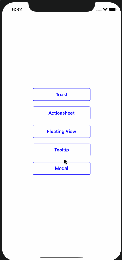
Example
Installation
If using yarn:
yarn add react-native-popup-view
If using npm:
npm i react-native-popup-view
Usage
Wrap App in the PopupProvider
import {PopupProvider} from 'react-native-popup';

export default function App() {
  return (
    <PopupProvider>
      <App />
    </PopupProvider>
  );
}
Declare with usePopup
import {usePopup} from 'react-native-popup';
...
const {showToast} = usePopup();
...
const onPress = () => {
  showToast({
    message: 'This is a toast',
    toastType: TOAST_TYPE.SUCCESS,
  });
};
Documentation
Generic params
| Name | Type | Description |
|---|---|---|
| showOverlay | Boolean | display a gray translucent full screen overlay |
| disableDismiss | Boolean | disable default touch to dismiss feature |
| onDismissStart | Function | called on the start of dismiss animation |
| onDismissEnd | Function | called on the end of dismiss animation |
| onShowStart | Function | called on the start of display animation |
| onShowEnd | Function | called on the end of display animation |
Actionsheet Params
| Name | Type | Description |
|---|---|---|
| options | Array | an array of ActionSheetOption, which has title, subtitle, onPress and isDestructive |
| actionViews | Array | alternative to options, take a list of customized option view. It could be anything |
| headerView | React element | header view of the action sheet |
| containerStyle | style object | layout style of the action sheet wrapper |
ActionSheetOption Prams
| Name | Type | Description |
|---|---|---|
| title | String | title of the action |
| subtitle | String | subtitle of the action |
| disabled | Boolean | determine if this action is clickable |
| onPress | Function | callback function |
| actionStyle | style object | style of the action view |
| actionTitleStyle | style object | style of title text |
| actionSubtitleStyle | style object | style of subtitle text |
FloatingView Params
| Name | Type | Description |
|---|---|---|
| anchorPoint | object | coordinate in the form of {x, y} |
| popupDirection | POPUP_DIRECTION | towards which direction the pop up view should be displayed |
| customView | React element | the actual view needs to be displayed |
Modal Prams
| Name | Type | Description |
|---|---|---|
| message | String | text message shown in toast |
| customView | React element | the actual view needs to be displayed |
Toast Params
| Name | Type | Description |
|---|---|---|
| showDismiss | Boolean | determine dismiss button visibility. default true |
| toastType | TOAST_TYPE | one of the toast type with preset style |
| toastStyle | style object | customize toast style |
| duration | Integer | duration before toast is dismissed, in milliseconds, default to 3000 |
| position | TOAST_POSITION | toast display position, default to top |
Tooltip Params
| Name | Type | Description |
|---|---|---|
| anchorPoint | object | coordinate in the form of {x, y} |
| popupDirection | POPUP_DIRECTION | towards which direction the pop up view should be displayed |
| text | String | text to be displayed in the tool tip |
| style | style object | customize tooltip style |
Contributing
Pull requests are welcome! Open a new GitHub issue for any bug or suggestion.
Author
Xiao Ma