README
React Native Reanimated Switch
:anchor: Installation
yarn add react-native-reanimated-switch
# or
npm i react-native-reanimated-switch
:family: Dependencies
React Native Reanimated
npm install react-native-reanimated
For iOS
cd ios && pod install && cd ..
For detailed instructions check it out here
Rebuild the project after adding the dependencies
:mag: Usage
import React, { useState } from "react";
import { SafeAreaView, StatusBar, StyleSheet, Text, View } from "react-native";
import RNSwitch from "./src/Switch";
const App = () => {
const [switchState, setSwitchState] = useState(false);
const handleOnPressSwitch = (value) => {
setSwitchState(value);
};
return (
<>
<StatusBar
barStyle="dark-content"
translucent={true}
backgroundColor="white"
/>
<SafeAreaView style={styles.container}>
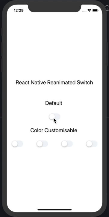
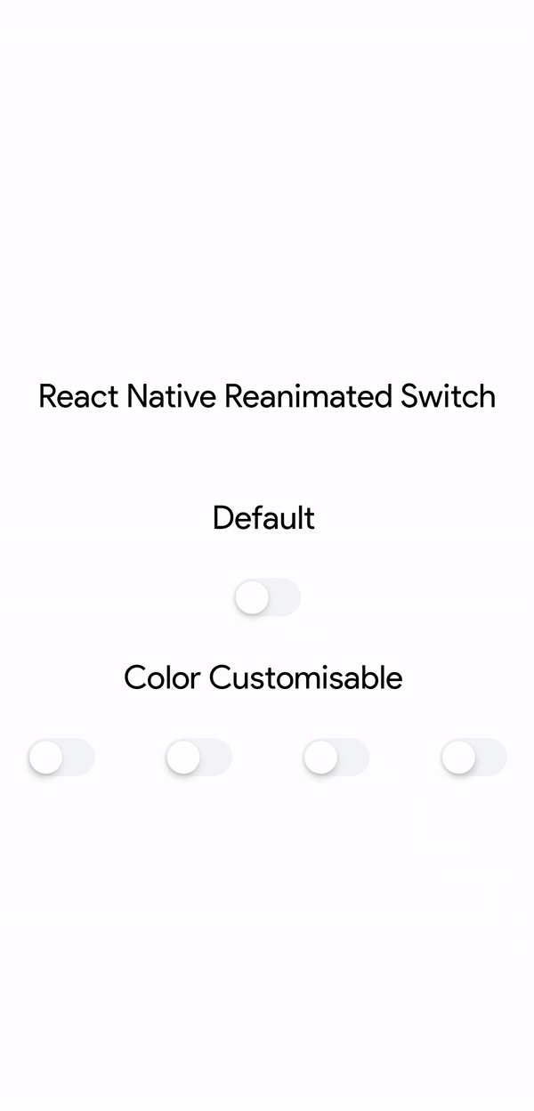
<Text style={styles.header}>React Native Reanimated Switch</Text>
<Text style={styles.header}>Default </Text>
<RNSwitch handleOnPress={handleOnPressSwitch} value={switchState} />
<Text style={styles.header}>Color Customisable </Text>
<View style={styles.switchContainer}>
<RNSwitch
handleOnPress={handleOnPressSwitch}
activeTrackColor="#FE5F8F"
value={switchState}
/>
<RNSwitch
handleOnPress={handleOnPressSwitch}
activeTrackColor="#667eea"
value={switchState}
/>
<RNSwitch
handleOnPress={handleOnPressSwitch}
activeTrackColor="#ed8936"
value={switchState}
/>
<RNSwitch
handleOnPress={handleOnPressSwitch}
activeTrackColor="#feb2b2"
value={switchState}
/>
</View>
</SafeAreaView>
</>
);
};
const styles = StyleSheet.create({
container: {
flex: 1,
display: "flex",
alignContent: "center",
justifyContent: "center",
alignItems: "center",
backgroundColor: "white",
},
header: {
fontSize: 24,
paddingVertical: 30,
},
switchContainer: {
display: "flex",
justifyContent: "space-between",
flexDirection: "row",
width: "90%",
},
});
export default App;
:wrench: Props
| Name | Description | Required | Type | Default |
|---|---|---|---|---|
| value | State of switch component | YES | Boolean | - |
| handleOnPress | A callback with the current switch state | YES | Function | - |
| activeTrackColor | The track color when switch is active | NO | Color | #007AFF |
| inActiveTrackColor | The track color when switch is inactive | NO | Color | #F2F5F7 |
| thumbColor | The color of switch thumb | NO | Color | #FFFFFF |
:tada: Example
Checkout the example here.
:notebook: Blog
Will Update Soon.
:snowman: Built with ❤️ and
:v: Contributing
Pull requests are always welcome! Feel free to open a new GitHub issue for any changes that can be made.
:man: Author
:clipboard: License
MIT