README
React Native Search Component
:anchor: Installation
yarn add react-native-search-component
# or
npm i react-native-search-component
:family: Dependencies
React Native Reanimated
npm install react-native-reanimated
For iOS
cd ios && pod install && cd ..
For Android
- Turn on Hermes engine by editing android/app/build.gradle
project.ext.react = [
  enableHermes: true  // <- here | clean and rebuild if changing
]
- Plug Reanimated in MainApplication.java
  import com.facebook.react.bridge.JSIModulePackage; // <- add
  import com.swmansion.reanimated.ReanimatedJSIModulePackage; // <- add
  ...
  private final ReactNativeHost mReactNativeHost = new ReactNativeHost(this) {
  ...

      @Override
      protected String getJSMainModuleName() {
        return "index";
      }

      @Override
      protected JSIModulePackage getJSIModulePackage() {
        return new ReanimatedJSIModulePackage(); // <- add
      }
    };
  ...
For detailed instructions check it out here
React Native SVG
npm install react-native-svg
For iOS
cd ios && pod install && cd ..
For detailed instructions check it out here
Rebuild the project after adding the dependencies
:mag: Usage
import React, { useState } from "react";
import { SafeAreaView, StyleSheet, Text, TouchableOpacity } from "react-native";
import SearchComponent from "react-native-search-component";

const App = () => {
  const [theme, setTheme] = React.useState("LIGHT");
  const [searchTerm, setSearchTerm] = useState("");

  const toggleTheme = () =>
    theme === "LIGHT" ? setTheme("DARK") : setTheme("LIGHT");
  const themeBasedContainer = [
    styles.container,
    { backgroundColor: theme === "LIGHT" ? "white" : "black" },
  ];
  const themeBasedTextStyle = [
    styles.textStyle,
    { color: theme === "LIGHT" ? "black" : "white" },
  ];

  const onChange = (e) => {
    setSearchTerm(e?.nativeEvent?.text);
  };
  const onSearchClear = () => setSearchTerm("");

  return (
    <SafeAreaView style={themeBasedContainer}>
      <Text style={themeBasedTextStyle}>React Native Search Component</Text>
      <TouchableOpacity style={{ paddingVertical: 12 }} onPress={toggleTheme}>
        <Text style={[styles.textStyle, { color: "#007AFF", fontSize: 18 }]}>
          Toggle Theme
        </Text>
      </TouchableOpacity>
      <SearchComponent
        value={searchTerm}
        theme={theme}
        onChange={onChange}
        onSearchClear={onSearchClear}
      />
      <Text
        style={[
          themeBasedTextStyle,
          { textAlign: "left", paddingLeft: 16, fontSize: 18 },
        ]}
      >
        {" "}
        Search Term : {searchTerm}
      </Text>
    </SafeAreaView>
  );
};

const styles = StyleSheet.create({
  container: {
    flex: 1,
    justifyContent: "center",
  },
  textStyle: {
    fontSize: 24,
    textAlign: "center",
    paddingVertical: 10,
  },
});

export default App;
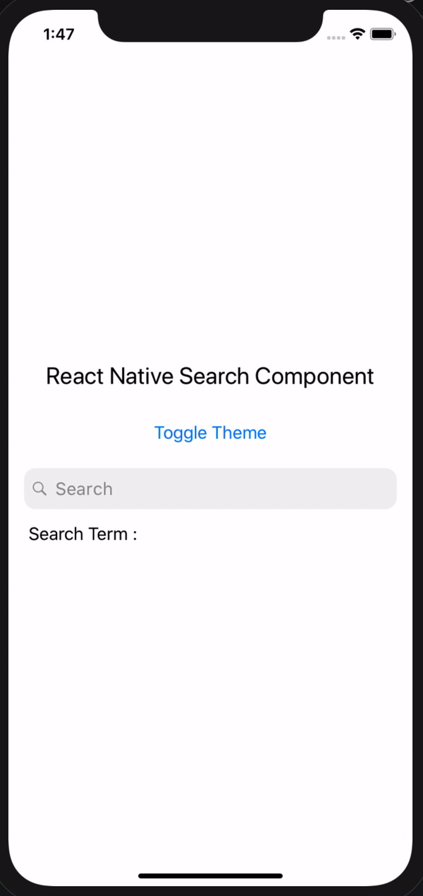
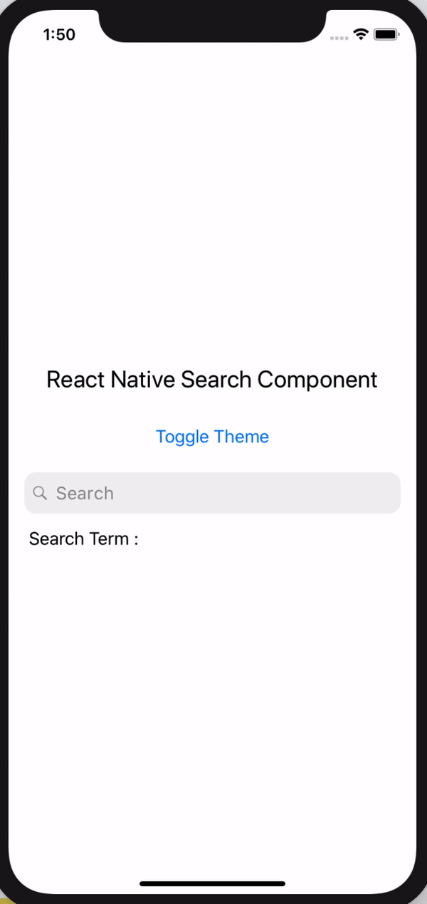
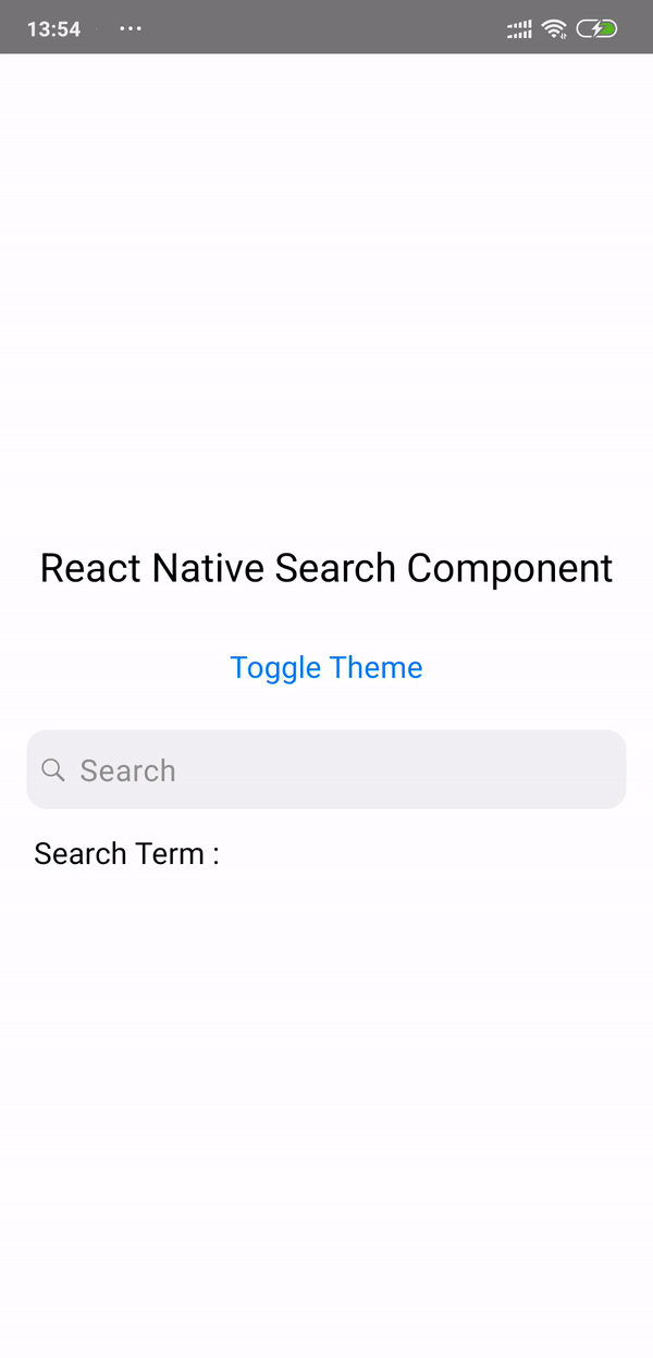
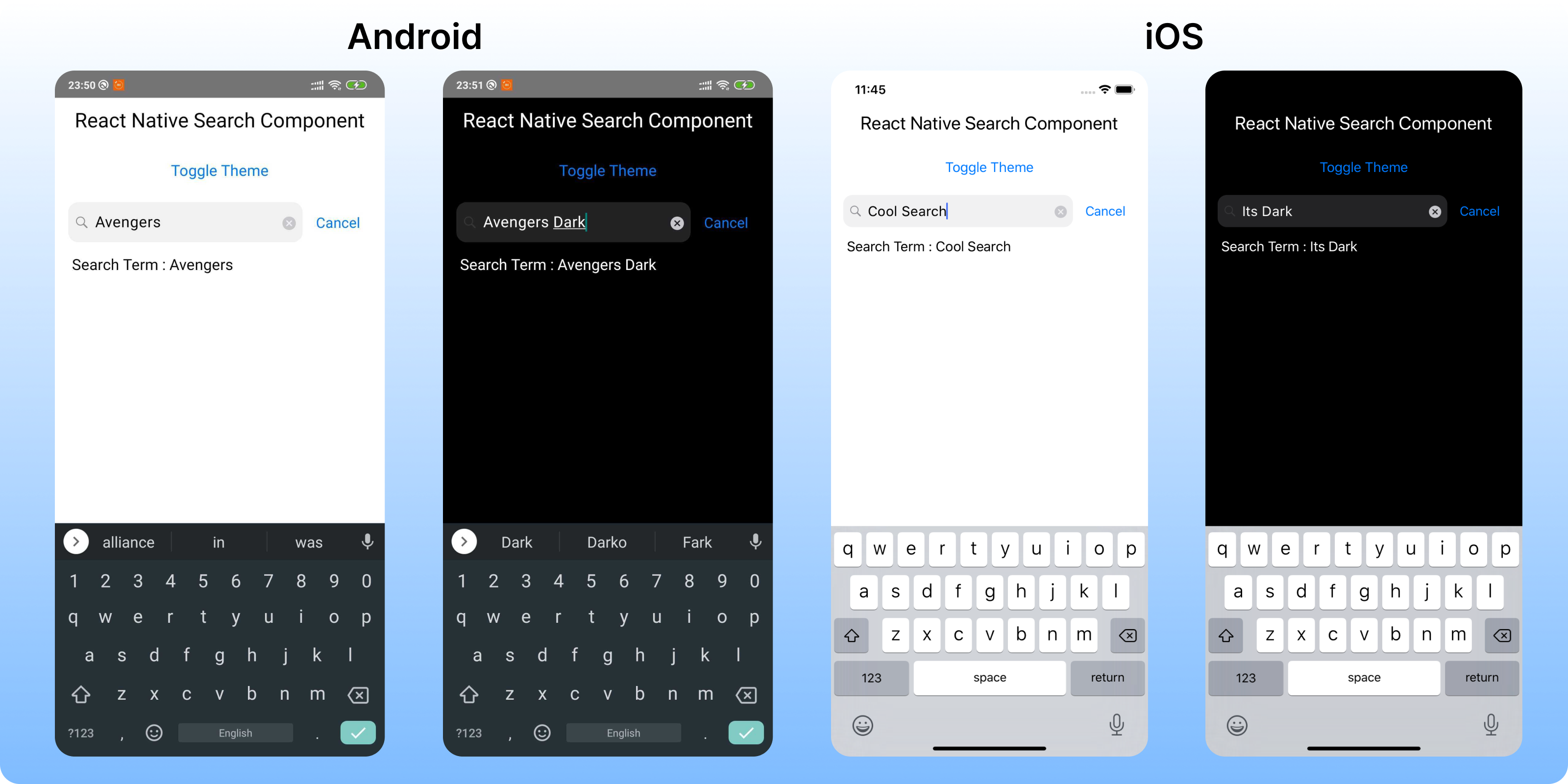
:camera: Screenshot
:wrench: Props
| Name | Description | Required | Type | Default |
|---|---|---|---|---|
| value | A search term Value | Yes | String | '' |
| placeholder | A placeholder value | No | String | '' |
| placeholderTextColor | Tintcolor for Placeholder | No | Color | Based on theme |
| onChange | A Callback function returning TextInput onChange | Yes | Function | () => {} |
| onSearchClear | A Callback function on Close Icon click | No | Function | () => {} |
| theme | App Theme | NO | oneOf['LIGHT','DARK] | 'LIGHT' |
| isLoading | Loading state Indicator on search | NO | Boolean | false |
| loadingTintColor | The tint color of spinner | NO | Color | '#636366' |
| cancelColor | The tint color of 'Cancel' text | NO | Color | '#007AFF' |
| customSearchInputStyle | The styles, that will rewrite default searchInputStyle | NO | Object | Check here |
| customCancelTextStyle | The styles, that will rewrite default "cancel" text Style | NO | Object | Check here |
:wrench: Style Objects
default value of Custome Search Input
{
  fontSize: 18,
  fontWeight: '400',
  lineHeight: 22,
  letterSpacing: 0.5,
  paddingHorizontal: 12,
  paddingVertical: 10,
  borderRadius: 12,
  paddingLeft: 32
}

default value of Custom Cancel Text Style
{
  paddingLeft: 16,
  fontSize: 17,
  color: props.cancelColor
}
:wrench: Methods
.searchInputRef()
Returns searchTextInput ref. Useful for directly control search input.
Example:
import { useEffect, useRef } from 'react';

[...]

const searchInput = useRef();

[...]

const toggleFocus = () => {
  const isFocused = searchInput.current.searchInputRef().isFocused();
  if (isFocused) {
    searchInput.current.searchInputRef().blur();
  } else {
    searchInput.current.searchInputRef().focus();
  }
};

<SearchComponent
  value={searchTerm}
  theme={theme}
  onChange={onChange}
  onSearchClear={onSearchClear}
  ref={searchInput}
/>
:tada: Example
Checkout the example here.
:notebook: Blog
Checkout my blog here.
:snowman: Built with ❤️ and
:v: Contributing
Pull requests are always welcome! Feel free to open a new GitHub issue for any changes that can be made.
:man: Author
:clipboard: License
MIT
Project by @Timeless ✌