README
react-native-segmented-text-input
A wickedly customizable <TextInput /> for React Native. Useful for tags, spellchecking, whatever.
🚀 Getting Started
Using npm:
npm install --save react-native-segmented-text-input
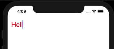
✍️ Usage
import SegmentedTextInput from "react-native-segmented-text-input";

export default () => {
  const [value, onChange] = useState(['', []]);
  return (
    <SegmentedTextInput
      value={value}
      onChange={onChange}
    />
  );
};
To initialize the view, you can supply the input text and corresponding pattern:
import { PATTERN_MENTION } from "react-native-segmented-text-input";
const [value, onChange] = useState(['', [["@cawfree", PATTERN_MENTION]]]);
🤔 Prop Types
| Prop Name | Type Struc | Required | Default | Description |
|---|---|---|---|---|
| value | [string, [string, matchingRegExp]] | false | ['', []] | The current state of the input. Array of the string being typed, and array of previous regexp matches relating to match string. |
| onChange | ([string, [[string, matchingRegExp]]) => undefined | false | Promise.resolve | Called when the segments or input text has changed. |
| patterns | {[regExpString]: React.ElementType, ...} | false | {["(^|\s)@[a-z\d-]+"] => Mention | Maps a to a React component to render them. Is passed an onRequestDelete prop used to delete the segment. |
| placeholder | string | false | "Add some @mentions..." | Placeholder for the text input. |
| disabled | boolean | false | false | Prevent the user from typing. |
| textStyle | styles | false | {fontSize: 28} | Style the text. (Inherited for both Text and InputText). |
| textInputStyle | styles | false | {} | Specific additional styling for the TextInput. |
| invalidTextStyle | styles | false | {color: "red"} | Specific additional styling for the TextInput when in error. |
| segmentContainerStyle | styles | false | {} | Additional styling for segment container. |
| suggestionsContainerStyle | styles | false | {} | Styling to apply to the container of the Suggestions. |
| shouldRenderInvalid | currentTextString => boolean | false | str => !str.startsWith("@") | Determines whether a particular string should be rendered using invalidTextStyle. |
| max | number | false | 3 | Maximum number of segments. |
| onSuggest | currentTextString => Promise([any]) | false | Promise.resolve([]) | A call which is made when the user is mid-typing. The string is passed to ask the parent to provide possible suggestions. |
| minSuggestionLength | number | false | 2 | The minimum number of characters a user should have typed before attempting to make a suggestion. |
| debounce | number | false | 250 | The number of milliseconds to throttle attempts at querying for a suggestion. |
| renderSuggestions | ({suggestions:[any], pickSuggestion: () => undefined, loadingSuggestions: boolean}) => |
false | () => |
Used to render suggestions. This function must understand the specific format of returned suggestion data. |