README
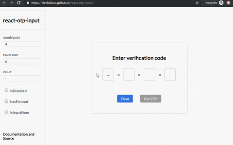
react-otp-input


A fully customizable, one-time password input component for the web built with React.
Installation

To install the latest stable version:
npm install --save react-otp-input
Basic usage:
import React, { Component } from 'react';
import OtpInput from 'react-otp-input';

export default class App extends Component {
  state = { otp: '' };

  handleChange = (otp) => this.setState({ otp });

  render() {
    return (
      <OtpInput
        value={this.state.otp}
        onChange={this.handleChange}
        numInputs={6}
        separator={<span>-</span>}
      />
    );
  }
}
API
| Name |
Type | Required | Default | Description |
|---|---|---|---|---|
| numInputs | number | true | 4 | Number of OTP inputs to be rendered. |
| onChange | function | true | console.log | Returns OTP code typed in inputs. |
| value | string / number | true | '' | The value of the OTP passed into the component. |
| placeholder | string | false | none | Specify an expected value of each input. The length of this string should be equal to numInputs. |
| separator | component |
false | none | Provide a custom separator between inputs by passing a component. For instance, <span>-</span> would add - between each input. |
| containerStyle | style (object) / className (string) | false | none | Style applied or class passed to container of inputs. |
| inputStyle | style (object) / className (string) | false | none | Style applied or class passed to each input. |
| focusStyle | style (object) / className (string) | false | none | Style applied or class passed to inputs on focus. |
| isDisabled | boolean | false | false | Disables all the inputs. |
| disabledStyle | style (object) / className (string) | false | none | Style applied or class passed to each input when disabled. |
| hasErrored | boolean | false | false | Indicates there is an error in the inputs. |
| errorStyle | style (object) / className (string) | false | none | Style applied or class passed to each input when errored. |
| shouldAutoFocus | boolean | false | false | Auto focuses input on initial page load. |
| isInputNum | boolean | false | false | Restrict input to only numbers. |
| isInputSecure | boolean | false | false | Masks input characters. |
| data-cy | string | false | - | Test attribute passed to the inputs. |
| data-testid | string | false | - | Test attribute passed to the inputs. |
Breaking changes when porting to v1.0.0
react-otp-input is now a controlled component to facilitate functionalities that weren't possible before from the application using it, such as clearing or pre-assigning values. For v1.0.0 and above, a value prop needs to be passed in the component for it to function as expected.
Development
To run the development server:
npm run dev
Checklist

- Add flowtypes
- Add ESLint, Prettier for code quality
- Add styling support for states including focus/disabled
- Write tests
Contributing


Feel free to open issues and pull requests!
License

Contributors ✨
Thanks goes to these wonderful people (emoji key):
 Abhishek Warokar 💻 🎨 🚧 🤔 👀 |
 Aj 💻 🎨 🤔 |
 Aromal Anil 💻 🔧 |
 Gabriele Corti 💻 ️️️️♿️ |
 Anoop 💻 |
 Dewansh Rawat 🐛 |
 Ishan Chhabra 💻 |
This project follows the all-contributors specification. Contributions of any kind welcome!