README
react-plotly.js-editor
Customizable React-based editor panel for Plotly charts, Part of Plotly's React Component Suite for building data visualization Web apps and products.
master

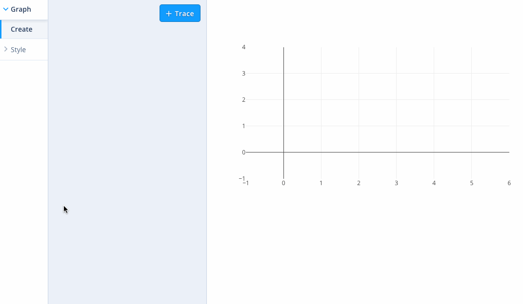
Demo & Screenshots
Check out the live demo here.
Quick start
Check out the demo of the latest release of the DefaultEditor at https://plotly.github.io/react-plotly.js-editor/ or run it locally with:
git clone [this repo]
cd react-plotly.js-editor
cd examples/simple
npm install
npm start
See more examples here.
Overview
This module's entry point is a React component called <PlotlyEditor /> which connects to a plotly.js-powered <Plot /> component care of react-plotly.js. A plotly.js plot is defined by a JSON-serializable object called a figure. <PlotlyEditor /> accepts as children React components whose descendents are input elements wrapped via connectToContainer() calls so as to bind them to the <Plot />'s figure's values. If no children are passed to the <PlotlyEditor />, the <DefaultEditor /> is used. This module also exposes the building block components that comprise the <DefaultEditor /> so that developers can create their own customized editors.
Connecting <PlotlyEditor /> to <Plot />
The binding between <PlotlyEditor /> and <Plot /> works a little differently that in most React apps because plotly.js mutates its properties. This is mapped onto React's one-way dataflow model via event handlers and shared revision numbers which trigger re-renders of mutated state. The following subset of the simple example shows how this works using a parent component to store state, but the principle is the same with a different state-manage approach, as shown in the redux example:
import PlotlyEditor from 'react-plotly.js-editor';
import Plot from 'react-plotly.js';

class App extends Component {
  constructor() {
    super();
    this.state = {graphDiv: {}, editorRevision: 0, plotRevision: 0};
  }

  handlePlotUpdate(graphDiv) {
    this.setState(({editorRevision: x}) => ({editorRevision: x + 1, graphDiv}));
  }

  handleEditorUpdate() {
    this.setState(({plotRevision: x}) => ({plotRevision: x + 1}));
  }

  render() {
    return (
      <div>
        <PlotlyEditor
          graphDiv={this.state.graphDiv}
          onUpdate={this.handleEditorUpdate.bind(this)}
          revision={this.state.editorRevision}
          {...snip}
        />
        <Plot
          data={this.state.graphDiv.data}
          layout={this.state.graphDiv.layout}
          onUpdate={this.handlePlotUpdate.bind(this)}
          revision={this.state.plotRevision}
          {...snip}
        />
      </div>
    );
  }
}
Data Management
<PlotlyEditor /> accepts a dataSources property which is an object of arrays of data, as well as a dataSourceOptions property which contains metadata about the dataSources, such as human-readable labels used to populate input elements like dropdown menus. <PlotlyEditor /> treats these properties as immutable so any changes to them will trigger a rerender, and accepts an onUpdateTraces event handler property which is called whenever it needs to access a column from dataSources, enabling asynchronous data loading e.g. from remote APIs. The async-data example shows how this is done using a dummy asynchronous back-end proxy.
Styling the <DefaultEditor /> and the built-in components
- Import editor styles with
import react-plotly.js-editor/lib/react-plotly.js-editor.min.css - Interested in theming?
- Need to support IE11? import the IE css instead:
import react-plotly.js-editor/lib/react-plotly.js-editor.ie.min.css
Development Setup
This repo contains a dev app that depends on the components locally and is configured for hot reloading, for easy local development. A jest-based test suite is also included.
npm install
npm start
# hacking happens here
npm test
Built-in Components
This module provides a number of nestable containers which are intended to contain fields that render widgets that have been connected to individual values in the figure via connector functions. Containers can also be connected to parts of the figure tree (e.g. layout or specific traces in data) such that their child fields map to the appropriate leaf values. A field must have a connected container as an ancestor in order to be bound to the figure. The <PlotlyEditor /> and connector functions use the React context API to push configuration information to child components.
At a pseudo-code level it looks like this:
<PlotlyEditor {...etc}>
  <ConnectedContainer {...etc}>
    <Field attr="path.to.figure.value" {...etc} />
  </ConnectedContainer>
</PlotlyEditor>
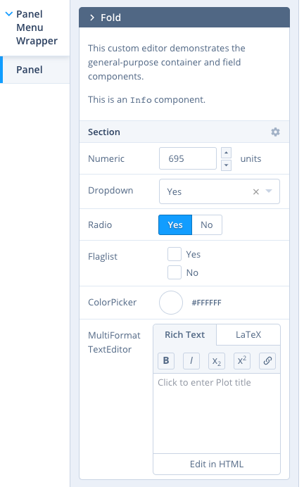
The custom editor example shows how to build a custom editor, and shows off all of the general-purpose containers and fields listed below.
General-purpose Containers
<Panel />: renders as a generic rectangular container with special handling for collapsing/expanding child<Fold />s and optionally an 'add' button for creating them<PanelMenuWrapper />: renders as a sidebar selector menu for<Panel />s<Fold />: collapsable container within a<Panel /><Section />: uncollapsable container within a<Panel />or<Fold /><MenuPanel />: container child of<Section />that appears when a cog icon in the section title is clicked on<SingleSidebarItem/>: wraps any item you would like to see appear in the sidebar menu.
General-purpose Fields
All Fields except <Info /> accept an attr property to bind them to a key in the figure (see https://plot.ly/javascript/reference/ for exhaustive documentation of figure keys). This property can be a .-delimited path to a leaf, starting at the context-appropriate point in the figure for the parent container (see connector functions below).
<Info />: renders its children as HTML, useful for displaying help text<Numeric />: renders as a text field with arrows and units, useful for numeric values<Radio />: renders as a button group, useful for mutually-exclusive low-cardinality enumerable values<Dropdown />: renders as a dropdown menu useful for mutually-exclusive high-cardinality enumerable values<ColorPicker />: renders as a popup color-picker, useful for CSS color hex value strings<ColorscalePicker />: npm module react-colorscales<Flaglist />: renders as a list of checkboxes, useful for+-joined flag lists likedata[].mode<TextEditor />: renders as a WYSIWYG editor, useful for text likelayout.title, takes props:latexOnly,richTextOnly,htmlOnlyif no format props given, defaults to theMultiFormattext editor (latex && richText && html)
Widgets
Simple component that takes in props and renders.
<Button/>: simple button component, useful when combined with<SingleSidebarItem/>to add as menu item
Special-Purpose Containers
<TraceAccordion />:<Panel />whose children are replicated into<Folds />connected to traces viaconnectTraceToPlot().<LayoutPanel />:<Panel />whose children are connected to thelayoutfigure key<TraceRequiredPanel />:<LayoutPanel />renders<PanelEmpty />if no trace data is set, can add extra conditions (i.e. an array of functions that will be run) with theextraConditionsprop and a matching array with extraEmptyPanelMessages to show when those conditions are not met.<AnnotationAccordion />:<Panel />whose children are replicated into<Folds />connected to annotations viaconnectAnnotationToLayout(). For use in a<LayoutPanel />.<ShapeAccordion />:<Panel />whose children are replicated into<Folds />connected to shapes viaconnectShapeToLayout(). For use in a<LayoutPanel />.<ImageAccordion />:<Panel />whose children are replicated into<Folds />connected to images viaconnectImageToLayout(). For use in a<LayoutPanel />.<AxesFold />:<Fold />whose children are bound to axis-specific keys. For use in a<LayoutPanel />; and automatically contains an<AxesSelector />(see below).<TraceMarkerSection />:<Section />with trace-specific name handling. For use in containers bound to traces e.g. as children of<TraceAccordion />.
Special-Purpose Fields
For use in containers bound to traces e.g. as children of <TraceAccordion />:
<DataSelector />: renders as a<Dropdown />coupled todata[].*srcetc, triggersonUpdateTraceswhen changed<TraceSelector />: renders as a<Dropdown />useful fordata[].type<LineDashSelector />: renders as a<Dropdown />useful fordata[].line.dash<LineShapeSelector />: renders as a<Dropdown />useful fordata[].line.shape<SymbolSelector />: renders as a<Dropdown />useful fordata[].marker.symbol<LayoutNumericFraction />and<LayoutNumericFractionInverse />: renders as a<Numeric />for use in trace-connected containers where normal<Numerics />would be bound to thedatakey instead of thelayoutkey in the figure e.g.layout.bargaporlayout.barwidth.<PositioningRef />: renders as a<Dropdown />useful forlayout.*.xref/yrefwhere the allowable values arepaper|[axis]<ErrorBars/>: renders a set of controls that control a trace's error bars (visibility,type,value,valueminus,array,arrayminus)
For use in containers bound to layout:
<FontSelector />: renders as a<Dropdown />whose options are rendered in the selected font<CanvasSize />: renders as a<Numeric />with visibility coupled tolayout.autosize
For use in containers bound to axes:
<AxesSelector />: renders as a<Radio />to select one or all axes. Must be in a container bound to a figure viaconnectAxesToPlot()and sets that container's context such that its children are bound to either all axes or just the selected one.<AxesFold>s automatically contain this component.<AxesRange />: numeric with visibility coupled tolayout.*axis.autorange
For use in containers bound to annotations e.g. as children of <AnnotationAccordion />:
<AnnotationRef />: renders as a<Dropdown />useful forlayout.annotations[].xref,layout.annotations[].yref<AnnotationArrowRef />: renders as a<Dropdown />useful forlayout.annotations[].axref,layout.annotations[].ayref<ArrowSelector />: renders as a<Dropdown />useful forlayout.annotations[].arrowhead
Connector functions
connectToContainer( Component ): returns a field component that can be bound to a figure value via theattrprop.connectTraceToPlot( Container ): returns a wrapped container component that can be bound to a figure trace such that its children are bound to that trace's figure entry under thedatakey, e.g.<TraceAccordion />above.connectLayoutToPlot( Container ): returns a wrapped container component that can be bound to a figure such that its children are bound to that figure's layout under thelayoutkey.connectAxesToLayout( Container ): returns a wrapped container component that should contain an<AxesSelector />field (see above) and can be bound to a figure such that its children are bound to that figure's axes entries under thelayout.*axiskeys.connectAnnotationToLayout( Container ): returns a wrapped container component that can be bound to a figure annotation such that its children are bound to that annotation's figure entry under thelayout.annotationskey, e.g. the<Fold>s in<AnnotationAccordion />above.connectShapeToLayout( Container ): returns a wrapped container component that can be bound to a shape such that its children are bound to that shape's figure entry under thelayout.shapeskey, e.g. the<Fold>s in<ShapeAccordion />above.connectImagesToLayout( Container ): returns a wrapped container component that can be bound to an image such that its children are bound to that image's figure entry under thelayout.imagekey, e.g. the<Fold>s in<ImageAccordion />above.
Mapbox Access Tokens
To use Satellite Maps in the Editor, Mapbox access tokens are required.
Once you have your tokens, you can provide it as a config prop to the react-plotly.js generated Plot component: <Plot config={{mapboxAccessToken: 'your token'}}/>
See also
License
© 2017 Plotly, Inc. MIT License.
Sponsors
This work was made possible by Alteryx, a leader in self-serve data analytics and data blending.