README
React Round Carousel 


An infinitely scrollable 3D carousel component for React


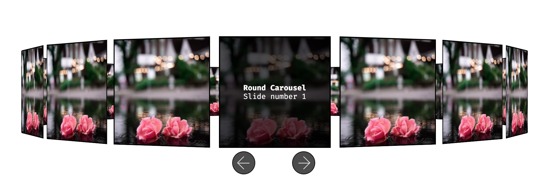
This is an infinitely scrollable 3D carousel component which can be used in a React application.
Install
First install the component using your preferred package manager:
npm i react-round-carousel

# or

yarn add react-round-carousel
Usage
Then import the component in your application. Here is an example:
The slides (or items) should have the following shape:
| Prop | Type | Required | Description | Example |
|---|---|---|---|---|
alt |
string |
false | Alternative text for the slide image | 'This is an example alt text' |
image |
string |
true | Path or URL to an image | 'https://source.unsplash.com/random/210x210' |
content |
ReactNode |
true | A ReactNode representing the content of the slide | <div><strong>Slide Title</strong></div> |
import * as React from 'react';
import * as ReactDOM from 'react-dom';

import { Carousel, CarouselItem } from '../dist/index';

// Create an array of Carousel Items
const items: CarouselItem[] = Array(20)
    .fill('')
    .map((_: string, index: number) => ({
        alt: 'A random Unsplash photo',
        image: 'https://source.unsplash.com/random/210x210',
        content: (
            <div>
                <strong>Round Carousel</strong>
                <span>Slide number {index + 1}</span>
            </div>
        )
    }));

const App = () => <Carousel items={items} />;

ReactDOM.render(<App />, document.getElementById('root'));
Options
The component accepts the following configuration options as props:
| Prop | Type | Required | Description | Default |
|---|---|---|---|---|
classNamePrefix |
string |
false | CSS classname prefix for the Carousel component | 'carousel' |
items |
CarouselItem |
true | An array of CarouselItems |
[] |
itemWidth |
number |
false | Width of each of the carousel items | 210 |
nextButtonContent |
string | ReactNode |
Content of the next button | 'Next' | |
prevButtonContent |
string | ReactNode |
Content of the previous button | 'Previous' | |
showControls |
boolean |
false | Show/hide navigation controls | true |
Support this project

