README
react-svg-pie
A React.js component for drawing pie segments with wrapped text using SVG.
You can draw individual pie segments with the TextWedge component, or manage
a collection of TextWedge instances using the Pie component.
The components use the Material UI mechanism for defining a default style and allowing applications to override any aspect of the CSS.
I built these components to be very flexible but have sensible defaults. This means that it's very easy to get started, and you can change anything that you need to later.
This page contains some examples of what the components look like, with the code that was used to produce each example. There are also some Storybooks that you can check out for the Pie component and the TextWedge component.
Getting started
To install this component, run this command in the root folder of your node.js application:
npm i react-svg-pie
To add a pie chart or pie menu to your application, add this to the top of your source file:
import { Pie } from 'react-svg-pie';
To test if it's working, add this html to your component:
<Pie data={[{value:1, title:'One'}, {value:1, title:'Two'}, {value:1, title:'Three'}]} />
Now take a look at the examples to get an idea about how this component can look.
If you want to do something very specific, the components and their props are documented below.
If you are still stuck, please raise an issue in GitHub. Thanks.
The Pie component
This component provides a convenient method of creating a set of TextWedge components that
divide up a full circle in proportion to a set of data values. Each data value can also have
other information associated with it to customize the look of the corresponding text wedge.
Pie component props
The props that have special meaning are documented below. In addition, any other props
that you set will be applied to the <g> element within the svg. This allows you to
add onClick handlers and set the transform for example.
radius
The radius of the pie circle as a number of pixels. The width and height of the SVG drawing will default to 2x this value. Defaults to 120 pixels.
width
The width of the SVG image produced. If you do not specify a width then it will default to 2x the radius of the pie.
height
The height of the SVG image produced. If you do not specify a height then it will default to 2x the radius of the pie.
centerRadius
This is the radius of the 'hole' to leave in the center of the pie. This is useful
for creatng pie menus and doughnuts. Defaults to 10 pixels. Setting the centerRadius
to the same value as the margin will ensure that all wedges come to a point.
className
The name of a CSS class to apply to the <g> element that wraps the pie drawing. In
Material UI this is usually generated using the makeStyles function. This allows
you to style fonts, strokes and fills for the whole drawing.
margin
The amount of space to leave around the sides of each pie segment. Defaults to 3 pixels. Note that if each pie segment has 3 pixels of space on either side, then the distance between two adjacent pie segments will be 6 pixels.
padding
The amount of space to leave between the edge of the pie segment and the text inside of it. Defaults to 5 pixels.
lineSpacing
This is the vertical distance between lines of text. If you do not set this prop, then the text will be measured with all of the CSS styling applied to calculate the line spacing. Each pie segment can use different text sizes and the margins and wrapping will work correctly for each segment.
lineHeight
The height of one line of text. By default this will be the 80% of the line spacing. This prop only affects the distance between the outside edge of the pie and the top of the first line of text.
data
The data to display on the pie. This defines the relative size of the pie slices, the title to display in each slice, and the styling to apply to each slice.
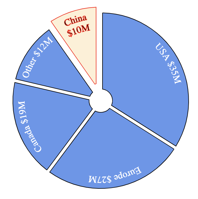
This is an example of the data prop:
const data = [{
    value: 20,
    title: 'China 20%',
    explode: 20
},{
    value: 30,
    title: 'Europe 30%'
},{
    value: 10,
    title: 'Canada 10%'
},{
    value: 40,
    title: 'USA 40%'
}];

return <Pie data={data} />
Below are the properties that you can set for each pie segment in the data prop.
Note that any other properties that you set will be passed to the TextWedge as
props. This allows you to set an onClick property for example and this
will be passed to TextWedge as an onClick prop.
value
The value property determines the relative size of the pie segments.
Each segment is sized in proportion to its value relative to the other
segments.
title
This is the text to draw inside the segment. If no title property is set
then the value will be drawn in the segment.
classes
Defines all of the CSS classes to use for this pie segment. This allows you to style the wedge and the text within it any way you want for each pie segment.
The classes object can be built using the Material UI makeStyles function.
This is illustrated in many of the examples.
explode
The distance to explode this pie segment by. Exploded pie segments are
"pulled out" from the pie circle to draw attention to them. When you do this
you might need to move the whole pie drawing within SVG to avoid clipping the
exploded segments. You can do this by passing a transform prop to the Pie
component. There are examples of how to do this.
startAngle
You can set this prop to rotate the whole pie around its center. The default
startAngle is -180 which draws the first pie segment clockwise starting in
the straight down (south) direction. This is the default because it works
well for pie menus with only one menu option.
Custom styling
In the data prop you can specify a classes property for any wedge to
override the styling of that wedge. The easy way to make this classes object
is with the makeStyles function from the Material UI library.
Below is an example of a Pie with two different wedge styles:
import { makeStyles } from '@material-ui/core/styles';

const navStyles = makeStyles((theme) => ({
  root: {
    stroke: 'red',
  },
  text: {
    fontSize: '25px',
    stroke: 'black',
  },
  wedge: {
    fill: 'pink',
    opacity: 0.2,
    '&:hover': {
      opacity: 0.4,
    },
  },
}));

const actionStyles = makeStyles((theme) => ({
  root: {
    stroke: 'blue',
  },
  text: {
    fontSize: '15px',
  },
  wedge: {
    fill: 'green',
    stroke: 'purple',
    strokeWidth: 2,
    opacity: 0.2,
    '&:hover': {
      opacity: 0.4,
    },
  },
}));

export const MyPie = () => {
  const navClasses = navStyles();
  const actionClasses = actionStyles();

  const data = [{
    value: 1,
    title: 'Option 1',
    classes: navClasses
  },{
    value: 1,
    title: 'Option 2',
    classes: navClasses
  },{
    value: 1,
    title: 'Option 3',
    classes: actionClasses
  }{
    value: 1,
    title: 'Option 4',
    classes: actionClasses
  },{
    value: 1,
    title: 'Option 5',
    classes: actionClasses
  }];

  return (<Pie data={data} />
}
The TextWedge component
The Pie component creates a set of TextWedge components internally,
but you can create these yourself for ultimate flexibility like this:
import React from 'react';
import { TextWedge } from 'react-svg-pie';
import { makeStyles } from '@material-ui/core/styles';

const useStyles = makeStyles((theme) => ({
  root: {
    stroke: 'blue',
  },
  text: {
    fontSize: '45px',
    fill: 'none',
  },
  wedge: {
    fill: 'green',
    stroke: 'black',
    strokeWidth: 2,
    fillOpacity: 0.2,
    '&:hover': {
      opacity: 0.4,
    },
  },
}));

export const CustomPie = () => {
  const classes = useStyles();
  return (
    <svg width="550" height="550">
      <TextWedge classes={classes} radius={250} centerRadius={50} startAngle={315} endAngle={45} drawWedge wedgeMargin={3}>
        This is the first wedge
      </TextWedge>
      <TextWedge classes={classes} radius={250} centerRadius={50} startAngle={45} endAngle={135} drawWedge wedgeMargin={3} explode={25}>
        This is the second wedge
      </TextWedge>
      <TextWedge classes={classes} radius={250} centerRadius={50} startAngle={135} endAngle={225} drawWedge wedgeMargin={3}>
        This is the third wedge
      </TextWedge>
      <TextWedge classes={classes} radius={250} centerRadius={50} startAngle={225} endAngle={315} drawWedge wedgeMargin={3}>
        This is the fourth wedge
      </TextWedge>
    </svg>
  );
};
Note that TextWedge outputs an SVG <g> element and must be put inside an <svg>
element. It is done this way to give you more flexibility - for example you might want
to put multiple pie drawings in one SVG or combine the pie drawing with other drawing
elements.
TextWedge component props
The TextWedge component has the following props, any other props passed to it will
be passed down to the <g> element that it outputs. This allows you to pass other
props such as onClick to the SVG group.
radius
The distance from the center of the pie to the outside edge in pixels. Defaults to 120 pixels.
You can either pass the same value to all TextWedge components in the pie, or you can
leave the default 120 pixels and scale your SVG to whatever size you need.
centerRadius
The radius of a circle in the middle of the pie that will not be drawn. This is useful for cases where you want to draw a pie menu, or draw a doughnut. Defaults to 10 pixels.
startAngle
The clockwise angle in degrees to start drawing at. This prop has no default and
must be specified for every TextWedge. Zero degrees is North of the center
of the pie, 90 degrees is East, 180 degrees South and 270 degrees West. You can also
set negative values.
If the startAngle is less than the endAngle then the wedge is assumed to span
0 degrees. For example if you set the start to -45 degrees and the end to +45 degrees
then the text wedge will span 90 degrees with North in the center.
endAngle
The angle in degrees to finish drawing at. This prop has no default and must be specified
for every TextWedge. The most common use case it to have the endAngle of one TextWedge
match the startAngle of the next TextWedge so that there are no gaps, but you can
also overlap them or leave gaps if you like.
children
You don't need to pass this prop explicitly, it will be set automatically by React and
contains the nested elements. For this component the children must be text strings, you
cannot place other React components inside the TextWedge because it is an SVG drawing
and cannot contain arbitrary html elements.
className
The name of a CSS class to apply to the root element of the TextWedge. In Material UI this
is usually generated using the makeStyles function.
classes
Optionally pass an object that overrides the styling of all parts of the TextWedge component.
Using this prop, you can change the style of the root element, the text, the wedge drawing and
baseline drawing.
lineSpacing
This is the vertical distance between lines of text. If you do not set this prop, then the
text will be measured with all of the CSS styling applied to calculate the line spacing.
lineHeight
The height of one line of text. By default this will be the 80% of the line spacing. This prop only affects the distance between the outside edge of the pie and the top of the first line of text.
You can pass this prop move the text up and down within the TextWedge.
padding
The number of pixels to leave between the left and right edge of the text and the edge of the wedge border. The default is 5 pixels.
drawWedge
Set this prop to a truthy value to draw the wedge. If you do not set this prop then
only the text will be drawn.
margin
If drawWedge is true, then this prop sets the number of pixels to inset the border
of the wedge drawing. The default value is 3 pixels. If you are not drawing the wedge
then this prop has no effect.
drawBaseline
Set this prop to a truthy value to draw a line on the text baseline. This is mostly useful for
debugging purposes, but can be used in production code if you like this effect. The style of the
baseline can be customized by passing a classes prop with a baseline property.
explode
Defines how many pixels to displace this pie segment from the circle to make this pie segment stand out. By default pie segments are not exploded.