README
react-top-loader
Simple fixed-to-top progress bar / loader component for React (similar to sites like GitHub, Medium etc.)

Installation
npm install react-top-loader
or
yarn add react-top-loader
Usage
- Just import
TopLoaderand set theshowprop totrue. This will show the indeterminate loader with looping animation at the top of the page. - Use the
progressprop to control the animation manually. - The loading bar is fixed to top by default. Set
fixedtofalseto disable it.
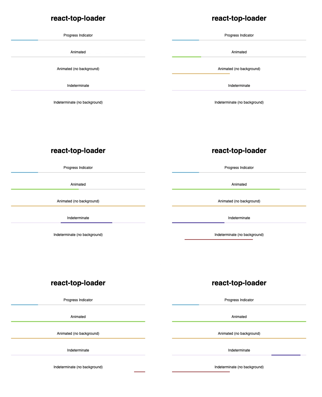
Here are some more examples:
import TopLoader from "react-top-loader";

const Examples = () => (
  <div>
    {/* Fixed to Top with looping animation */}
    <TopLoader show color="#61d800" />

    {/* Progress Indicator */}
    <div style={{ padding: 16 }}>
      <TopLoader show progress={0.2} fixed={false} backgroundColor="#ddd" />
    </div>

    {/* Animated */}
    <div style={{ padding: 16 }}>
      <Animator
        color="#61d800"
        fixed={false}
        backgroundColor="#ddd"
        progressDuration={400}
      />
    </div>

    {/* Indeterminate */}
    <div style={{ padding: 16 }}>
      <TopLoader backgroundColor="#eee6ff" show fixed={false} color="#0000e4" />
    </div>

    {/* Indeterminate (no background) */}
    <div style={{ padding: 16 }}>
      <div>Indeterminate (no background)</div>
      <TopLoader color="#D32F2F" show fixed={false} duration={2500} />
    </div>
  </div>
);

// Helper class to animate the loader
class Animator extends React.Component {
  state = { progress: 0 };

  componentDidMount() {
    setInterval(
      () => this.setState({ progress: Math.min(1, this.state.progress + 0.1) }),
      400
    );
  }

  render() {
    return <TopLoader show progress={this.state.progress} {...this.props} />;
  }
}
Props
| Prop | Type | Default | Required | Description |
|---|---|---|---|---|
show |
boolean |
false |
yes | Set this to true to show the loader |
progress |
null (or) number (between 0 and 1) |
no | If undefined or null, indeterminate animated loader is shown. If specified, a fraction of the strip is filled |
|
fixed |
boolean |
true |
no | If true, loader is shown at the top of the page (position:fixed). Otherwise you have to position it yourself |
thickness |
number |
2 |
no | Thickness (height) of the loading strip in pixels (px) |
color |
string |
"#03a9f4" |
no | Color of the loading strip |
backgroundColor |
string |
"transparent" |
no | Color of the empty region behind the loading strip (transparent by default) |
delay |
number (milliseconds) |
0 |
no | Show the loader after a specified delay (use this to prevent flashing of loader of very short tasks/requests) |
duration |
number (milliseconds) |
1500 |
no | Duration of the animation of the indeterminate loader (not applicable if progress is provided) |
progressDuration |
number (milliseconds) |
400 |
no | If you're changing the value of progress to animate the loader, then use this to control the speed of animation |
zIndex |
number |
10000 |
no | Z-Index of the top-level loader div |
className |
string |
no | Specify a custom class for the top-level div |
|
style |
object |
no | Override styles for the top-level div |
Credits
Developed by the Jovian.ml team. Released under the MIT Licence. Inspired by this Codepen example by Shahen Algoo.
