README
reactjs-bottom-navigation
reactjs bottom navigation menu component
Introduction
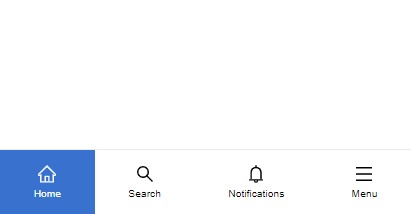 Bottom Navigation Menu component for react js
full Tutorial: click here
Bottom Navigation Menu component for react js
full Tutorial: click here
Installation
npm install --save reactjs-bottom-navigation
Usage
// first import the component and css

import BottomNavigation from 'reactjs-bottom-navigation'
import 'reactjs-bottom-navigation/dist/index.css'

function App() {
  // items

  const bottomNavItems = [
    {
      title: 'Home',

      icon: <HomeOutlined style={{ fontSize: '18px' }} />,

      activeIcon: <HomeOutlined style={{ fontSize: '18px', color: '#fff' }} />
    },

    {
      title: 'Search',

      icon: <SearchOutlined style={{ fontSize: '18px' }} />,

      activeIcon: <SearchOutlined style={{ fontSize: '18px', color: '#fff' }} />
    },

    {
      title: 'Notifications',

      icon: <BellOutlined style={{ fontSize: '18px' }} />,

      activeIcon: <BellOutlined style={{ fontSize: '18px', color: '#fff' }} />
    },

    {
      title: 'Menu',

      icon: <MenuOutlined style={{ fontSize: '18px' }} />,

      activeIcon: <MenuOutlined style={{ fontSize: '18px', color: '#fff' }} />,

      onClick: () => alert('menu clicked')
    }
  ]

  return (
    <div>
      <BottomNavigation
        items={bottomNavItems}
        defaultSelected={0}
        onItemClick={(item) => console.log(item)}
      />
    </div>
  )
}
Props
| Props | Type | default | description |
| ------------------ | --------------------- | ------- | ----------------------------------------------------------------------------- |
| items | Array of item objects | - | see the below table |
| defaultSelected | number | null | default active item |
| onItemClick | function | - | triggers when an item is clicked and it returns the item including it's index |
| noActiveBg | boolean | false | disable active item background |
| activeBgColor | boolean | false | custom active background color |
| activeTextColor | boolean | false | custom active text color |
Item Structure
| Prop | Type | description |
| ---------- | ------------- | ------------------------------------------------------------------------------ |
| title | string | item title |
| icon | jsx or string | item icon, can be any element |
| activeIcon | jsx or string | item active icon, can be any element |
| onClick | function | triggers when the item is clicked and it returns the item including it's index |
Customization
the component elements have the following class names which you can assign new styles to them:
Bottom Navigation: bottom-nav
Items: bottom-nav-item
titles: bottom-nav-item–title
you can also use "activeBgColor" and "activeTextColor" props
License
MIT © hoseinhamzei